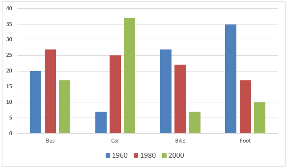
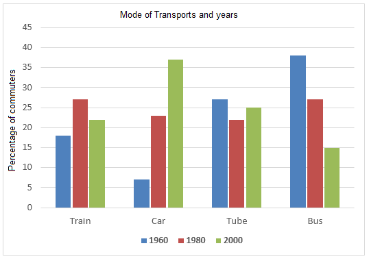
Academic Task 1 · Bar charts Transport·Employment The graph below shows the different modes of transport used to travel to and from work in one European city in 1960, 1980 and 2000. Write this task Compare 4 sample answers→
Academic Task 1 · Bar charts Transport The bar charts below give information about the railway system in six cities in Europe. Write this task Compare 3 sample answers→
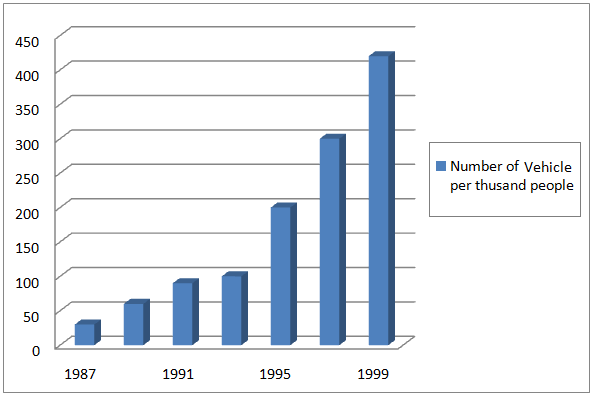
Academic Task 1 · Bar charts Transport The bar chart below gives information about vehicle ownership in China. Write this task Compare 3 sample answers→
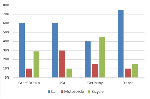
Academic Task 1 · Bar charts Transport·Age The chart below shows the type of transports young people in four countries prefer to use. Write this task Compare 2 sample answers→
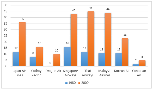
Academic Task 1 · Bar charts Transport·Travel The graph below presents the number of different airline flights coming to Hong Kong per week in 1980 and 2000. Write this task Compare 2 sample answers→
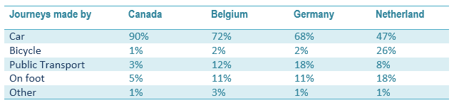
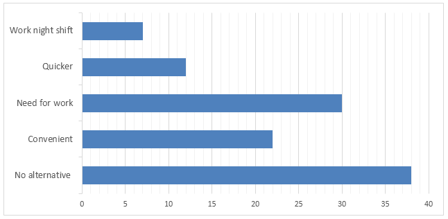
Academic Task 1 · Bar charts Transport·Employment The table below shows the percentage of journey by different means in 4 countries and the bar graph shows the reasons for Canadian people to use a car to reach their workplace. Write this task Compare 2 sample answers→