The graph below gives information about the number of jobs in four sectors of the economy in the US between 1960 and 2020. Summarise the information by selecting and reporting the main features, and make comparisons where relevant.
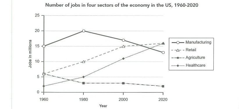
The graph below gives information about the number of jobs in four sectors of the economy in the US between 1960 and 2020. Summarise the information by selecting and reporting the main features, and make comparisons where relevant.
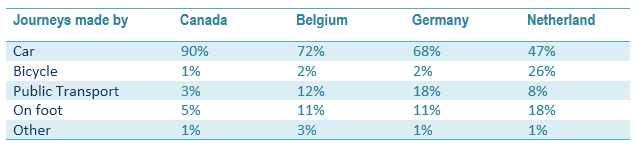
The line graphs below show the production and demand for steel in million tonnes and the number of workers employed in the steel industry in the UK in 2010.
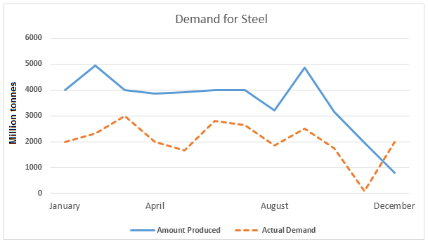
The table below shows the percentage of journey by different means in 4 countries and the bar graph shows the reasons for Canadian people to use a car to reach their workplace.
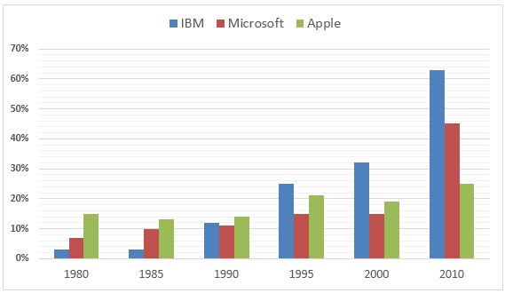
The bar chart below shows the percentage participation of men in senior development in three companies between 1980 and the year 2010. Percentage of participation of men in senior development positions
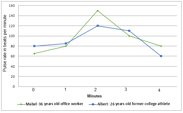
The graph shows a comparison in the pulse rate changes between two different individuals of different ages and professions. Write a report for a university tutor describing the information shown in the diagrams below. Exercise and pulse rate
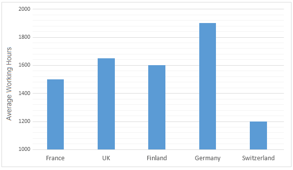
The bar charts below show the average of annual working hours and the average duration of holidays in five European countries. Average number of working hours per person in a year Average duration of holidays in hours per person in a year
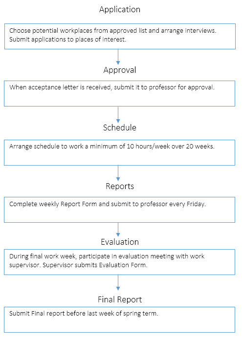
The flowchart below shows the process involved in completing the work experience requirement for university students. Fulfilling the work Experience Requirement Credits will be awarded when the final report is submitted.
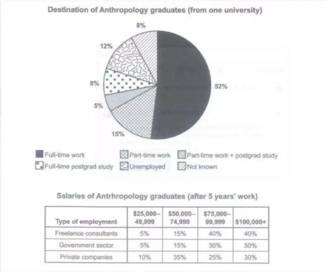
The chart below shows what Anthropology graduates from one university did after finishing their undergraduate degree course. The table shows the salaries of the anthropologists in work after five years. Summarize the information by selecting and reporting the main features, and make comparisons where relevant.
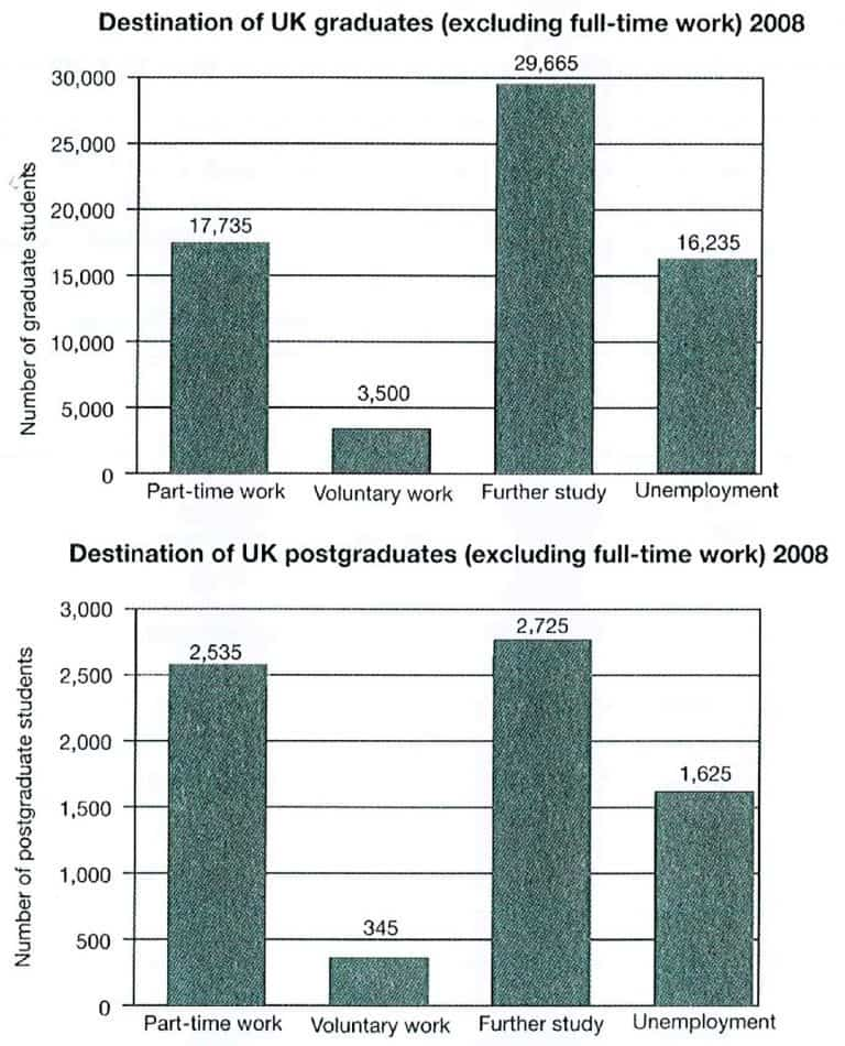
The charts below show what UK graduate and postgraduate students who did not go into full-time work did after leaving college in 2008. Summarise the information by selecting and reporting the main features, and make comparisons where relevant.
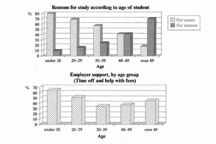
The charts below show the main reasons for study among students of different age groups and the amount of support they received from employers. Summarise the information by selecting and reporting the main features, and make comparisons where relevant.