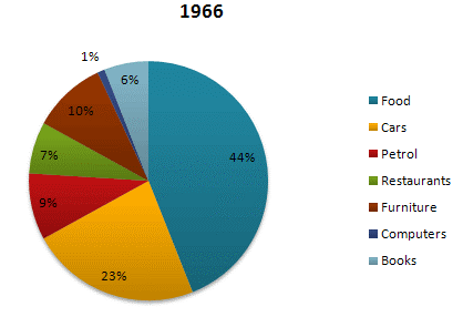
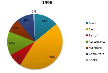
The given pie charts compare the expenses in 7 different categories in 1966 and 1996 by American Citizens.
Sample Response
The pie charts compare Americans' expenditure in 7 different categories namely food, cars, petrol, restaurants, furniture, computers and books in 1966 with that of 1996. Overall, the least significant percentage of spending by Americans went on computers in 1966 while the food cost them the highest percentage. After three decades, cars became the largest segment of expenses by American residents and the smallest segment was spent on books, percentage-wise. Cars accounted for 23 percent of expenses by Americans in 1966 and after thirty years, this ratio remarkably increased to 45%. The expense of dining out in 1966 was 7 percent and it had doubled in 1996 (14%). Only 1 percent of the American population's money went on purchasing computers but this figure rose to 10 percent in 1996. Food comprised 44 percent of all the expenses made by Americans in 1966, and it fell to 14 percent in 1996. In 1966, petrol and furniture outlay was at 9 percent and 10 percent respectively and remained relatively unchanged over a 30-year period. Lastly, expenditure on books had plunged from 6 percent to 1 percent at the end of the period.
IELTS Writing Correction
- 1. Set off namely Original: 7 different categories namely Suggested revision: 7 different categories, namely Why it matters: A comma should introduce the list following namely.
- 2. Link both years Original: in 1966 with that of 1996 Suggested revision: in 1966 and 1996 Why it matters: The charts compare expenditure across the same categories in two years, so this direct coordination is clearer.
- 3. Use precise trend wording Original: this ratio remarkably increased Suggested revision: this figure rose markedly Why it matters: Figure and rose are more natural terms for describing a chart percentage.
- 4. Use simple past Original: it had doubled Suggested revision: it doubled Why it matters: The change between the two stated years does not require the past perfect.
- 5. Use concise wording Original: American population's money Suggested revision: Americans' spending Why it matters: The original possessive phrase is awkward and refers imprecisely to the population's money.
- 6. Correct the collocation Original: expenses made by Americans Suggested revision: expenditure by Americans Why it matters: Expenditure is incurred rather than made in this context.
- 7. Clarify both categories Original: petrol and furniture outlay was Suggested revision: spending on petrol and furniture was Why it matters: This phrasing naturally introduces the two respective percentages.
- 8. Use simple past Original: had plunged Suggested revision: fell Why it matters: The simple past is appropriate for the change over the stated period.
- 9. Use natural phrasing Original: The expense of dining out Suggested revision: Spending on dining out Why it matters: This collocation describes a category of consumer expenditure more naturally.
- 10. Simplify the expression Original: went on purchasing computers Suggested revision: was spent on computers Why it matters: The passive spending construction is concise and avoids the awkward gerund phrase.
- 11. Correct percentage phrasing Original: Food comprised 44 percent Suggested revision: Food accounted for 44 percent Why it matters: A category accounts for a percentage of the total; it does not comprise that percentage.
- 12. Use endpoint preposition Original: at Suggested revision: by Why it matters: By correctly marks the endpoint reached after the decline.
Suggested Rewrites
- 7 different categories namely 7 different categories, namely
- in 1966 with that of 1996 in 1966 and 1996
- this ratio remarkably increased this figure rose markedly
- it had doubled it doubled
- American population's money Americans' spending
- expenses made by Americans expenditure by Americans
Why this response received Band 7.0
The response is strongest in its comprehensive and accurate selection of data, including a clear overview of the changing largest and smallest categories and well-chosen figures for every segment. Its main limitation is presentation in a single paragraph, alongside a few awkward collocations and minor grammatical slips. Prioritize separating the overview from grouped comparisons while retaining the same concise, data-focused coverage.
IELTS Writing Criteria Scores
Task Achievement
The response accurately identifies the main changes and supports them with well-selected figures covering all seven categories.
Refine the analysis by explicitly contrasting the sharp changes with the relatively stable petrol and furniture shares.
Coherence and Cohesion
Ideas progress logically and cohesive devices guide the reader, but the entire report is presented as one dense paragraph.
Use a separate overview and two detail paragraphs grouped by categories that rose and categories that fell or stayed stable.
Lexical Resource
Vocabulary is varied and mostly precise, with occasional awkward expressions such as 'the food cost them the highest percentage.'
Prefer natural collocations such as 'food accounted for the largest share' and 'spending on computers.'
Grammatical Range and Accuracy
The response uses varied complex structures with good overall control, although a few agreement and modifier errors remain.
Check agreement in combined subjects such as 'petrol and furniture outlays were' and tighten awkwardly modified clauses.
Write this task while it is fresh
Try the same task now. It helps you remember the feedback and write better next time.
IELTS Academic Writing Task 1
The given pie charts compare the expenses in 7 different categories in 1966 and 1996 by American Citizens.
Your response
Write the task yourself, then compare your choices with the annotated response.