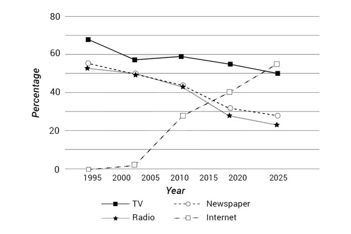
The chart shows the percentage of people who accessed news from 4 sources from 1995 and projection to 2025
Sample Response
The line graph shows how the proportion of people getting news from 4 different sources, namely TV, newspapers, radio, and the internet, has changed since 1995 with projections until 2025.
Overall, it is clear that updating news on the internet has increased in popularity, and this trend is projected to continue, while the reverse is true for the remainder, making the gaps between the four means of media narrow substantially in the second half of the period in question.
TV remains the dominant means throughout most of this period, with roughly 70% of citizens using it in 1995, falling to under 60% in 2000. Having plateaued until 2010, this figure then saw a steady decrease. This is expected to continue, reaching the lowest point of 50% in 2025.
The use of newspapers and radio is similar over the three decades. From around 58% and 52% respectively in 1995, the percentages of people getting news from both sources declined to an equal 50% five years later. There have been considerable decreases to more or less than 30% at present, and the figure for newspapers is predicted to fall slightly to under 30% in 2025, while that for radio will fall more significantly by approximately 10%.
In the first year, there was hardly any person getting updated on news via the internet. However, it experienced a negligible increase in 2000 followed by a surge to just above 40% in 2022, overtaking radio and newspapers in 2018 and 2019, respectively. Prediction shows that this figure should continue to rise dramatically to a peak of 58% in 2025.
IELTS Writing Correction
- 1. Use accurate collocation Original: updating Suggested revision: accessing Why it matters: People access or get news online rather than update news.
- 2. Qualify approximate values Original: an equal 50% Suggested revision: about 50% each Why it matters: The two plotted values are close to, rather than exactly at, the same level.
- 3. Use chart time Original: at present Suggested revision: by around 2018 Why it matters: The graph describes a dated data point, so a shifting reference such as present is misleading.
- 4. State approximation clearly Original: more or less than 30% Suggested revision: around 30% Why it matters: More or less than does not identify a clear value or direction.
- 5. Correct radio decline Original: by approximately 10% Suggested revision: by about five percentage points Why it matters: The radio figure falls from roughly 28% to about 23%, a drop of around five percentage points.
- 6. Correct plotted year Original: 2022 Suggested revision: around 2018 Why it matters: The point just above 40% appears before 2020 on the chart, not in 2022.
- 7. Correct final value Original: 58% in 2025 Suggested revision: about 55% in 2025 Why it matters: The projected internet value is approximately 55% on the graph.
- 8. Report plotted values precisely Original: roughly 70% of citizens using it in 1995, falling to under 60% in 2000 Suggested revision: use falling from about 68% in 1995 to roughly 56% at the next data point Why it matters: The plotted values are closer to 68% and 56%, and the second point is best identified directly from the chart.
- 9. Describe slight variation Original: Having plateaued until 2010 Suggested revision: After remaining broadly stable until 2010 Why it matters: The TV figure rises slightly before 2010 rather than forming a completely flat plateau.
- 10. Use direct trend verb Original: saw a steady decrease Suggested revision: declined steadily Why it matters: A direct verb states the trend more concisely.
- 11. Describe similar trends Original: The use of newspapers and radio is similar Suggested revision: Newspaper and radio use followed similar trends Why it matters: The revision makes clear that the two trajectories, rather than the activities themselves, are similar.
- 12. Correct initial values Original: around 58% and 52% respectively Suggested revision: about 55% and 52%, respectively Why it matters: The newspaper series begins near 55%, while radio begins at about 52%.
Suggested Rewrites
- updating accessing
- an equal 50% about 50% each
- at present by around 2018
- more or less than 30% around 30%
- by approximately 10% by about five percentage points
- 2022 around 2018
Why this response received Band 7.5
The response provides a clear overview and organizes the four news sources into a coherent, mostly accurate account, with especially effective comparisons of their opposing trends. Its main limitation is occasional imprecision in dates, crossing points, and phrasing, including unsupported exact years for the internet overtaking other sources. Prioritize matching every reported time point and comparison precisely to the graph.
IELTS Writing Criteria Scores
Task Achievement
A clear overview and well-selected trends cover all four sources, though a few dates and exact crossing points are imprecise or unsupported.
Check each stated year and crossover directly against the graph, especially the internet values and projected endpoints.
Coherence and Cohesion
Information progresses logically from the overview to clearly grouped details, with effective paragraphing and referencing.
Make the newspaper and radio comparison slightly more concise so each numerical contrast is immediately traceable.
Lexical Resource
The response uses a good range of trend and comparison vocabulary, although several collocations such as updating news and means of media are unnatural.
Use more natural expressions such as accessing news, news source, and almost nobody obtained news online.
Grammatical Range and Accuracy
Complex sentences are handled with generally good control, while occasional article, clause, and phrasing errors remain non-impeding.
Refine article use and sentence subjects in constructions such as Prediction shows and there was hardly any person.
Write this task while it is fresh
Try the same task now. It helps you remember the feedback and write better next time.
IELTS Academic Writing Task 1
The chart shows the percentage of people who accessed news from 4 sources from 1995 and projection to 2025
Your response
Write the task yourself, then compare your choices with the annotated response.