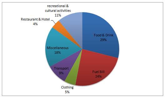
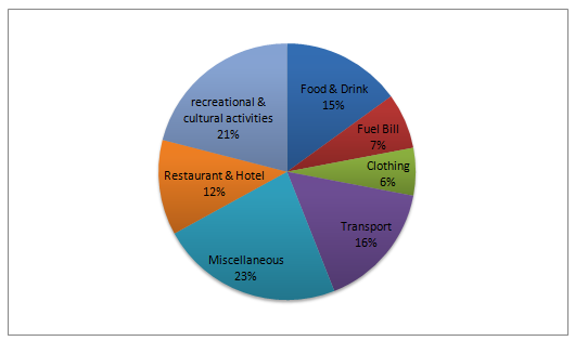
The charts below show the percentage of monthly household income spent on various items by two different groups in one European country.
Sample Response
The pie charts illustrate the proportion of household expenditure by two income groups in Europe. In general, it is clear that house rent is not included in the two pie charts.
First of all, the low-income group spends the most money on food and drink which accounted for 29% of the total income, while the high-income group spends only 15%. It is clearly shown that high-income earner spends the majority of the income on miscellaneous items (23%) whereas only 18% allocated them for the low-income earner. Those who earn less money spend more money on fuel bills than the high-income group (24% and 7% respectively). A direct link can be seen between money spent on transport and fuel bills, that is transport makes up a smaller proportion in the low-income group than high-income group (9% for the former and 16% for the latter).
Another interesting feature is that the low-income earners spend less money on recreational and cultural activities compared to the high-income group, with figures 11% and 21% respectively). For both the income groups, less money is spent on restaurant and hotel and clothing, that is 4% and 5% for low-income group and 7% and 8% for the high-income group.
IELTS Writing Correction
- 1. State the measure precisely Original: the proportion of household expenditure by two income groups Suggested revision: the proportions of monthly household income spent by two groups Why it matters: The charts compare percentages of income spent, so this wording identifies the measure more precisely.
- 2. Include the full exclusion Original: house rent is not included in the two pie charts Suggested revision: house rent and purchase costs are excluded from both charts Why it matters: The note beneath the charts excludes both house rent and purchase costs.
- 3. Use a report transition Original: First of all Suggested revision: Turning to the figures Why it matters: This transition introduces chart details more naturally in an analytical report.
- 4. Describe a percentage share Original: spends the most money Suggested revision: spends the largest share of income Why it matters: The chart shows proportions rather than absolute amounts of money.
- 5. Keep the tense consistent Original: accounted Suggested revision: accounts Why it matters: The present-tense description requires the present-tense verb “accounts.”
- 6. Refer to the group Original: high-income earner Suggested revision: the high-income group Why it matters: The chart represents a defined group, and the singular count noun currently lacks a determiner.
- 7. Avoid overstating 23 percent Original: the majority of the income Suggested revision: the largest share of income Why it matters: Twenty-three percent is the largest category for this group but is not a majority.
- 8. Complete the passive form Original: only 18% allocated them Suggested revision: only 18% is allocated Why it matters: The percentage needs an auxiliary verb, and “them” has no clear plural referent.
- 9. Use the correct agent Original: for the low-income earner Suggested revision: by the low-income group Why it matters: The preposition “by” identifies the group making the allocation.
- 10. Compare shares, not amounts Original: Those who earn less money spend more money on fuel bills Suggested revision: The low-income group spends a larger share of income on fuel bills Why it matters: The charts support a comparison of percentages, not absolute monetary spending.
- 11. Set off respectively Original: 7% respectively Suggested revision: 7%, respectively Why it matters: A comma conventionally separates the final adverb “respectively” from the paired figures.
- 12. Use direct reporting language Original: Another interesting feature is that Suggested revision: The charts also show that Why it matters: Direct reporting language is more precise and concise than the evaluative phrase “interesting feature.”
Suggested Rewrites
- the proportion of household expenditure by two income groups the proportions of monthly household income spent by two groups
- house rent is not included in the two pie charts house rent and purchase costs are excluded from both charts
- First of all Turning to the figures
- spends the most money spends the largest share of income
- accounted accounts
- high-income earner the high-income group
Why this response received Band 6.0
The response’s strongest feature is its broad coverage of the categories and its generally clear direct comparisons between the two income groups. However, the opening does not provide a meaningful overview of the main spending patterns, and the restaurant/hotel and clothing figures for the high-income group are inaccurate; the priority is to summarise the dominant contrasts first and then verify every percentage against the charts.
IELTS Writing Criteria Scores
Task Achievement
The response compares nearly all categories and reports most figures accurately, but it lacks a genuine overview and misstates two high-income percentages.
Add an overview identifying the contrasting priorities of the two groups, then check every cited figure against the charts.
Coherence and Cohesion
The report progresses logically through grouped comparisons, although some linking phrases are mechanical and a few sentences connect ideas awkwardly.
Group the categories around clearer comparison themes and use simpler linking where the relationship is already evident.
Lexical Resource
A sufficient range of task vocabulary conveys the comparisons clearly, despite several awkward collocations and imprecise expressions.
Use more precise constructions such as “accounted for” and “was allocated to” while avoiding vague claims such as a “direct link.”
Grammatical Range and Accuracy
The response uses a mix of simple and complex structures, but recurring article, agreement, clause, and punctuation errors reduce control.
Proofread complex comparative sentences for complete clause structure, accurate articles, and balanced punctuation.
Write this task while it is fresh
Try the same task now. It helps you remember the feedback and write better next time.
IELTS Academic Writing Task 1
The charts below show the percentage of monthly household income spent on various items by two different groups in one European country.
Your response
Write the task yourself, then compare your choices with the annotated response.