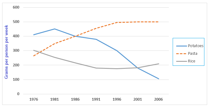
The graph below shows the amount in grams of potatoes, pasta and rice eaten in a European country between 1976 and 2006.
Sample Response
The line graph compares the intake of three food items – potato, pasta and rice in a European country between 1976 and 2006. The unit is given in grams and it represents the consumption by each person in a week. Overall, potato consumption was higher than rice and pasta consumption in the 1970s but after three decades, pasta became the most popular. Getting back to the details, around 400 grams of potato was consumed by each person in a week in 1976 in this country. At that time, the consumption of rice was exactly 300 grams, which was slightly higher than that of pasta. After ten years, pasta consumption skyrocketed while rice consumption plummeted and potato intake slightly dropped. In 1996, pasta became the highest consumed food at 500 grams while potato intake dropped to around 300 grams and rice below 20 grams. Finally, in 2006, pasta intake stood at 500 grams as it was 10 years earlier while potato eating per person further dipped and reached the nadir at only 100 grams. With a slight increase in potato consumption than 5 years earlier, potato remained as the second most preferred food in this country.
IELTS Writing Correction
- 1. Use plural noun Original: potato Suggested revision: potatoes Why it matters: Use the plural form because the chart category refers to potatoes generally.
- 2. Describe consumption precisely Original: most popular Suggested revision: most widely consumed Why it matters: This wording reports the measured quantity without implying a preference survey.
- 3. Use formal transition Original: Getting back to the details Suggested revision: In detail Why it matters: A concise transition is more appropriate for an objective chart description.
- 4. Moderate the trend Original: skyrocketed Suggested revision: rose steadily Why it matters: The chart shows pasta rising from about 250 to 400 grams over the first decade, so this verb overstates the change.
- 5. Moderate the decline Original: plummeted Suggested revision: fell steadily Why it matters: Rice declined gradually from about 300 to 220 grams rather than collapsing abruptly.
- 6. Fix word form Original: highest Suggested revision: most Why it matters: The superlative requires most rather than highest before consumed.
- 7. Correct rice figure Original: rice below 20 grams Suggested revision: rice at about 175 grams Why it matters: The 1996 rice value is just under 180 grams, not below 20 grams.
- 8. Use natural collocation Original: eating Suggested revision: consumption Why it matters: Consumption is the standard noun for reporting food intake in a chart.
- 9. Use exact time point Original: in the 1970s Suggested revision: in 1976 Why it matters: The chart provides only one data point from the 1970s, namely 1976.
- 10. Name the endpoint Original: after three decades Suggested revision: by 2006 Why it matters: Naming the final year makes the overview more precise.
- 11. Refine starting value Original: around 400 grams of potato Suggested revision: just over 400 grams of potatoes Why it matters: The potato series begins slightly above 400 grams in 1976.
- 12. Remove repetition Original: in 1976 in this country Suggested revision: in 1976 Why it matters: The country has already been identified, so repeating it adds no information.
Suggested Rewrites
- potato potatoes
- most popular most widely consumed
- Getting back to the details In detail
- skyrocketed rose steadily
- plummeted fell steadily
- highest most
Why this response received Band 6.5
The response presents a clear overview of the main shift from potatoes to pasta and uses generally effective language to describe trends. Its main weakness is data accuracy: rice is seriously understated in 1996, the final potato movement is reversed, and potatoes are incorrectly ranked second in 2006. The priority is to verify each final value and describe the late rice recovery accurately.
IELTS Writing Criteria Scores
Task Achievement
A relevant overview and several correct comparisons are provided, but major errors in the 1996 rice figure and the 2006 trends and rankings weaken accuracy.
Check the plotted values carefully and report that rice recovered to about 210 grams while potatoes fell to about 100 grams by 2006.
Coherence and Cohesion
The response follows a logical movement from introduction and overview to chronological detail, although it is presented as one dense paragraph and some linking is mechanical.
Separate the overview from the detail paragraph and group the three series more clearly around their contrasting trends.
Lexical Resource
There is a good range of trend vocabulary, but expressions such as "potato eating" and "most preferred food" are imprecise for measured consumption.
Use precise chart language such as "potato consumption" and "the most widely consumed item" while avoiding overstated verbs where changes are gradual.
Grammatical Range and Accuracy
A variety of sentence structures is used with generally clear meaning, though awkward comparison forms and article or singular-plural choices recur.
Refine comparative structures, for example by writing "a slight increase compared with five years earlier" and consistently using plural food names where appropriate.
Write this task while it is fresh
Try the same task now. It helps you remember the feedback and write better next time.
IELTS Academic Writing Task 1
The graph below shows the amount in grams of potatoes, pasta and rice eaten in a European country between 1976 and 2006.
Your response
Write the task yourself, then compare your choices with the annotated response.