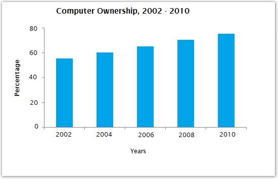
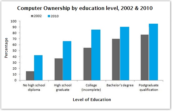
The graphs below give information about computer ownership as a percentage of the population between 2002 and 2010, and by the level of education for the years 2002 and 2010.
Sample Response
The supplied two bar graphs depict the percentage of computer belongings in a community. The first graph demonstrates the general computer ownership during an eight-year period since 2002 to 2010. Meanwhile the second graph details the figure more specifically regarding education level in both 2002 and 2010.
The overall trend created by the two sources illustrates an increasing number of people who owned computer due to the timeline and the level of education. Respectively, it can be seen that the latest the year, the higher the percentage of computer ownership and the higher the degree of education, the higher the ownership percentage.
Looking at the detail, the trend showed in the first graph gradually swelled from about 50% to around 70% out of 80% respectively from 2002 to 2010 and counted for about 20% higher from the earliest to the latest time observed.
Meanwhile, due to the education level, the ownership percentage increased gradually between 2002 and 2010 in each qualification level. As is shown by the graph, postgraduate qualification and bachelor’s degree were roughly accounted for the high number of ownership's percentage. However, the trend range of computer belongings in no high school diploma essentially was the highest increase of ownership percentage range among all qualification level. It sharply jumped to more than two times higher, about 15% and more than 40% out of 100% in 2002 and 2010 respectively. On the other hand, the smallest increase of percentage range was true for the postgraduate level that climbed up only from 80% in 2002 to about 95% in 2010.
IELTS Writing Correction
- 1. Use ownership Original: belongings Suggested revision: ownership Why it matters: Belongings means possessions generally, whereas the chart measures computer ownership.
- 2. Match the population Original: in a community Suggested revision: among the population Why it matters: The graph reports a population percentage rather than describing a particular community.
- 3. Correct time range Original: since Suggested revision: from Why it matters: Use from with to when giving the two endpoints of a period.
- 4. Describe the breakdown Original: details the figure Suggested revision: presents the data Why it matters: The graph contains several education-level figures, so the singular expression is inaccurate.
- 5. Use concise phrasing Original: regarding Suggested revision: by Why it matters: This preposition states the basis of the breakdown more naturally.
- 6. Use plural noun Original: detail Suggested revision: details Why it matters: The paragraph discusses several data points, so details should be plural.
- 7. Use past participle Original: showed Suggested revision: shown Why it matters: The reduced relative clause requires the past participle shown.
- 8. Use chart language Original: gradually swelled Suggested revision: rose steadily Why it matters: Swell is imprecise for a measured increase in a bar chart.
- 9. Correct the figures Original: from about 50% to around 70% out of 80% Suggested revision: from about 55% to roughly 75% Why it matters: The first graph shows approximately 55% in 2002 and 75% in 2010.
- 10. Remove misplaced linker Original: respectively from 2002 to 2010 Suggested revision: from 2002 to 2010 Why it matters: Respectively is unnecessary because the years and values are already presented in chronological order.
- 11. State the increase Original: counted for about 20% higher Suggested revision: represented an increase of about 20 percentage points Why it matters: Percentage points accurately expresses the difference between the two percentages.
- 12. Show category basis Original: due to the education level Suggested revision: across education levels Why it matters: The data are grouped by education rather than caused by education level.
Suggested Rewrites
- belongings ownership
- in a community among the population
- since from
- details the figure presents the data
- regarding by
- detail details
Why this response received Band 6.0
The response is strongest in providing a clear overview of the two main upward patterns and a generally logical progression from the overall trend to supporting details. Its main limitation is uneven accuracy and selection: it understates the overall rise and wrongly identifies the least-educated group as having the largest increase. Prioritize checking each value and comparison against the graphs, then express the findings with more natural academic collocations.
IELTS Writing Criteria Scores
Task Achievement
The response gives a clear overview and some relevant figures, but several comparisons are inaccurate or insufficiently developed.
Verify the overall values and compare all education groups accurately, especially the largest absolute increase.
Coherence and Cohesion
Information follows a sensible introduction-overview-detail structure, although linking is sometimes mechanical and sentences become cumbersome.
Group the details into clearer comparisons and use simpler transitions instead of repeatedly relying on stock linking phrases.
Lexical Resource
There is some range in trend language, but frequent unnatural choices such as 'computer belongings' and 'ownership's percentage' reduce precision.
Use standard Task 1 collocations such as 'computer ownership,' 'proportion,' 'rose,' and 'percentage-point increase.'
Grammatical Range and Accuracy
The response attempts varied sentence forms, but recurring errors in articles, agreement, prepositions, and clause construction weaken control.
Prioritize accurate comparative structures and check subject-verb agreement and article use in every sentence.
Write this task while it is fresh
Try the same task now. It helps you remember the feedback and write better next time.
IELTS Academic Writing Task 1
The graphs below give information about computer ownership as a percentage of the population between 2002 and 2010, and by the level of education for the years 2002 and 2010.
Your response
Write the task yourself, then compare your choices with the annotated response.