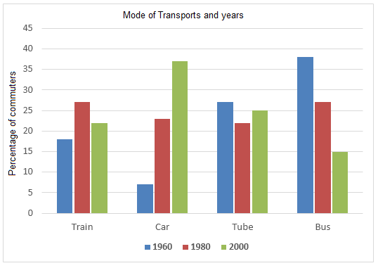
The graph below shows the different modes of transport used to travel to and from work in one European city in 1960, 1980 and 2000.
Sample Response
The provided bar graph compares the types of transportation used by commuters in one European city in three different years commencing from 1960. Four transportation types- train, car, tube and bus are compared in the graph and it is evident that in this European city people used buses in early years but started preferring cars and tubes in later years to reach and return from their workplaces.
As is observed in the given diagram, the majority of the commuters (about 38%) in this city used buses in 1960. The use of tube comprised over 25% while approximately 19% passengers used trains. Only 6% passengers used cars in this year which was quite fewer than the percentage of other transportation users. After 20 years, the percentages of the train and the car users increased significantly while tube and bus users decreased. In this year (1980), more than 22% users used cars and the percentages of train users exceeded the passengers of bus users. Finally, in the year 2000, the percentages of car users rocketed and reached to bout 37%. The percentages of other transportation users decreased except for the tube that was used by 1 out of four passengers in this year. Interestingly the use of bus decreased to only 15% and that was lower than the commuters of any other transportation type to commute to and from their offices.
IELTS Writing Correction
- 1. Use the chart term Original: types of transportation Suggested revision: modes of transport Why it matters: “Modes of transport” is the conventional phrase for the categories shown.
- 2. List the years directly Original: in three different years commencing from 1960 Suggested revision: in 1960, 1980, and 2000 Why it matters: The chart contains three discrete years rather than a period commencing in 1960.
- 3. Punctuate the list Original: transportation types- train Suggested revision: transportation types—train Why it matters: An em dash, not a hyphen, correctly introduces the list.
- 4. Use concise task wording Original: reach and return from their workplaces Suggested revision: travel to and from work Why it matters: The revised phrase states the commuting purpose naturally and directly.
- 5. Name the visual correctly Original: the given diagram Suggested revision: the bar chart Why it matters: The source visual is a bar chart rather than a diagram.
- 6. Avoid calling it a majority Original: the majority of the commuters (about 38%) Suggested revision: the largest proportion of commuters (about 38%) Why it matters: A 38% share is the largest category but is below the majority threshold.
- 7. Use a complete proportion phrase Original: The use of tube comprised over 25% Suggested revision: Tube use accounted for just over 25% Why it matters: “Accounted for” correctly links the category to its percentage.
- 8. Add the proportion preposition Original: approximately 19% passengers Suggested revision: approximately 19% of passengers Why it matters: A percentage before a noun requires “of.”
- 9. Correct the car figure Original: Only 6% passengers Suggested revision: Only about 7% of passengers Why it matters: The 1960 car bar is approximately 7%, and the percentage also requires “of.”
- 10. Use a valid comparison Original: quite fewer than Suggested revision: much lower than Why it matters: Percentages are described as higher or lower, not “quite fewer.”
- 11. Clarify the comparison Original: the percentage of other transportation users Suggested revision: the proportions using other modes Why it matters: The revised noun phrase is concise and compares like measures.
- 12. Use natural proportion phrasing Original: the percentages of the train and the car users Suggested revision: the proportions of train and car users Why it matters: The articles are unnecessary and “proportions” is natural for the two groups.
Suggested Rewrites
- types of transportation modes of transport
- in three different years commencing from 1960 in 1960, 1980, and 2000
- transportation types- train transportation types—train
- reach and return from their workplaces travel to and from work
- the given diagram the bar chart
- the majority of the commuters (about 38%) the largest proportion of commuters (about 38%)
Why this response received Band 6.0
The response provides a clear overview of the broad shift from buses towards cars and selects figures for every transport mode across the period. Its main weakness is factual precision: the 1980 bus figure is miscompared with trains, and the description of later tube and train trends is blurred. The priority is to organise comparisons around accurate start-to-finish changes and then proofread recurring grammatical forms.
IELTS Writing Criteria Scores
Task Achievement
The main shift towards car use is identified and all four modes receive relevant coverage, but several comparisons and trend claims do not match the chart precisely.
Correct the 1980 comparison and explicitly report that train use rises overall while bus use falls sharply from the highest to the lowest share.
Coherence and Cohesion
The introduction and detailed paragraph form a logical structure, and information moves broadly from 1960 through 2000, though the dense final section hampers clarity.
Divide the details into an early-year comparison and a later-trend paragraph so that changes across modes are easier to compare.
Lexical Resource
The report shows adequate range for describing proportions and movement, but several awkward collocations and imprecise noun phrases reduce naturalness.
Use standard forms such as the proportion of commuters, rose to, fell to, and users of each mode.
Grammatical Range and Accuracy
A range of complex sentences is used, but errors with articles, quantifiers, comparison structures, and verb patterns recur throughout the report.
Proofread percentage noun phrases and comparative clauses, correcting forms such as “reached to” and “lower than the commuters.”
Write this task while it is fresh
Try the same task now. It helps you remember the feedback and write better next time.
IELTS Academic Writing Task 1
The graph below shows the different modes of transport used to travel to and from work in one European city in 1960, 1980 and 2000.
Your response
Write the task yourself, then compare your choices with the annotated response.