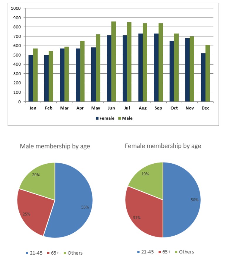
The graph below shows the average monthly use of health clubs in Miami and Florida by all full-time members in 2017. The pie charts show the age profile of male and female members of this health club.
Sample Response
The infographic representation in the form of the first bar graph illustrates the monthly usage of the health club in two cities in 2017, and the second pie chart topics the age of men and women members of the health club.
Overall, it can be seen that the highest usage of the health club in June was in the male category, while the number of people was approximately the same from June to August month in both categories in 2017. In the female category, health club usage was lowest in December.
First of all, the highest usage of the health club in the male category was in June, with around 850 males. However, starting of the two months, male and female members were approximately stable, and that were 550 and 570, 500 and 500 respectively. Air scrap shows both categories were inclined till the month of June then after rapidly declined and December month show 600 man and 500 women used health club.
On the other hand, the age group of 21-45 people were the highest group in male. (55%). Notably, a quarter (25%) of the male was in the age group of 65 and above. However, in females, the 21-45 age doubled(50%) in 2017.
IELTS Writing Correction
- 1. Use concise chart term Original: infographic representation in the form of the first bar graph Suggested revision: bar chart Why it matters: The shorter term names the visual precisely without unnecessary wording.
- 2. Match task wording Original: monthly usage Suggested revision: average monthly use Why it matters: This phrase accurately reflects the measure named in the task.
- 3. Correct chart categories Original: in two cities Suggested revision: by male and female members Why it matters: The bars compare genders by month rather than two cities.
- 4. Fix chart description Original: the second pie chart topics Suggested revision: the two pie charts show Why it matters: There are two pie charts, and “show” is the correct reporting verb.
- 5. Use natural labels Original: men and women members Suggested revision: male and female members Why it matters: These are the standard concise labels for the two membership groups.
- 6. Correct summer comparison Original: the number of people was approximately the same from June to August month in both categories Suggested revision: male use stayed around 840–860, while female use was about 710–730 from June to August Why it matters: The chart shows a persistent gender gap during these months rather than approximately equal figures.
- 7. Correct lowest months Original: was lowest in December Suggested revision: was lowest in January and February Why it matters: Female use is about 500 in January and February, slightly below December's figure.
- 8. Fix time phrase Original: starting of the two months Suggested revision: during the first two months Why it matters: The revised prepositional phrase clearly refers to January and February.
- 9. Describe close values Original: were approximately stable Suggested revision: were fairly similar Why it matters: The figures are close across the first two months rather than literally stable for both groups.
- 10. Correct early figures Original: and that were 550 and 570, 500 and 500 respectively Suggested revision: at about 570 and 540 for men, and 500 in both months for women, respectively Why it matters: The replacement aligns the January and February values with the chart.
- 11. Fix agreement Original: of the male was Suggested revision: of male members were Why it matters: The plural group requires a plural noun phrase and verb.
- 12. Use natural age label Original: 65 and above Suggested revision: 65 or older Why it matters: “65 or older” is the natural expression for this age category.
Suggested Rewrites
- infographic representation in the form of the first bar graph bar chart
- monthly usage average monthly use
- in two cities by male and female members
- the second pie chart topics the two pie charts show
- men and women members male and female members
- the number of people was approximately the same from June to August month in both categories male use stayed around 840–860, while female use was about 710–730 from June to August
Why this response received Band 5.0
The response has a recognisable structure and covers both the monthly-use chart and the membership-age charts, with several accurate figures. However, its overview misses the dominant pattern that male use is higher throughout the year, includes an inaccurate claim about the female low point, and leaves much of the age data unreported. Prioritise an accurate two-part overview and select balanced comparisons from every visual.
IELTS Writing Criteria Scores
Task Achievement
The response addresses both chart types and reports some correct values, but the overview contains an inaccurate low point and omits major monthly and age-profile comparisons.
Highlight that male attendance is higher in every month and that both series peak in summer, then compare all three age groups for both sexes.
Coherence and Cohesion
Information is divided into introduction, overview, monthly data, and age data, but several links and comparisons are difficult to follow.
Use one paragraph for the annual trend and one for the two age profiles, linking figures through direct comparisons rather than vague references.
Lexical Resource
Basic chart vocabulary is present, but repetition and frequent inaccurate choices such as “pie chart topics,” “Air scrap,” and “inclined” impair clarity.
Use precise expressions such as “the chart shows,” “attendance rose,” “peaked,” “declined,” and “accounted for” consistently.
Grammatical Range and Accuracy
Frequent errors in agreement, articles, tense, plurals, and sentence construction make several data statements difficult to decode.
Write shorter comparison sentences with explicit subjects, correct past-tense verbs, and agreement between figures and plural nouns.
Write this task while it is fresh
Try the same task now. It helps you remember the feedback and write better next time.
IELTS Academic Writing Task 1
The graph below shows the average monthly use of health clubs in Miami and Florida by all full-time members in 2017. The pie charts show the age profile of male and female members of this health club.
Your response
Write the task yourself, then compare your choices with the annotated response.