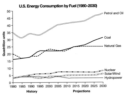
The graph below gives information from a 2008 report about consumption of energy in the USA since 1980 with projections until 2030.
Sample Response
The bar graph compares the consumption of energy in the USA from 1980 and also gives a projection of it till the year 2030. As is presented in the graph, petrol and oil were the main two sources of energy while the use of coal would increase in the coming years. As is presented in the line graph, initially in 1980 35 quadrillion units of oil and petrol energy was consumed in the USA while 15-20 quadrillion units each of coal and natural gas was consumed. In this year less than 5 quadrillion energy got from nuclear, solar and hydropower was consumed. The consumption of all of these energy sources kept on increasing with some fluctuations. It is projected that in 2030 the consumption of petrol and oil will reach to over 50 quadrillion units while coal and natural gas’s consumption will reach from 20 to 30 quadrillions. The consumption of nuclear, solar/ wind and hydropower will also increase and would reach to over 5 quadrillion units.
In 2030, oil and petrol would be mostly consumed to get energy while in the second most consumed energy source would be coals.
IELTS Writing Correction
- 1. Correct chart type Original: bar Suggested revision: line Why it matters: The visual presents six time-series lines rather than bars.
- 2. Use concise wording Original: a projection of it Suggested revision: projections Why it matters: The plural noun states the graph's forward-looking content more directly.
- 3. Use formal time phrase Original: till the year 2030 Suggested revision: to 2030 Why it matters: This is a more concise formal expression for the projection endpoint.
- 4. Treat category as one Original: petrol and oil were the main two sources of energy Suggested revision: petrol and oil was the main energy source Why it matters: Petrol and oil form one combined category in the graph, not two separate sources.
- 5. Use projection tense Original: the use of coal would increase Suggested revision: coal consumption is projected to increase Why it matters: The revised tense clearly distinguishes projected figures from historical data.
- 6. Avoid repeated framing Original: As is presented in the line graph Suggested revision: The graph also shows that Why it matters: This avoids repeating the same introductory structure in consecutive sentences.
- 7. Remove redundancy Original: initially in 1980 Suggested revision: In 1980, Why it matters: The year already identifies the initial point, so 'initially' is unnecessary.
- 8. Fix noun phrase Original: 35 quadrillion units of oil and petrol energy was consumed Suggested revision: 35 quadrillion units of petrol and oil were consumed Why it matters: The revision corrects the awkward noun phrase and subject-verb agreement.
- 9. Separate starting values Original: 15-20 quadrillion units each of coal and natural gas Suggested revision: about 16 quadrillion units of coal and 20 quadrillion units of natural gas Why it matters: The graph gives different 1980 values for coal and natural gas.
- 10. Use past reference Original: this Suggested revision: that Why it matters: 'That year' refers back more naturally to 1980.
- 11. Correct oil projection Original: reach to over 50 quadrillion units Suggested revision: reach about 49 quadrillion units Why it matters: The 2030 petrol-and-oil point is just below 50, not above it.
- 12. Fix possessive structure Original: coal and natural gas’s consumption Suggested revision: the consumption of coal and natural gas Why it matters: The revised structure avoids attaching a singular possessive ending to a compound category.
Suggested Rewrites
- bar line
- a projection of it projections
- till the year 2030 to 2030
- petrol and oil were the main two sources of energy petrol and oil was the main energy source
- the use of coal would increase coal consumption is projected to increase
- As is presented in the line graph The graph also shows that
Why this response received Band 6.0
The response gives a clear general direction and includes figures for all six energy sources, so the main message is easy to follow. Its main weakness is limited and sometimes inaccurate selection: it calls the visual a bar graph, overstates the 2030 petrol figure, and overlooks important contrasts such as coal overtaking natural gas and hydropower remaining broadly stable. Prioritise precise comparisons across the historical and projected periods.
IELTS Writing Criteria Scores
Task Achievement
The response provides an overview and covers all fuel types, but several details are imprecise and major comparisons are omitted.
Select the most significant changes accurately, including coal surpassing natural gas and the contrasting patterns among the three minor sources.
Coherence and Cohesion
Information follows a generally clear overview-to-detail progression, although repetition and the isolated final sentence weaken paragraph organisation.
Group the dominant fuels and the minor fuels into purposeful detail paragraphs and remove the repetitive concluding statement.
Lexical Resource
The vocabulary is adequate for describing trends and projections, but several collocations and forms are awkward or inaccurate.
Use precise chart language such as 'is projected to reach', 'quadrillion units', and 'coal' without unnecessary plural forms.
Grammatical Range and Accuracy
A mix of sentence forms communicates the trends clearly, though recurring agreement, article, preposition, and noun-form errors reduce control.
Proofread complex comparison sentences for subject-verb agreement, articles, and correct structures after verbs such as 'reach'.
Write this task while it is fresh
Try the same task now. It helps you remember the feedback and write better next time.
IELTS Academic Writing Task 1
The graph below gives information from a 2008 report about consumption of energy in the USA since 1980 with projections until 2030.
Your response
Write the task yourself, then compare your choices with the annotated response.