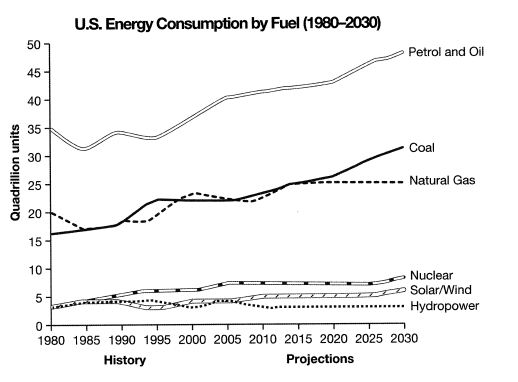
The graph below gives information from a 2008 report about consumption of energy in the USA since 1980 with projections until 2030.
Sample Response
The line graph depicts information about utilisation of energy in the USA since 1980 with predictions until 2030. In general, petrol & oil and coal accounted as high units of fuel consumption in 1980 and will be increased until 2030. In contrast, nuclear, solar/wind and water power were less favourable fuel consumed since 1980 and will be less chosen until 2030.
Looking at the details, petrol and oil reckoned about 35 quadrillion units in 1980 and was true as the highest fuel use at the time and has gone up gradually to about 40 quadrillions in 2015 and will increase to more than 45 quadrillions in 2030. The same trend is true for coal resources. The coal consumption was about 16 quadrillion units in 1980 and the figure levelled up through the observed years and is projected to hit the figure of 30 quadrillion units in 2030. Natural gas utilisation seemed fluctuated over observed years and it points about 20 quadrillion unit in 2015. However, it is predicted to level off until 2030.
In contrast, nuclear, sun/ wind, and hydropower kept small quantities of fuel consumption compared to other fuel sources as they are projected to a tiny amount of fuel utilisation in 2030. Nuclear use was about 4 quadrillion units in 1980 and in 2030 the figure will hit only about 7 quadrillion units. Solar and hydropower also amassed about 4 quadrillions in 1980 and in 2030, the consumption will be only about 5 quadrillions for solar and hydropower will remain the same figure like it was in 1980.
IELTS Writing Correction
- 1. Use chart terminology Original: utilisation of energy Suggested revision: energy consumption Why it matters: This is the standard term for the quantity measured by the graph.
- 2. Correct the construction Original: accounted as high units of fuel consumption Suggested revision: had the highest levels of fuel consumption Why it matters: The original phrase uses an incorrect verb pattern and an unnatural noun phrase.
- 3. Use active form Original: will be increased Suggested revision: will increase Why it matters: The fuels themselves are projected to increase, so the active form is required.
- 4. Report a value Original: reckoned about Suggested revision: stood at about Why it matters: Values on a graph stand at a level rather than reckon a quantity.
- 5. Name the measure Original: resources Suggested revision: consumption Why it matters: The graph measures consumption, not the quantity of coal resources.
- 6. Use trend language Original: levelled up Suggested revision: rose Why it matters: Levelled up is not the appropriate expression for a sustained upward trend.
- 7. Clarify the period Original: through the observed years Suggested revision: over the period shown Why it matters: This phrase refers more naturally and precisely to the graph's time span.
- 8. Correct coal projection Original: 30 quadrillion units Suggested revision: about 32 quadrillion units Why it matters: The graph projects coal consumption at roughly 32 quadrillion units in 2030.
- 9. Correct verb form Original: seemed fluctuated Suggested revision: fluctuated Why it matters: The finite verb fluctuated should be used without seemed in this construction.
- 10. Add the article Original: over observed years Suggested revision: over the period shown Why it matters: This is a natural way to refer to the complete displayed period.
- 11. Report the level Original: it points about Suggested revision: it stood at about Why it matters: Point is not used this way to report a graph value.
- 12. Correct gas value Original: 20 quadrillion unit Suggested revision: 25 quadrillion units Why it matters: Natural gas is shown at about 25 quadrillion units in 2015.
Suggested Rewrites
- utilisation of energy energy consumption
- accounted as high units of fuel consumption had the highest levels of fuel consumption
- will be increased will increase
- reckoned about stood at about
- resources consumption
- levelled up rose
Why this response received Band 6.0
The response is clearly organised around higher- and lower-use fuels and identifies the dominant sources. Its main limitation is data accuracy and precision, particularly the understated natural-gas figure for 2015 and several imprecise descriptions of trends. Prioritise checking each selected value against the graph and using accurate trend language, then revise recurring grammar and collocation errors so comparisons read more naturally.
IELTS Writing Criteria Scores
Task Achievement
The report identifies the dominant fuels and broad trends, but its overview is partly misleading and several figures differ from the graph.
Verify key values, especially natural gas at about 25 quadrillion units in 2015, and distinguish rising, stable, and fluctuating series precisely.
Coherence and Cohesion
The three-part structure creates broadly clear progression from the overview to the major and minor fuel groups, despite some repetitive linking.
Use more specific comparative links to connect related trends instead of repeatedly relying on general contrast phrases.
Lexical Resource
There is some range in energy-related vocabulary, but frequent unnatural choices such as "reckoned," "levelled up," and "amassed" reduce precision.
Use standard Task 1 collocations such as "stood at," "rose to," "fluctuated," and "remained stable."
Grammatical Range and Accuracy
A mix of sentence forms is attempted, but recurring agreement, article, passive-form, and noun-form errors weaken control.
Review subject-verb agreement and use singular measurement forms after numbers, as in "40 quadrillion units."
Write this task while it is fresh
Try the same task now. It helps you remember the feedback and write better next time.
IELTS Academic Writing Task 1
The graph below gives information from a 2008 report about consumption of energy in the USA since 1980 with projections until 2030.
Your response
Write the task yourself, then compare your choices with the annotated response.