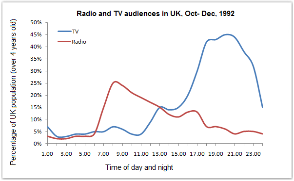
The graph below shows radio and television audiences of United Kingdom throughout the day in the year 1992.
Sample Response
The provided line graph gives information about the percentage of the population watched TV or listened to the radio during the day-time or night-time. This study has been realised among the UK population from October to December 1992.
If we first glance at the graph, we can observe that 7% of the UK population started listening to radio from 6:00 am in the morning whereas nobody watched TV at this time of day. The radio audiences gradually increased to reach a peak of 26% of people at 8.30 am. Then, this trend went step by step down to about 4% of the audiences at 6 pm. We can truly affirm that people listened to radio mostly before heading to work or on the way to their workplace. However, regarding TV audiences the time period where people were watching it the most is obviously between 6.00 pm to 10.00 pm with the highest point reaching 45% at 8.00 pm.
To sum up, the UK population were more active listening to the radio in the early morning before going to work while they were active on watching TV in the afternoon once they got back from work to before they went to sleep.
IELTS Writing Correction
- 1. Add relative pronoun Original: percentage of the population watched TV or listened to the radio Suggested revision: percentage of the population who watched TV or listened to the radio Why it matters: “Who” is needed to introduce the clause describing the population.
- 2. Use natural time phrase Original: day-time or night-time Suggested revision: day or night Why it matters: The simpler pair is the natural expression for coverage across a full day.
- 3. Name the visual Original: study Suggested revision: graph Why it matters: The source is a graph, not a study conducted by the writer.
- 4. Fix reporting phrase Original: has been realised among Suggested revision: shows data for Why it matters: “Realised among” is not grammatical or idiomatic for describing the population represented.
- 5. Use singular aggregate Original: audiences Suggested revision: audience Why it matters: “Audience” is normally singular when referring to the total percentage listening at one time.
- 6. Use consistent measure Original: 26% of people Suggested revision: 26% of the population Why it matters: This wording matches the graph's stated unit and the terminology used elsewhere.
- 7. Refer to the figure Original: trend Suggested revision: figure Why it matters: A percentage declines, whereas “trend” refers to the overall direction of change.
- 8. Use academic trend verb Original: went step by step down Suggested revision: declined gradually Why it matters: The replacement is a concise and appropriate description of a downward line.
- 9. Correct the value Original: 4% of the audiences Suggested revision: about 7% of the population Why it matters: At approximately 6 pm, the radio line is near 7%, not 4%.
- 10. Avoid overstatement Original: truly affirm Suggested revision: see Why it matters: The graph supports an observation, while “affirm” sounds unnecessarily forceful.
- 11. Fix word order Original: listened to radio mostly Suggested revision: mostly listened to the radio Why it matters: The adverb should precede the main verb, and “radio” needs the definite article here.
- 12. Repair clause structure Original: regarding TV audiences the time period where Suggested revision: for television, the period when Why it matters: The revision supplies needed punctuation and uses “when” for a time period.
Suggested Rewrites
- percentage of the population watched TV or listened to the radio percentage of the population who watched TV or listened to the radio
- day-time or night-time day or night
- study graph
- has been realised among shows data for
- audiences audience
- 26% of people 26% of the population
Why this response received Band 6.0
The response is strongest when identifying the contrasting peak periods for radio and television and organizing these observations into a readable progression. However, coverage is selective and includes inaccurate or unsupported details about the 6 a.m. values and audience behaviour, while language errors recur. The highest priority is to describe the complete visual pattern more objectively, including the midday crossover and later fluctuations, with more controlled sentence structures.
IELTS Writing Criteria Scores
Task Achievement
The main morning radio peak and evening television peak are identified, but several values are inaccurate and important intervening trends are omitted.
Add the midday crossover and later fluctuations, and verify the 6 a.m. figures directly against the graph.
Coherence and Cohesion
The response has a clear introduction, detail paragraph, and summary, with generally logical progression despite some awkward connections.
Organize the detail around direct radio-television comparisons rather than moving unevenly between the two series.
Lexical Resource
There is adequate trend vocabulary, but recurrent unnatural collocations and imprecise expressions reduce flexibility and accuracy.
Replace phrases such as "study has been realised" and "active on watching" with precise, conventional graph-description language.
Grammatical Range and Accuracy
Simple and complex structures communicate the main meaning, though agreement, relative-clause, preposition, and complement errors occur regularly.
Practise accurate percentage clauses and time-range constructions, particularly "the percentage who watched" and "between X and Y."
Write this task while it is fresh
Try the same task now. It helps you remember the feedback and write better next time.
IELTS Academic Writing Task 1
The graph below shows radio and television audiences of United Kingdom throughout the day in the year 1992.
Your response
Write the task yourself, then compare your choices with the annotated response.