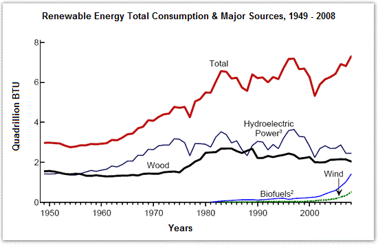
The diagram shows the consumption of renewable energy in the USA from 1949-2008.
Sample Response
The given line graph shows the main sources through which renewable energy is produced in the USA and also tells about its total consumption from 1949 to 2008. Water and timbers have been the main means of producing energy. Initially, from 1950 to 1960 the energy provided by them has approximately been same being 2 Quadrillion BTU, but from 1960 to 1980, the production of hydroelectric power doubled than fuel provided by wood. This increased trend of making energy through water is consistent with the total energy usage. The generation of energy through biofuels and wind was introduced in 1980. Since then, they have made a contribution of less than 1 Quadrillion BTU in the production of total energy. Yet this is a significant contribution as the overall consumption of energy increased in subsequent years reaching up to a maximum of 7 Quadrillion BTU by 2008. It just dipped in 2000 because hydroelectric power also decreased during this time, but then they both rose again. The changing trends in gross energy consumption are consistent with the generation of hydroelectric power signifying it as the major source of energy production. Wood has been the second most important source, while biofuels and wind made little contributions.
IELTS Writing Correction
- 1. Report consumption Original: sources through which renewable energy is produced Suggested revision: sources of renewable energy consumed Why it matters: The graph measures consumption rather than energy production.
- 2. Use graph verb Original: also tells about Suggested revision: also shows Why it matters: Shows is more concise and appropriate for describing a graph.
- 3. Use source label Original: timbers Suggested revision: wood Why it matters: Wood is the source named in the graph, whereas timber is not countable here.
- 4. Describe consumption Original: main means of producing energy Suggested revision: main sources of renewable-energy consumption Why it matters: The series show energy consumed from each source, not energy generation.
- 5. Natural trend phrase Original: increased Suggested revision: upward Why it matters: Upward trend is the standard collocation for a rise on a graph.
- 6. Use chart category Original: making energy through water Suggested revision: hydroelectric-energy consumption Why it matters: The visual reports consumption of hydroelectric power.
- 7. Specify the total Original: total energy usage Suggested revision: total renewable-energy consumption Why it matters: The graph covers renewable energy rather than all energy use.
- 8. Use measured quantity Original: generation of energy through biofuels and wind Suggested revision: consumption of biofuels and wind energy Why it matters: Generation is not the quantity plotted.
- 9. Avoid causal claim Original: was introduced Suggested revision: first appeared on the graph Why it matters: The graph shows when the series begins, not when the sources were introduced.
- 10. Use concise peak Original: reaching up to a maximum Suggested revision: reaching a peak Why it matters: Peak expresses the maximum without redundant wording.
- 11. Name the subject Original: It just dipped Suggested revision: Total consumption dipped sharply Why it matters: It has an unclear reference and just inaccurately suggests there was only one fall.
- 12. Use precise reference Original: during this time Suggested revision: at that time Why it matters: This concise phrase clearly refers to the same point in the series.
Suggested Rewrites
- sources through which renewable energy is produced sources of renewable energy consumed
- also tells about also shows
- timbers wood
- main means of producing energy main sources of renewable-energy consumption
- increased upward
- making energy through water hydroelectric-energy consumption
Why this response received Band 6.0
The response provides a coherent overview of hydroelectric power and wood as the historically dominant sources and tracks the total alongside the smaller sources. Its main weakness is data accuracy: several values and timings are overstated or misplaced, including the early levels, the claimed doubling of hydroelectricity, and the contributions of wind and biofuels; the priority is to verify key figures and describe trends without unsupported causal links.
IELTS Writing Criteria Scores
Task Achievement
The response covers all series and offers a useful overview, but several numerical and chronological claims do not match the graph closely.
Anchor the account in accurate milestones, noting the roughly three-unit total in 1949, the volatile hydroelectric trend, and the late rise of wind and biofuels.
Coherence and Cohesion
The report follows a generally logical path from major sources to minor sources and total consumption, although some links imply unsupported causation.
Group the total and the two established sources first, then compare the two newer sources in a separate detail paragraph.
Lexical Resource
There is sufficient range for trends and comparisons, but imprecise choices such as timbers, doubled than, and making energy reduce naturalness.
Prefer precise terms such as wood, rose to nearly twice the level, consumption, and renewable-energy source.
Grammatical Range and Accuracy
A mix of simple and complex structures communicates the trends, but article, comparison, tense, and word-form errors occur repeatedly.
Practise comparative structures and keep past tense consistent when describing completed changes over the 1949–2008 period.
Write this task while it is fresh
Try the same task now. It helps you remember the feedback and write better next time.
IELTS Academic Writing Task 1
The diagram shows the consumption of renewable energy in the USA from 1949-2008.
Your response
Write the task yourself, then compare your choices with the annotated response.