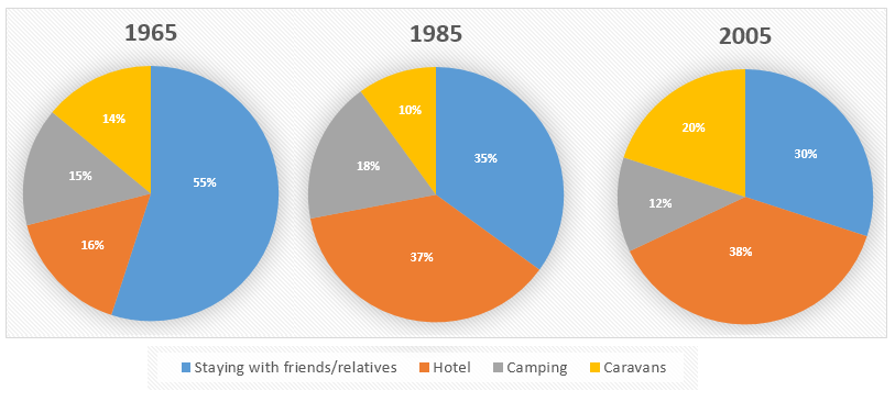
The charts show the proportion of holidaymakers of one region staying in different types of accommodation in three different years.
Sample Response
The pie charts compare the ratio of holidaymakers from a region who used different types of lodging in 1965, 1985 and 2005. Overall, the hotel became the primary type of accommodation for the majority of the travellers in 1985 and 2005 despite most of the people’s preference to stay with a friend or relative. According to the illustration, more than half of the holidaymakers from a region stayed in a house owned by a friend or relative in 1965. This ratio declined over the time and dropped to 35 and 30 percent in 1985 and 2005. A hotel was a preferred accommodation for 16% of these travellers and with time more holidaymakers started to live in a hotel. In 2000, more than one-third visitors stayed in a hotel. Camping while enjoying holidays was chosen by 15% people in 1965 and after two decades it was preferred by 18% holiday seekers. The popularity of camping seems like decreased in 2005. Finally, 14% visitors picked a caravan as an accommodation in 1965 and their ratio decreased to 10% in 2 decades but doubled in 2000.
IELTS Writing Correction
- 1. Use chart terminology Original: ratio Suggested revision: proportion Why it matters: Proportion is the more precise term for a share shown in a pie chart.
- 2. Describe accommodation clearly Original: who used different types of lodging Suggested revision: who stayed in different types of accommodation Why it matters: This wording describes the measured behaviour more naturally and precisely.
- 3. Use concise wording Original: a house owned by a friend or relative Suggested revision: a friend’s or relative’s home Why it matters: The revision expresses the same accommodation category more concisely.
- 4. Remove unnecessary article Original: over the time Suggested revision: over time Why it matters: The fixed expression for a gradual change is “over time” without an article.
- 5. Clarify paired figures Original: 35 and 30 percent Suggested revision: 35% and 30% Why it matters: Marking each figure with the percentage sign makes the comparison unambiguous.
- 6. Correct the year Original: 2000 Suggested revision: 2005 Why it matters: The final pie chart represents 2005, not 2000.
- 7. Add missing preposition Original: more than one-third visitors Suggested revision: more than one-third of visitors Why it matters: A fraction referring to a noun requires “of” before that noun.
- 8. Use concise category Original: Camping while enjoying holidays Suggested revision: Camping Why it matters: The chart category can be named directly without the redundant phrase.
- 9. Add missing of Original: chosen by 15% people Suggested revision: chosen by 15% of people Why it matters: A percentage referring to people requires “of” before the noun.
- 10. Complete percentage phrase Original: 18% holiday seekers Suggested revision: 18% of holidaymakers Why it matters: The percentage needs “of,” and “holidaymakers” matches the chart population.
- 11. Fix verb construction Original: seems like decreased Suggested revision: seems to have decreased Why it matters: “Seem” takes a to-infinitive here rather than “like” followed by a past participle.
- 12. Add missing of Original: 14% visitors Suggested revision: 14% of visitors Why it matters: A percentage referring to visitors requires “of” before the noun.
Suggested Rewrites
- ratio proportion
- who used different types of lodging who stayed in different types of accommodation
- a house owned by a friend or relative a friend’s or relative’s home
- over the time over time
- 35 and 30 percent 35% and 30%
- 2000 2005
Why this response received Band 6.0
The response covers all four accommodation types and generally tracks the major shifts, with a logical category-by-category progression. Its main weakness is data precision: it calls the hotel share a majority, gives 2000 instead of 2005 twice, and leaves some final figures vague. Prioritise accurate year labels and exact comparative statements, then separate the overview from the details and proofread recurring article and phrasing errors.
IELTS Writing Criteria Scores
Task Achievement
A relevant overview and coverage of every category are provided, but the hotel is incorrectly called a majority and 2005 is twice reported as 2000.
Check every year and percentage against the charts and state the 2005 camping and caravan figures explicitly.
Coherence and Cohesion
The response progresses logically by accommodation type, although presenting everything in one paragraph weakens the distinction between overview and detail.
Use a separate overview followed by clearly grouped detail paragraphs with more deliberate comparisons.
Lexical Resource
Vocabulary is sufficiently varied for the task, but several choices are imprecise or unnatural, including "ratio," "live in a hotel," and "holiday seekers."
Use precise chart language such as "proportion," "stay in a hotel," and "holidaymakers" consistently.
Grammatical Range and Accuracy
A mix of sentence forms communicates the trends clearly, but recurring article, plural, and construction errors reduce control.
Proofread noun phrases and verb patterns, especially forms such as "15% of people," "one-third of visitors," and "seems to have decreased."
Write this task while it is fresh
Try the same task now. It helps you remember the feedback and write better next time.
IELTS Academic Writing Task 1
The charts show the proportion of holidaymakers of one region staying in different types of accommodation in three different years.
Your response
Write the task yourself, then compare your choices with the annotated response.