The graph below shows the top priorities by business companies in the USA in 2016. Top Priorities by Company Size
Same question Compare 2 different answers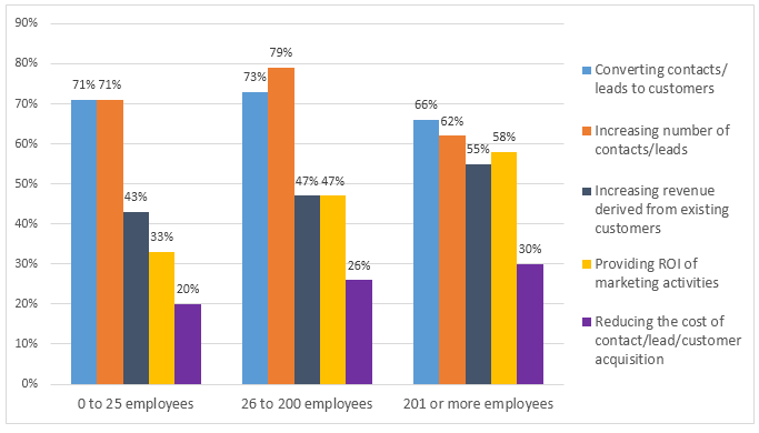
Sample Response
The bar graph outlines the comparative analysis of the American company's top five priorities in 2016 according to the size of the company. The striking feature to note is that irrespective of the size of the companies, primary importance was given to raising the number of contacts and converting them to customers. Looking deep at the details, every company's two top priorities were to keep on increasing leads and to turn those leads into customers. Small businesses, with 0-25 employees, gave equal emphasis to these two aspects. But a company with 26-200 employees gave the lead generation and customer conversion the highest priority. Since small and medium companies spent more on lead generation, they focused less on cost minimisation to gain customers. Contrary to this, 30% priority was set by large organisations (more than 201 employees) to reduce this cost and they set the target to earn profit from existing customers. Medium-sized industry indicated 47% to both increasing revenues derived from existing customers and providing ROI of marketing activities, whereas, 55% and 58% precedence from a large company and 43% and 33% from the small company was assigned respectively to the same objectives.
IELTS Writing Correction
- 1. Use direct reporting Original: outlines Suggested revision: shows Why it matters: "Shows" is a more direct verb for presenting chart data.
- 2. Remove inflated wording Original: comparative analysis Suggested revision: comparison Why it matters: The chart presents a comparison rather than an analysis performed by the chart itself.
- 3. Fix plural possessive Original: American company's Suggested revision: American companies' Why it matters: The graph covers multiple companies, so the plural possessive form is required.
- 4. Use concise category Original: according to the size of the company Suggested revision: by company size Why it matters: This concise phrase accurately names the grouping used in the chart.
- 5. Signal the overview Original: The striking feature to note is that Suggested revision: Overall, Why it matters: A direct overview marker makes the key pattern easier to identify.
- 6. Simplify comparison phrase Original: irrespective of the size of the companies Suggested revision: regardless of company size Why it matters: The replacement expresses the same cross-category comparison more concisely.
- 7. Use chart terminology Original: primary importance Suggested revision: the highest priority Why it matters: "Highest priority" matches the ranked categories shown in the graph.
- 8. Match the chart label Original: raising the number of contacts Suggested revision: increasing the number of contacts/leads Why it matters: The replacement follows the category wording used in the visual.
- 9. Fix conversion preposition Original: to Suggested revision: into Why it matters: The standard construction is "convert something into something".
- 10. Use formal transition Original: Looking deep at the details Suggested revision: In detail Why it matters: The original expression is unnatural in formal data reporting.
- 11. Clarify the grouping Original: every company's two top priorities Suggested revision: the two highest priorities across all company sizes Why it matters: The replacement gives the quantifier and possessive relationship a clear structure.
- 12. Use precise category Original: to keep on increasing leads Suggested revision: to increase contacts/leads Why it matters: This concise wording matches the visual's category label.
Suggested Rewrites
- outlines shows
- comparative analysis comparison
- American company's American companies'
- according to the size of the company by company size
- The striking feature to note is that Overall,
- irrespective of the size of the companies regardless of company size
Why this response received Band 7.5
The response identifies the dominant priorities clearly and supports its account with accurate comparisons across all three company sizes. Its strongest feature is the well-selected numerical detail, while its main limitation is awkward phrasing in several descriptions of percentages and priorities. The highest priority is to retain the accurate comparisons but express them through more natural data-reporting structures, particularly in the dense final sentence.
IELTS Writing Criteria Scores
Task Achievement
The overview is accurate and the response selects the leading priorities and relevant figures for every company size with only minor imprecision in interpretation.
Keep the description strictly tied to priority percentages rather than implying that the chart directly measures company spending.
Coherence and Cohesion
Information is ordered from the main pattern to size-specific details, and references generally connect comparisons clearly.
Divide the detailed comparisons into clearer groups and avoid packing four figures and two objectives into one closing sentence.
Lexical Resource
There is a good range of topic-specific vocabulary, although expressions such as "30% priority" and "precedence from a large company" are unnatural.
Use conventional chart language such as "was prioritised by 30%" and "the corresponding figures were" for greater precision.
Grammatical Range and Accuracy
Most sentences show effective control of varied structures, but the final comparison contains faulty agreement and an overloaded passive construction.
Match plural percentage subjects with plural verbs and simplify complex comparison sentences to maintain grammatical control.
Write this task while it is fresh
Try the same task now. It helps you remember the feedback and write better next time.
IELTS Academic Writing Task 1
The graph below shows the top priorities by business companies in the USA in 2016. Top Priorities by Company Size
Your response
Write the task yourself, then compare your choices with the annotated response.