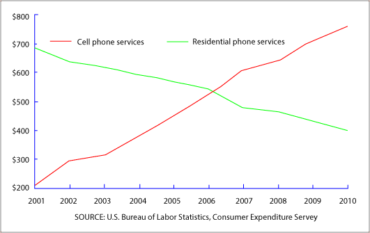
The graph below shows US consumers' average annual expenditures on the cell phone and residential phone services between 2001 and 2010.
Sample Response
The given line graph depicts the data of average yearly spending of US consumers on the cell phone and residential phone services over a decade from 2001.
A cursory glance at the graph is enough to show that the customer spending on residential phone decreased and on the mobile phone had increased. In the beginning year, that was in 2001, the phone users spend massive $690 for residential phone services. Whereas, on mobile phone services they spent almost six-fold less than the land phone, that was 200$. Again, the very next year in 2002, the mobile customer spending pattern slightly went up to $300. Surprisingly, the residential phone users’ expenditure dropped to $650 in the same year. In the following years, the cell phone users spending skyrocketed and residential phone users spending dropped down and reached the same rate of $550 in 2006. Then, the land phone users spending pattern sank to $400 in 2010. However, the cell phone users spending hiked to almost two-fold than residential phone users, that was around $800 in the same period.
Overall, the residential phone user declined tremendously and cell phone users increased in the USA during the period of from 2001 to 2010.
IELTS Writing Correction
- 1. Use concise chart language Original: depicts the data of average yearly spending Suggested revision: shows the average annual expenditure Why it matters: This phrasing is more concise and natural for describing the measured variable.
- 2. State the full period Original: over a decade from 2001 Suggested revision: between 2001 and 2010 Why it matters: The chart covers the complete period from 2001 through 2010.
- 3. Use the chart term Original: the customer spending Suggested revision: consumer spending Why it matters: Consumer spending is the more natural term in this context.
- 4. Fix contrast and tense Original: and on the mobile phone had increased Suggested revision: whereas spending on cell phone services increased Why it matters: The replacement creates a grammatical contrast and keeps the past tense consistent.
- 5. Simplify the time phrase Original: In the beginning year, that was in 2001 Suggested revision: In 2001 Why it matters: The original time clause is grammatically awkward and unnecessarily repetitive.
- 6. Use correct past tense Original: the phone users spend Suggested revision: consumers spent Why it matters: A past-tense verb is required for expenditure recorded in 2001.
- 7. Report data neutrally Original: massive Suggested revision: about Why it matters: The chart supports an approximate value, while massive is subjective.
- 8. Use a direct transition Original: Again, the very next year in 2002 Suggested revision: In 2002 Why it matters: The shorter transition gives the chronology more direct progression.
- 9. Use precise terminology Original: the mobile customer spending pattern Suggested revision: spending on cell phone services Why it matters: The replacement accurately names the expenditure series shown in the chart.
- 10. Describe the rise accurately Original: slightly went up Suggested revision: rose Why it matters: The increase from about $200 to $300 is too substantial to call slight.
- 11. Remove subjective language Original: Surprisingly, Suggested revision: Delete Why it matters: Task 1 reporting should describe the change without an unsupported personal reaction.
- 12. Name expenditure precisely Original: the residential phone users’ expenditure Suggested revision: expenditure on residential phone services Why it matters: This wording clearly identifies the series rather than the users.
Suggested Rewrites
- depicts the data of average yearly spending shows the average annual expenditure
- over a decade from 2001 between 2001 and 2010
- the customer spending consumer spending
- and on the mobile phone had increased whereas spending on cell phone services increased
- In the beginning year, that was in 2001 In 2001
- the phone users spend consumers spent
Why this response received Band 6.0
The response identifies the opposing trends clearly and supports them with relevant starting, crossover, and ending figures. Its main limitation is imprecise phrasing and a few inaccurate or overstated details, especially the 2010 cell-phone figure and the final comparison, while sentence-control errors recur. Prioritize reporting figures more precisely and using simpler, grammatically complete comparison sentences throughout.
IELTS Writing Criteria Scores
Task Achievement
The main opposing trends, approximate endpoints, and crossover are all identified with generally relevant figures.
Report the final cell-phone value more precisely and qualify approximations consistently when comparing the two services.
Coherence and Cohesion
The response follows a clear chronological path, although some linking is mechanical and the main detail paragraph is densely packed.
Group the early and later periods into separate paragraphs and connect comparisons within complete sentences.
Lexical Resource
There is adequate vocabulary for trends and comparisons, but several choices such as 'massive,' 'hiked,' and 'spending pattern' are imprecise or unnatural.
Use neutral, accurate trend language and vary references to expenditure without forcing uncommon expressions.
Grammatical Range and Accuracy
A mix of sentence forms is attempted, but agreement, article, possessive, and clause-structure errors recur throughout.
Check subject-verb agreement and replace fragmentary 'Whereas' clauses and repeated 'that was' structures with complete comparisons.
Write this task while it is fresh
Try the same task now. It helps you remember the feedback and write better next time.
IELTS Academic Writing Task 1
The graph below shows US consumers' average annual expenditures on the cell phone and residential phone services between 2001 and 2010.
Your response
Write the task yourself, then compare your choices with the annotated response.