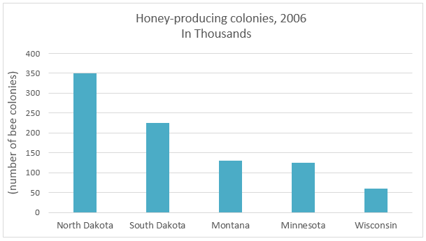
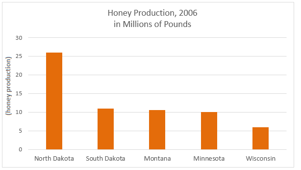
Agriculture·Production The bar charts below provide information about honey production and honey producing colonies in the five American states in 2006. Write this task Compare 2 sample answers (Band 6.5–7.5)→
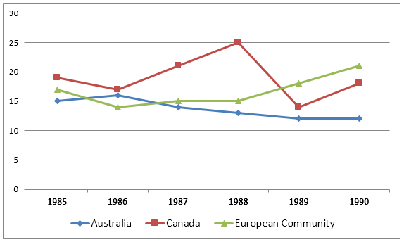
Agriculture·Trade The graph below shows the differences in wheat exports over three different areas. Write this task
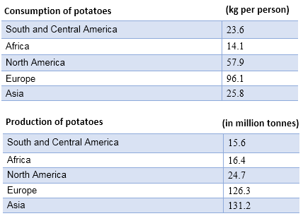
Food·Agriculture·Production The tables below provide information about the consumption and production of potatoes in five parts of the world in 2006. Write this task Compare 2 sample answers (Band 6.5)→
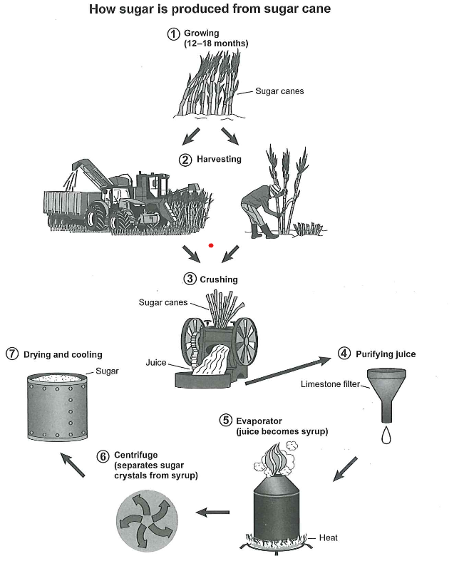
Manufacturing·Food·Agriculture The diagram below shows the manufacturing process for making sugar from sugar cane. Write this task
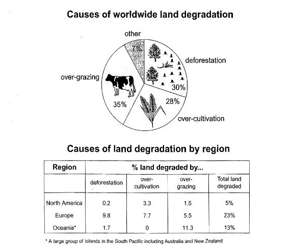
Agriculture·Land use·Environment The pie chart below shows the main reasons why agricultural land becomes less productive. The table shows how these causes affected three regions of the world during the 1990s. Write this task