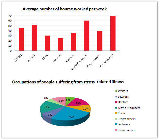
The graphs show figures relating to hours worked and stress levels amongst professionals in eight groups.
Sample Response
The graphs present data about working hours of different professionals and the percentage of employees experience stress-related issues. Overall, businessmen work longer hours on an average and the stress-related illness among teachers are highest. As is presented in the bar graph, businessmen work 70 hours per week, the highest, among the average working hours of given professionals. Movie producers work 60 hours per week, which is the second highest. The third longest working hours per weeks are for Doctors and they work more than 50 hours per week. Writers, programmers, lawyers and chefs work 47, 40, 37 and 30 hours per week consecutively. The least working hours are for lecturers, 28 hours a week. Interestingly, though the lecturers work fewer hours per week than other professionals, their stress-related sickness is higher than other experts. On an average, one-fourth teachers have this problem. Movie producers and doctors have 18 and 15 percentage anxiety issues consecutively. Though businessmen work longer hours a week, their percentage of stress-related ailment is only 10%, lesser than the lecturers, movie producers and doctors. Programmers, writer and lawyers suffer this issue less than 10% of the total.
IELTS Writing Correction
- 1. Use participle form Original: experience Suggested revision: experiencing Why it matters: The noun phrase requires a participle to describe the employees.
- 2. Use concise reporting Original: As is presented Suggested revision: As shown Why it matters: This is a more natural and concise way to refer to the graph.
- 3. Repair comparison phrase Original: the highest, among the average working hours of given professionals Suggested revision: the highest figure among the professions shown Why it matters: The original phrase is grammatically awkward and uses an unnecessary comma.
- 4. Complete comparison noun Original: which is the second highest Suggested revision: the second-highest figure Why it matters: A clear noun phrase makes the ranking more precise.
- 5. Correct two figures Original: 47, 40, 37 and 30 Suggested revision: 45, 40, 35 and 30 Why it matters: The graph shows about 45 hours for writers and 35 for lawyers.
- 6. Use respectively Original: per week consecutively Suggested revision: per week, respectively Why it matters: Respectively, rather than consecutively, links the figures to the occupations in order.
- 7. Compare rates accurately Original: their stress-related sickness is higher than other experts Suggested revision: their stress-related illness rate is higher than that of the other professions Why it matters: The comparison concerns illness rates across professions, not people compared with experts.
- 8. Add correct reference Original: one-fourth teachers Suggested revision: one quarter of lecturers Why it matters: The fraction requires of, and the chart category is lecturers rather than teachers.
- 9. Express percentages clearly Original: 18 and 15 percentage anxiety issues consecutively Suggested revision: stress-related illness rates of 18% and 15%, respectively Why it matters: The revision uses the chart's measure and matches each percentage to its profession.
- 10. Correct business figure Original: only 10% Suggested revision: 11% Why it matters: The pie chart assigns businessmen an 11% share.
- 11. Use lower than Original: lesser Suggested revision: lower Why it matters: Lower is the standard comparative for a percentage.
- 12. Use plural noun Original: writer Suggested revision: writers Why it matters: Writer must be plural to match the other occupational groups.
Suggested Rewrites
- experience experiencing
- As is presented As shown
- the highest, among the average working hours of given professionals the highest figure among the professions shown
- which is the second highest the second-highest figure
- 47, 40, 37 and 30 45, 40, 35 and 30
- per week consecutively per week, respectively
Why this response received Band 6.5
The response identifies the main extremes clearly and supports them with a useful range of figures from both charts. Its principal limitation is uneven accuracy: several working-hour values are slightly wrong, the businessmen figure is understated, and some stress categories are grouped vaguely. Prioritise checking every reported number against the visuals and organise the two datasets into distinct paragraphs while correcting recurring agreement and word-form errors.
IELTS Writing Criteria Scores
Task Achievement
A clear overview and most key comparisons are present, but several figures are slightly inaccurate and some stress categories lack precise coverage.
Verify figures against both charts and report the remaining stress shares, including chefs at 10% and businessmen at 11%.
Coherence and Cohesion
Information progresses logically from working hours to stress levels, although the single-block presentation weakens paragraph-level organisation.
Separate the overview, working-hours details, and stress figures into clear paragraphs and use comparison links selectively.
Lexical Resource
The response uses a reasonable range of topic vocabulary, but awkward collocations and repeated misuse of ‘consecutively’ reduce precision.
Use ‘respectively’ for paired figures and favour precise phrases such as ‘proportion affected by stress-related illness’.
Grammatical Range and Accuracy
A mix of simple and complex sentences communicates the data clearly, but agreement, plural, and article errors recur.
Edit systematically for subject–verb agreement and noun forms, especially ‘illness is’, ‘hours per week’, and ‘writers’.
Write this task while it is fresh
Try the same task now. It helps you remember the feedback and write better next time.
IELTS Academic Writing Task 1
The graphs show figures relating to hours worked and stress levels amongst professionals in eight groups.
Your response
Write the task yourself, then compare your choices with the annotated response.