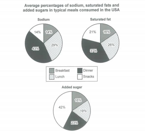
The charts below show the average percentages in typical meals of three types of nutrients, all of which may be unhealthy if eaten too much. Average percentages of sodium, saturated fats and added sugars in typical meals consumed in the USA
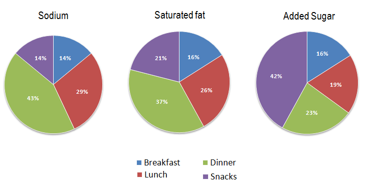
The charts below show the average percentages in typical meals of three types of nutrients, all of which may be unhealthy if eaten too much. Average percentages of sodium, saturated fats and added sugars in typical meals consumed in the USA
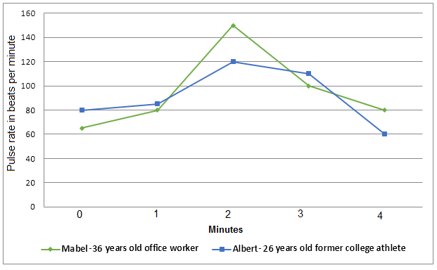
The graph shows a comparison in the pulse rate changes between two different individuals of different ages and professions. Write a report for a university tutor describing the information shown in the diagrams below. Exercise and pulse rate
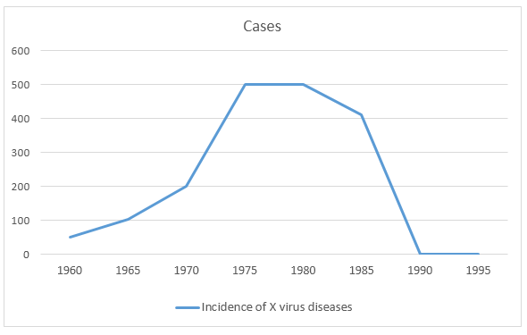
The line graph below shows the cases of diseases caused by X virus in Australia from 1960 to 1995.
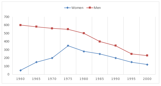
The line graph below gives information about men and women smokers in Bhutan from 1960 to 2000. Men & Women Smokers in Bhutan (per 1000)
The charts below show the average percentages in typical meals of three types of nutrients, all of which may be unhealthy if eaten too much. Summarise the information by selecting and reporting the main features, and make comparisons where relevant.