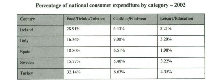
The table below gives information on consumer spending on different items in five different countries in 2002. Percentage of national consumer expenditure by category - 2002
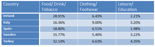
The table below gives information on consumer spending on different items in five different countries in 2002. Percentage of national consumer expenditure by category - 2002
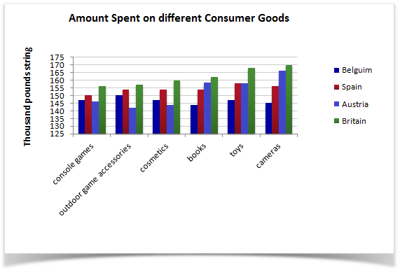
The bar chart below gives information about four countries spending habits of shopping on consumer goods in 2012.
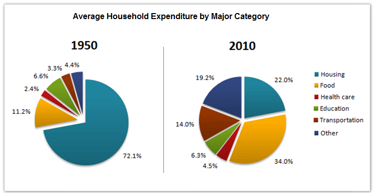
The pie charts below show the average household expenditures in a country in 1950 and 2010.
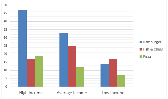
The Bar graph below shows the Expenditure in Million Pounds on fast food items by income groups in the UK. Expenditure on Fast Foods (in Million Pounds) by Income Groups, UK 1990
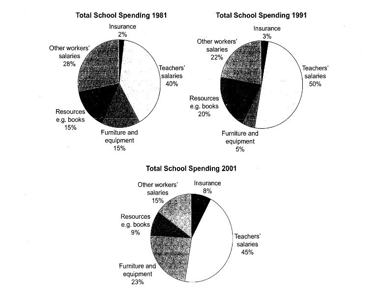
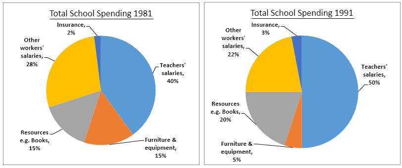
The three pie charts below show the changes in annual spending by a particular UK school in 1981, 1991 and 2001.
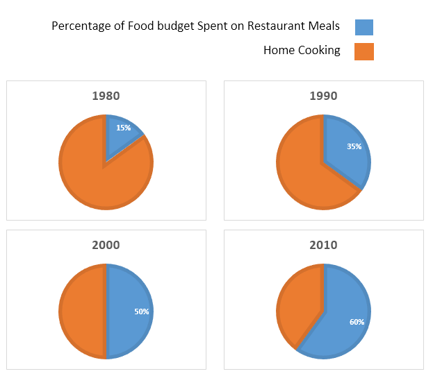
The charts below show the percentage of food budget the average Australian family spent on restaurant meals in different years. The graph shows the number of meals eaten in fast food restaurants and sit-down restaurants.
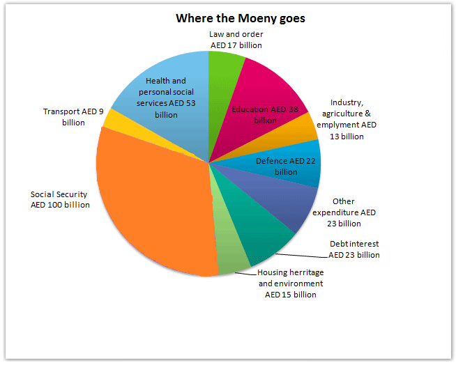
The pie chart gives information on UAE government spending in 2000. The total budget was AED 315 billion.
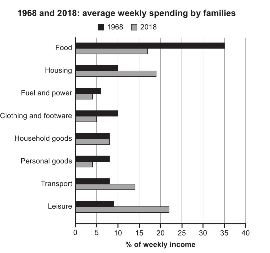
The chart below gives information about how families in one country spent their weekly income in 1968 and in 2018. Summarise the information by selecting and reporting the main features, and make comparisons where relevant.
The table below gives information on consumer spending on different items in five different countries in 2002. Summarise the information by selecting and reporting the main features, and make comparisons where relevant.
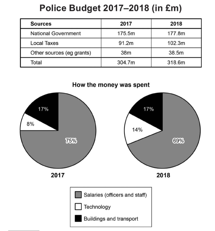
The table and charts below give information on the police budget for 2017 and 2018 in one area of Britain. The table shows where the money came from and the charts show how it was distributed. Summarise the information by selecting and reporting the main features, and make comparisons where relevant.
The three pie charts below show the changes in annual spending by a particular UK school in 1981, 1991 and 2001. Summarise the information by selecting and reporting the main features, and make comparisons where relevant.