IELTS Academic Writing Task 1
雅思折线图小作文题目
汇总 Cambridge IELTS 和 Official Guide 中的雅思学术类 Task 1 折线图题目,适合练习趋势描述、时间变化和数据对比。
题型 折线图
题目 11
来源分组 10
用真实 IELTS 题源练习折线图小作文题目
这些折线图题目适合集中练习上升、下降、峰值、波动和整体趋势概述。
Cambridge IELTS Academic 第 21 册
本册共 1 道题。
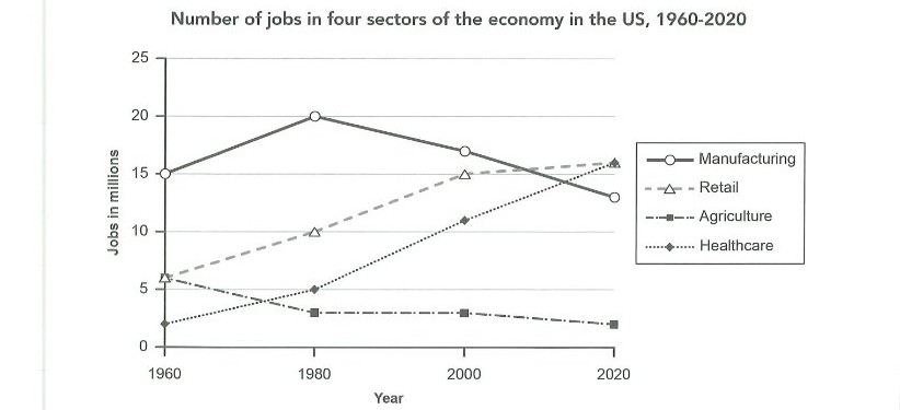
The graph below gives information about the number of jobs in four sectors of the economy in the US between 1960 and 2020.
Summarise the information by selecting and reporting the main features, and make comparisons where relevant.
Cambridge IELTS Academic 第 21 册 Writing Test 1 的 Task 1 图片。
Cambridge IELTS Academic 第 19 册
本册共 1 道题。
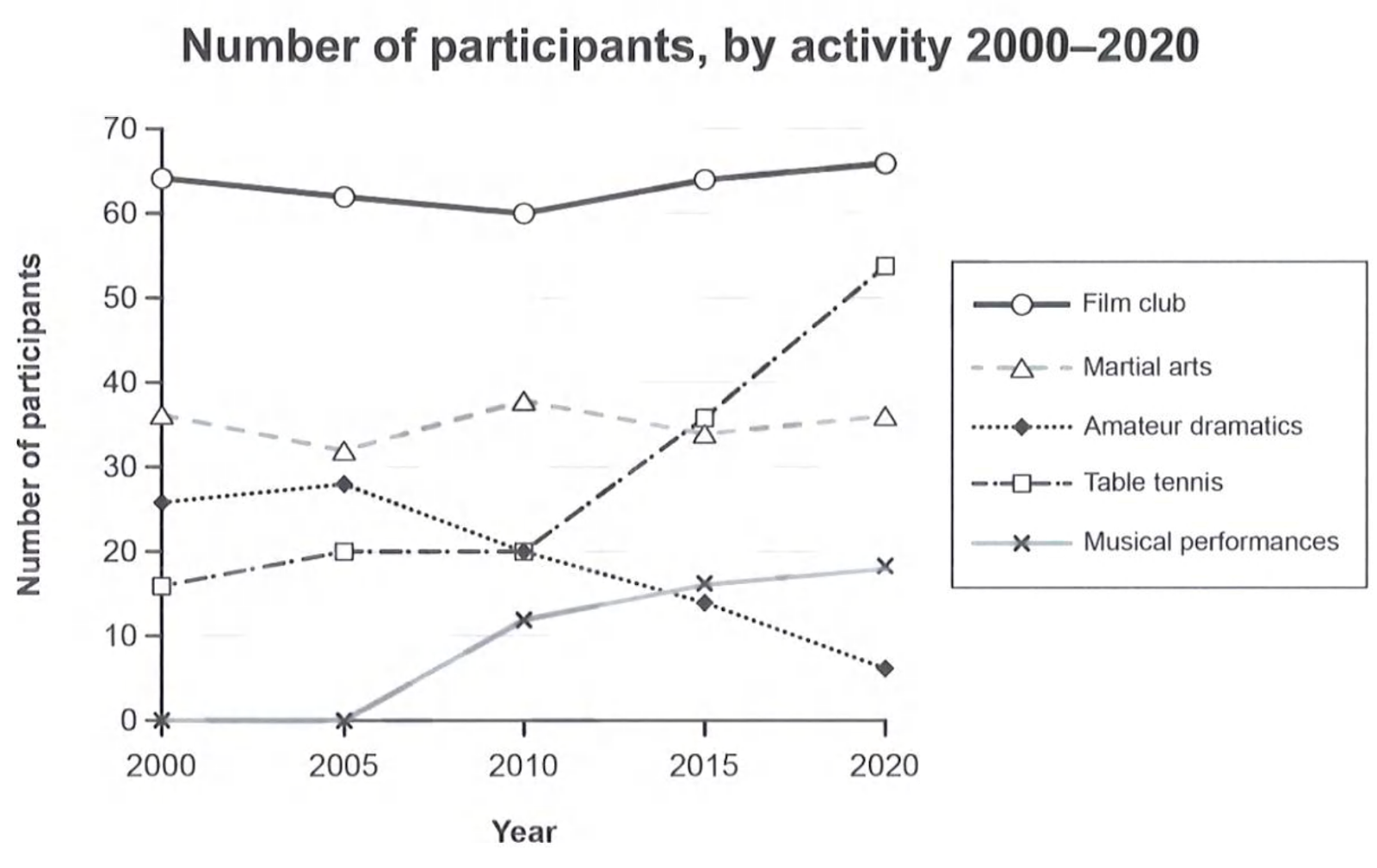
The graph below gives information on the numbers of participants for different activities at one social centre in Melbourne, Australia for the period 2000 to 2020.
Summarise the information by selecting and reporting the main features, and make comparisons where relevant.
Cambridge IELTS Academic 第 19 册 Writing Test 1 的 Task 1 图片。
Cambridge IELTS Academic 第 18 册
本册共 2 道题。
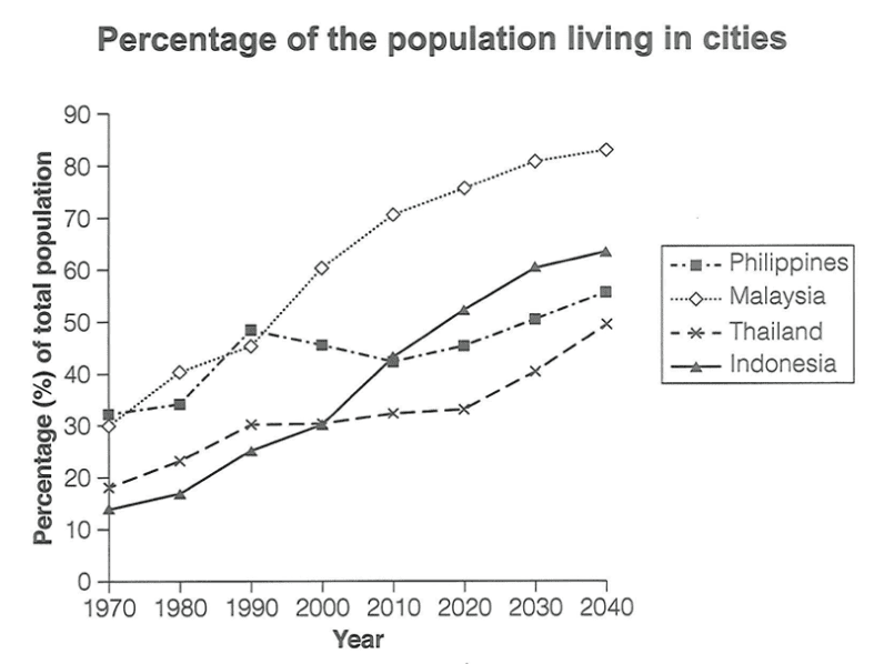
The graph below gives information about the percentage of the population in four Asian countries living in cities from 1970 to 2020, with predictions for 2030 and 2040.
Summarise the information by selecting and reporting the main features, and make comparisons where relevant.
Cambridge IELTS Academic 第 18 册 Writing Test 1 的 Task 1 图片。
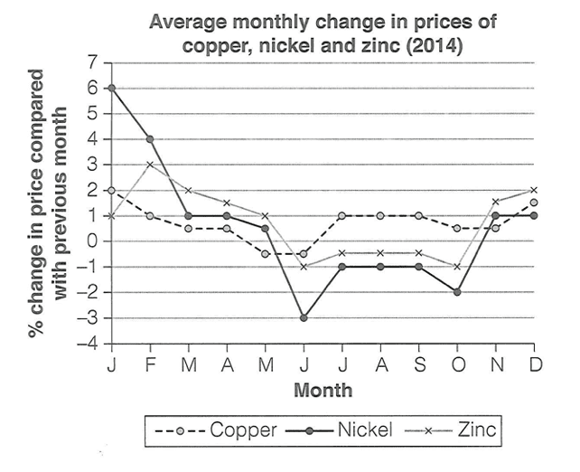
The graph below shows the average monthly change in the prices of three metals during 2014.
Summarise the information by selecting and reporting the main features, and make comparisons where relevant.
Cambridge IELTS Academic 第 18 册 Writing Test 4 的 Task 1 图片。
Cambridge IELTS Academic 第 17 册
本册共 1 道题。
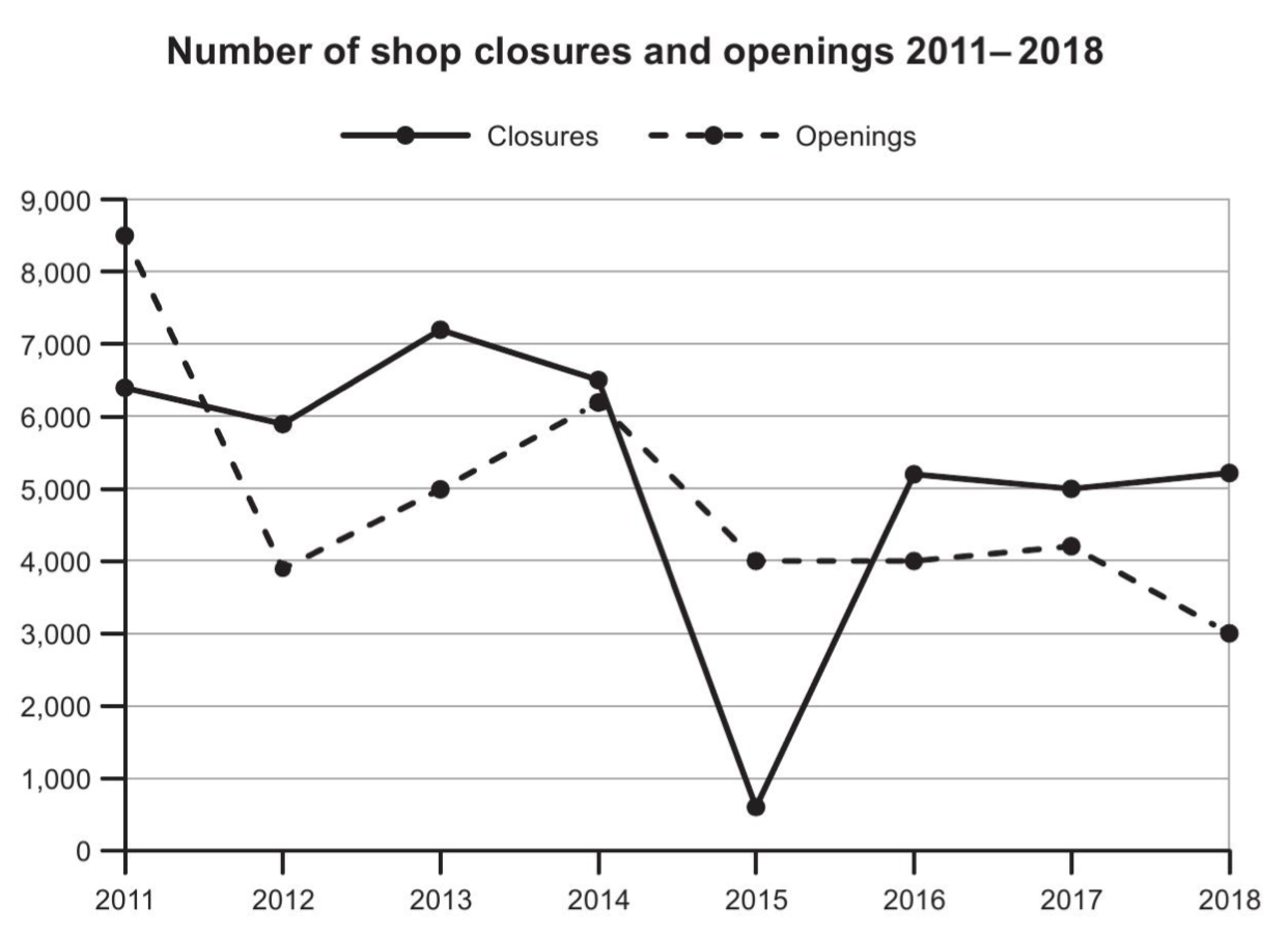
The graph below shows the number of shops that closed and the number of new shops that opened in one country between 2011 and 2018.
Summarise the information by selecting and reporting the main features, and make comparisons where relevant.
Cambridge IELTS Academic 第 17 册 Writing Test 4 的 Task 1 图片。
Cambridge IELTS Academic 第 15 册
本册共 1 道题。
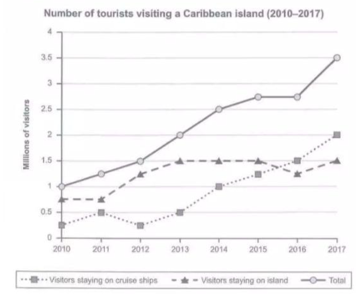
The graph below shows the number of tourists visiting a particular Caribbean island between 2010 and 2017.
Summarize the information by selecting and reporting the main features, and make comparisons where relevant.
Cambridge IELTS Academic 第 15 册 Writing Test 2 的 Task 1 图片。
Cambridge IELTS Academic 第 11 册
本册共 1 道题。
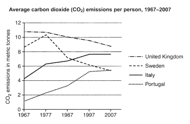
The graph below shows the average carbon dioxide (CO2) emissions per person in the United Kingdom, Sweden, Italy and Portugal between 1967 and 2007.
Summarise the information by selecting and reporting the main features, and make comparisons where relevant.
Cambridge IELTS Academic 第 11 册 Writing Test 3 的 Task 1 图片。
Cambridge IELTS Academic 第 9 册
本册共 1 道题。
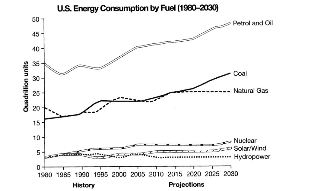
The graph below gives information from a 2008 report about consumption of energy in the USA since 1980 with projections until 2030.
Summarise the information by selecting and reporting the main features, and make comparisons where relevant.
Cambridge IELTS Academic 第 9 册 Writing Test 4 的 Task 1 图片。
Cambridge IELTS Academic 第 8 册
本册共 1 道题。
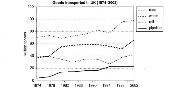
The graph below shows the quantities of goods transported in the UK between 1974 and 2002 by four different modes of transport.
Summarise the information by selecting and reporting the main features, and make comparisons where relevant.
Cambridge IELTS Academic 第 8 册 Writing Test 4 的 Task 1 图片。
Cambridge IELTS Academic 第 7 册
本册共 1 道题。
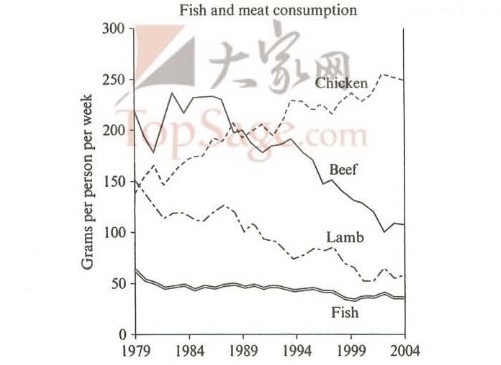
The graph below shows the consumption of fish and some different kinds of meat in a European country between 1979 and 2004.
Summarise the information by selecting and reporting the main features, and make comparisons where relevant.
Cambridge IELTS Academic 第 7 册 Writing Test 2 的 Task 1 图片。
Cambridge IELTS Academic 第 5 册
本册共 1 道题。
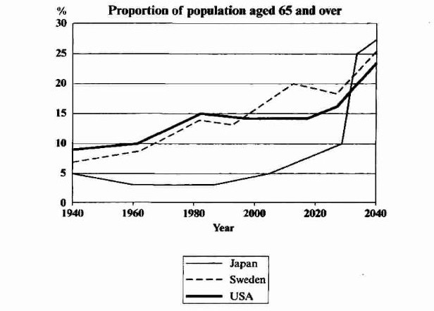
The graph below shows the proportion of the population aged 65 and over between 1940 and 2040 in three different countries.
Summarise the information by selecting and reporting the main features, and make comparisons where relevant.
Cambridge IELTS Academic 第 5 册 Writing Test 1 的 Task 1 图片。