Chorleywood is a village near London whose population has increased steadily since the middle of the nineteenth century. The map below shows the development of the village.
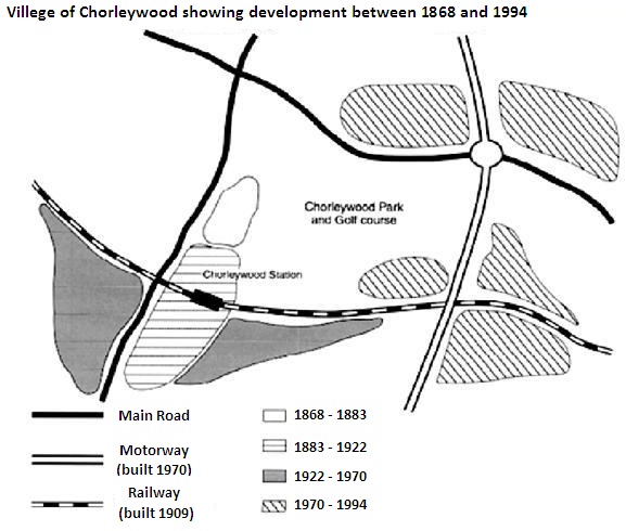
Chorleywood is a village near London whose population has increased steadily since the middle of the nineteenth century. The map below shows the development of the village.
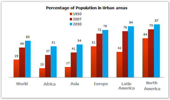
The bar chart below gives information about the percentage of the population living in urban areas in the world and in different continents.
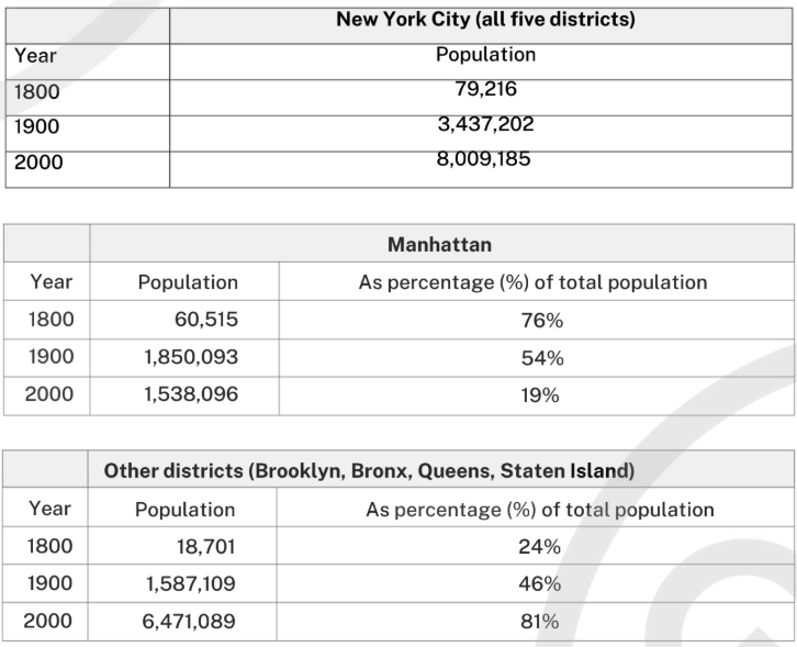
The first table below shows changes in the total population of New York City from 1800 to 2000. The second and third tables show changes in the population of the five districts of the city (Manhattan, Brooklyn, Bronx, Queens, Staten Island) over the same period. Summarise the information by selecting and reporting the main features, and make comparisons where relevant.
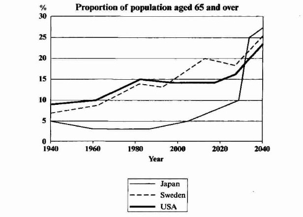
The graph below shows the proportion of the population aged 65 and over between 1940 and 2040 in three different countries. Summarise the information by selecting and reporting the main features, and make comparisons where relevant.
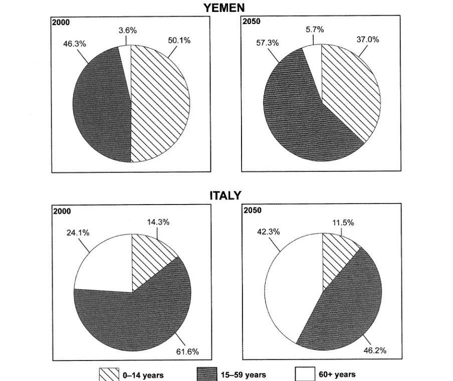
The charts below give information on the ages of the populations of Yemen and Italy in 2000 and projections for 2050. Summarise the information by selecting and reporting the main features, and make comparisons where relevant.
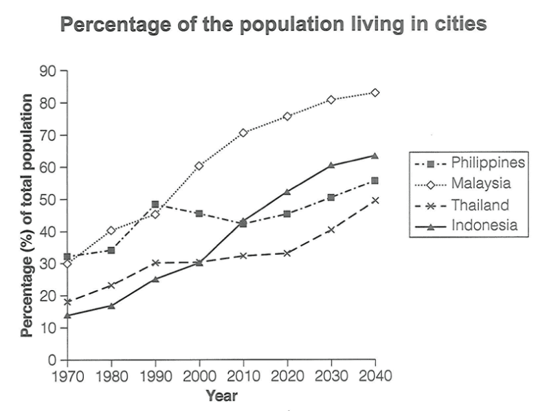
The graph below gives information about the percentage of the population in four Asian countries living in cities from 1970 to 2020, with predictions for 2030 and 2040. Summarise the information by selecting and reporting the main features, and make comparisons where relevant.