The two graphs show the main sources of energy in the USA in the 1980s and the 1990s. Sources of Energy, USA, in the 1980s and 1990s.
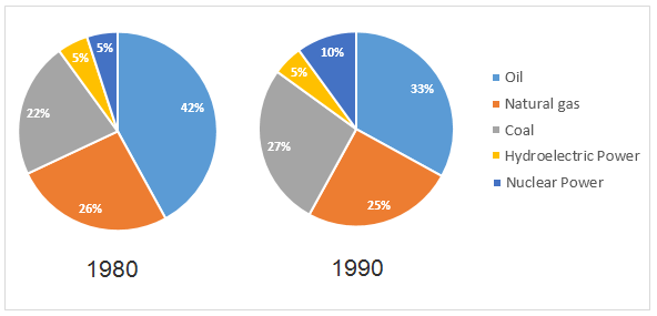
The two graphs show the main sources of energy in the USA in the 1980s and the 1990s. Sources of Energy, USA, in the 1980s and 1990s.
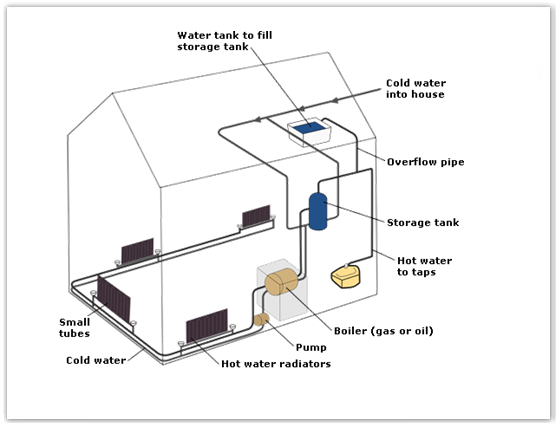
The diagram below shows how a central heating system in a house works.
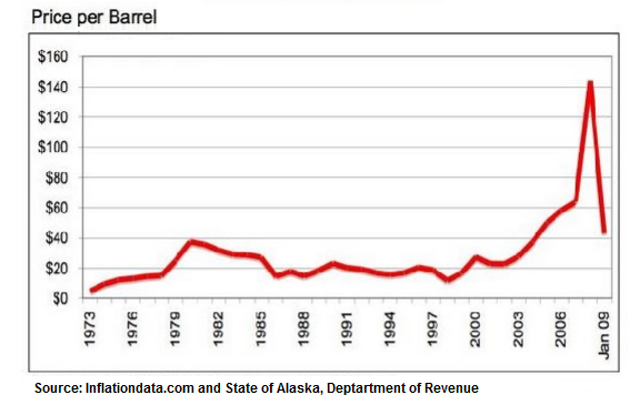
The line graph shows the historical oil prices per barrel from 1973 to January 2009.
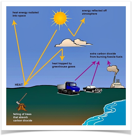
The following diagram shows how greenhouse gases trap energy from the Sun.
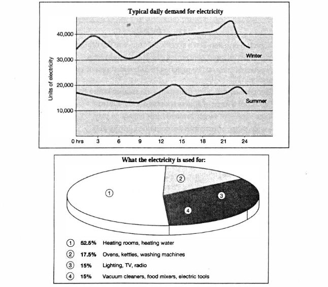
The graph below shows the demand for electricity in England during typical days in winter and summer. The pie chart shows how electricity is used in an average English home. Summarise the information by selecting and reporting the main features, and make comparisons where relevant.
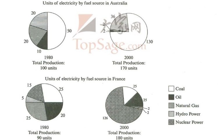
The pie charts below show units of electricity production by fuel source in Australia and France in 1980 and 2000. Summarise the information by selecting and reporting the main features, and make comparisons where relevant.
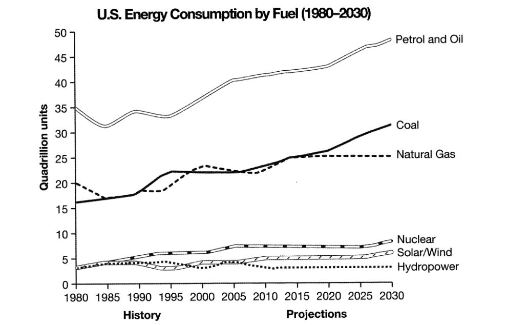
The graph below gives information from a 2008 report about consumption of energy in the USA since 1980 with projections until 2030. Summarise the information by selecting and reporting the main features, and make comparisons where relevant.
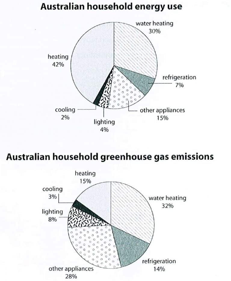
The first chart below shows how energy is used in an average Australian household. The second chart shows the greenhouse gas emissions which result from this energy use. Summarise the information by selecting and reporting the main features, and make comparisons where relevant.
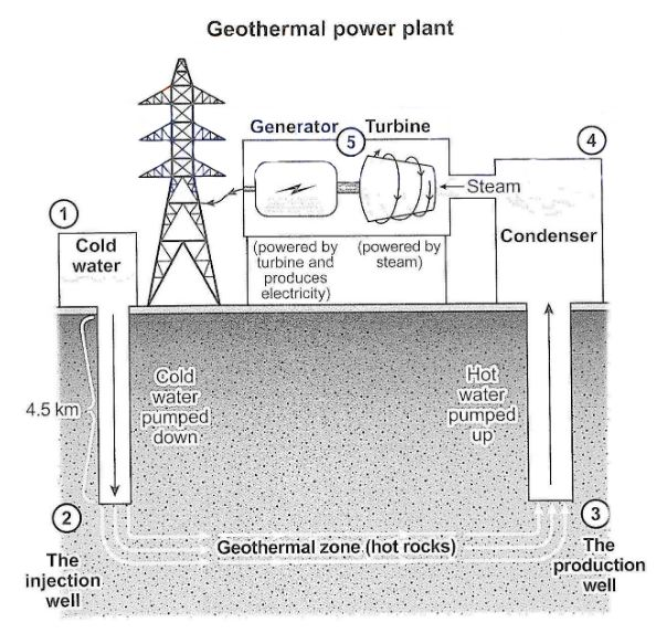
The diagram below shows how geothermal energy is used to produce electricity. Summarise the information by selecting and reporting the main features, and make comparisons where relevant.
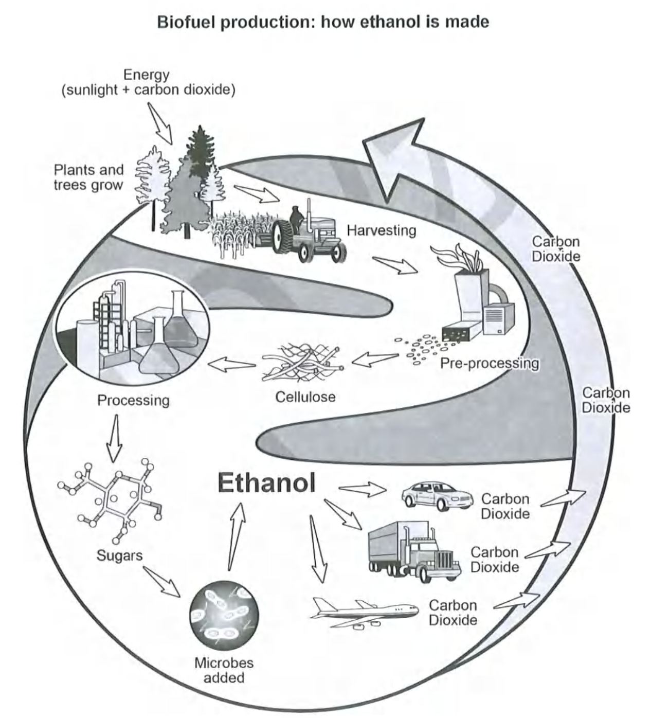
The diagram below shows how a biofuel called ethanol is produced. Summarise the information by selecting and reporting the main features, and make comparisons where relevant.
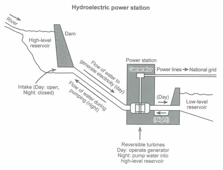
The diagram below shows how electricity is generated in a hydroelectric power station. Summarise the information by selecting and reporting the main features and make comparisons where relevant.
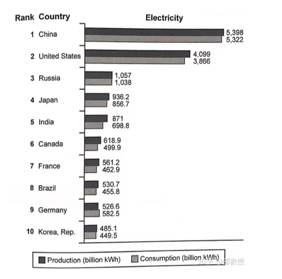
The bar chart below shows the top ten countries for the production and consumption of electricity in 2014. Summarise the information by selecting and reporting the main features, and make comparisons where relevant.