The map below shows the changes in an American town between 1948 and 2010.
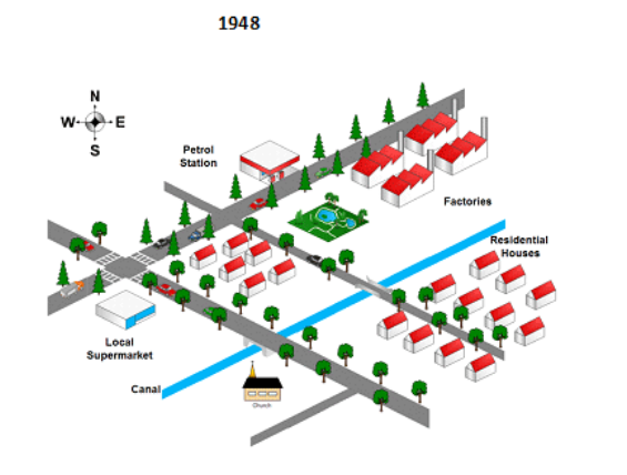
The map below shows the changes in an American town between 1948 and 2010.
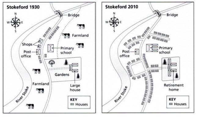
The maps below show the village of Stokeford in 1930 and 2010.
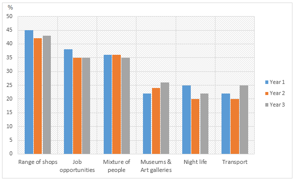
The bar charts and line graph below show the results of a survey conducted over a three-year period to discover what people who live in London think of the city. What are the best things about living in London? What are the worst things about living in London? Are these things a major problem in London? (% of people answering ‘yes’)
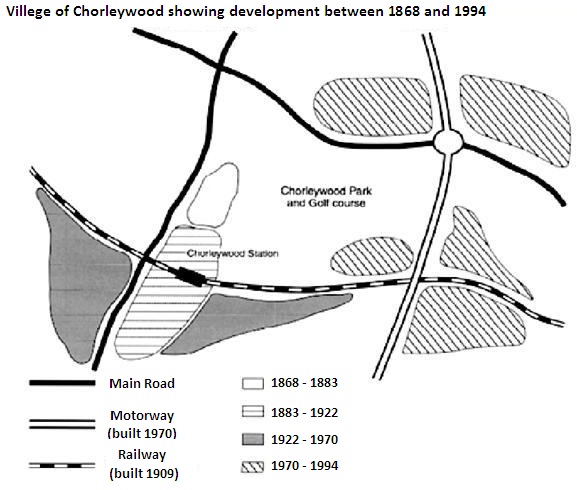
Chorleywood is a village near London whose population has increased steadily since the middle of the nineteenth century. The map below shows the development of the village.
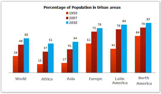
The bar chart below gives information about the percentage of the population living in urban areas in the world and in different continents.
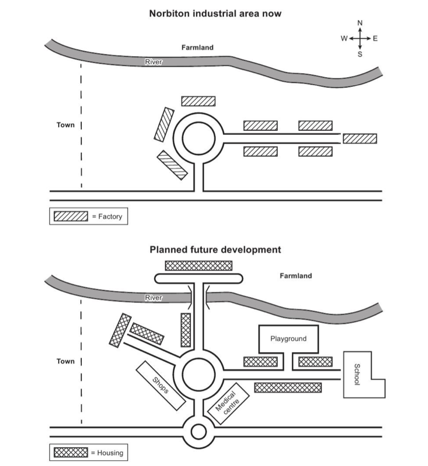
The maps below show an industrial area in the town of Norbiton, and planned future development of the site. Summarise the information by selecting and reporting the main features, and make comparisons where relevant.
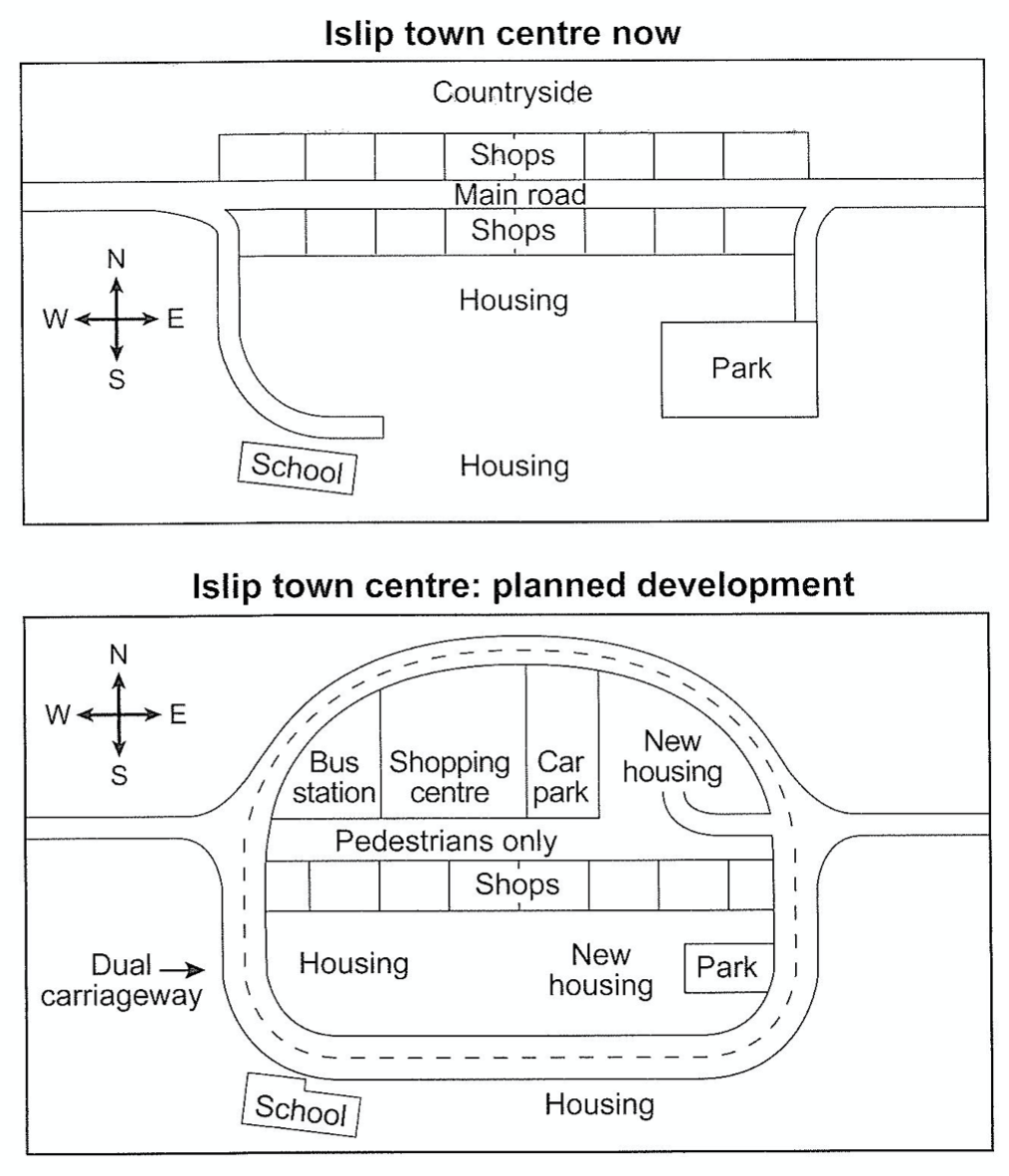
The maps below show the centre of a small town called Islip as it is now, and plans for its development. Summarise the information by selecting and reporting the main features, and make comparisons where relevant.
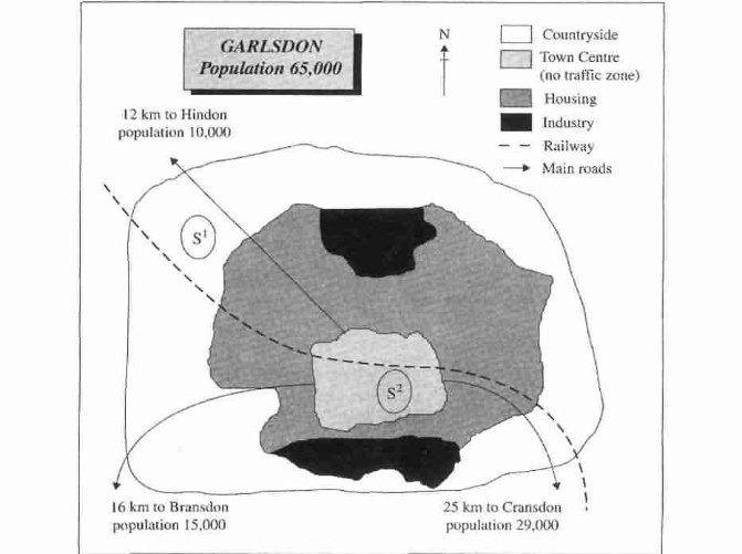
The map below is of the town of Garlsdon. A new supermarket (S) is planned for the town. The map shows two possible sites for the supermarket. Summarise the information by selecting and reporting the main features, and make comparisons where relevant.
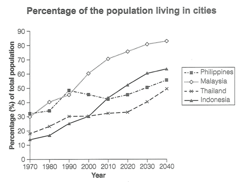
The graph below gives information about the percentage of the population in four Asian countries living in cities from 1970 to 2020, with predictions for 2030 and 2040. Summarise the information by selecting and reporting the main features, and make comparisons where relevant.