TableTask 1Demographics·AgeThe table below presents the number of children ever born to women aged 40-44 years in Australia for each year the information was collected since 1981.Write this taskView 1 sample answer→
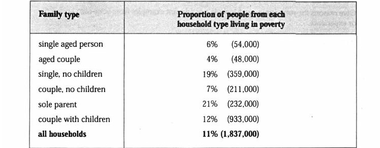
TableTask 1Income·DemographicsThe table below shows the proportion of different categories of families living in poverty in Australia in 1999.Write this taskView 1 sample answer→
TableTask 1DemographicsThe table gives statistics showing the aspects of quality of life in five countries.Write this taskView 1 sample answer→
TableTask 1DemographicsThe table below shows the changes in some household types in Canada from 1984 to 2020.Write this taskView 1 sample answer→
Pie ChartTask 1Income·DemographicsThe pie chart shows the proportion of different categories of families living in poverty in the UK in 2002.Write this taskView 1 sample answer→
Pie ChartTask 1Government·DemographicsThe pie chart shows the percentage of persons arrested in the five years ending 1994 and the bar chart shows the most recent reasons for arrest.Write this taskView 1 sample answer→
Line GraphTask 1Population·DemographicsThe graph below gives information about changes in the birth and death rates in New Zealand between 1901 and 2101.Write this task
TableTask 1Income·DemographicsThe table below shows the proportion of different categories of families living in poverty in Australia in 1999.Write this taskView 1 sample answer→
Bar ChartTask 1Housing·Age·DemographicsThe bar chart below shows the percentage of people living alone in five different age groups in the USA between 1850 and 2000.Write this taskView 1 sample answer→