Biểu đồ đườngTask 1Pollution·Public servicesThe graph below shows the number of complaints made about noise to Environmental Health authorities in the city of Newtown between 1980 and 1996.Viết bài này
Biểu đồ trònTask 1Pollution·EnvironmentThe pie charts below show how dangerous waste products are dealt with in three countries.Viết bài này
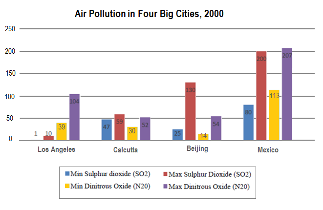
Biểu đồ cộtTask 1PollutionThe chart shows the average daily minimum and maximum levels of air pollutants in 4 cities 2000.Viết bài nàyXem 1 bài mẫu cùng đề→
Biểu đồ kết hợpTask 1Environment·PollutionThe charts below give information about different types of waste disposal in one country in 1960 and 2011.Viết bài nàyXem 1 bài mẫu cùng đề→
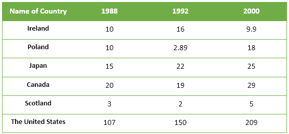
Bảng số liệuTask 1Environment·PollutionThe table below shows the amount of waste production (in millions of tonnes) in six different countries over a twenty-year period.Viết bài nàyXem 1 bài mẫu cùng đề→
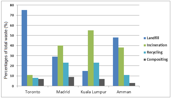
Biểu đồ cộtTask 1Environment·PollutionThe bar chart shows different methods of waste disposal in four cities; Toronto, Madrid, Kuala Lumpur and Amman.Viết bài nàyXem 1 bài mẫu cùng đề→
Biểu đồ đườngTask 1Pollution·EmissionsThe graph below shows UK air pollutants in millions of tonnes, from three different sources, between 1990 and 2005.Viết bài nàyXem 1 bài mẫu cùng đề→
Biểu đồ đườngTask 1PollutionThe graph below shows the pollution levels in London between 1600 and 2000.Viết bài nàyXem 1 bài mẫu cùng đề→
Biểu đồ cộtTask 1Pollution·EnvironmentThe chart below shows the average daily minimum and maximum levels of two air pollutants in four big cities in 2000.Viết bài nàyXem 1 bài mẫu cùng đề→
Biểu đồ kết hợpTask 1Water·PollutionThe diagram below shows nitrogen sources and concentration levels in the groundwater of a coastal city.Viết bài nàyXem 1 bài mẫu cùng đề→