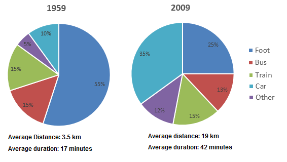
Transport·Employment The graphs below show how people in a European city reached their office and got back home in 1959 and 2009. Viết bài này
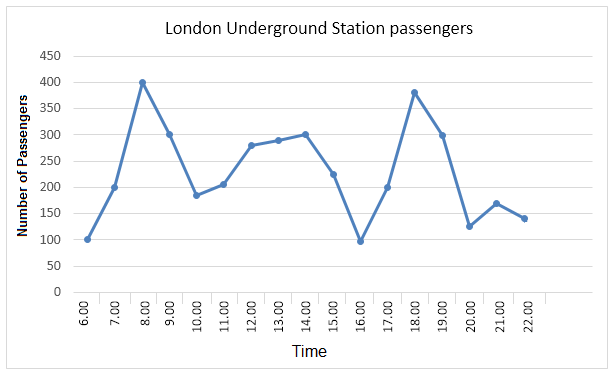
Transport The graph shows Underground Station passenger numbers in London. Viết bài này So sánh 6 bài mẫu cùng đề (Band 5–7)→
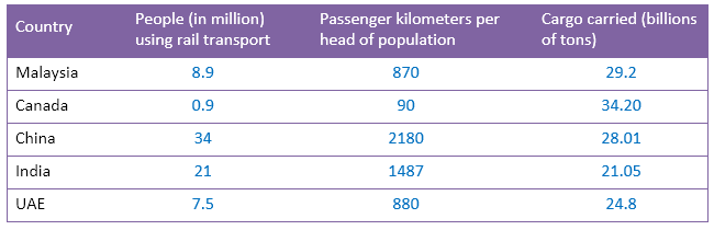
Transport The table below gives information about the rail transport in five countries in 2015. Viết bài này So sánh 2 bài mẫu cùng đề (Band 6.5–7)→
Transport·Employment The graph presents percentages of commuters using different modes of transports in London in the years 1960, 1980, 2000 and 2010. Viết bài này
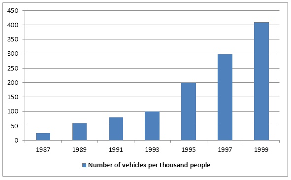
Transport The bar chart below gives information about vehicle ownership in China. Viết bài này So sánh 3 bài mẫu cùng đề (Band 6.5–7)→
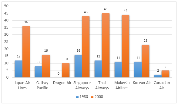
Transport·Travel The graph below presents the number of different airline flights coming to Hong Kong per week in 1980 and 2000. Viết bài này
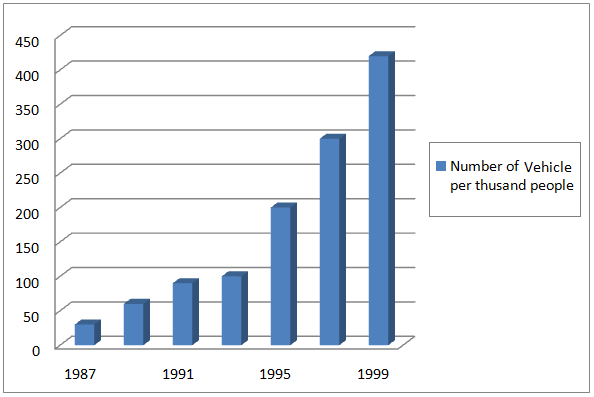
Transport The graph below shows the number of vehicles owned by per thousand people in China from 1987 to 1999. Viết bài này
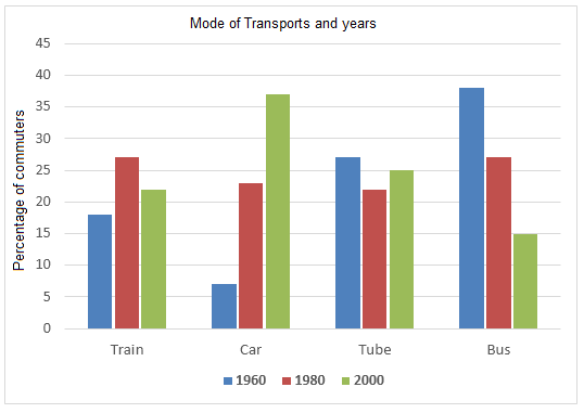
Transport The graph below shows the different modes of transport used to travel to and from work in one European city in 1960, 1980 and 2000. Viết bài này So sánh 4 bài mẫu cùng đề (Band 6–6.5)→
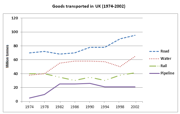
Transport The graph below shows the quantities of goods transported in the UK between 1974 and 2002 by four different modes of transport. Viết bài này So sánh 4 bài mẫu cùng đề (Band 5–6.5)→
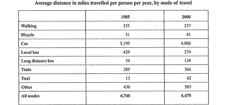
Transport·Travel The table below gives information about changes in modes of travel in England between 1985 and 2000. Viết bài này