Test 3Task 1
The diagram below shows how a biofuel called ethanol is produced.
Summarise the information by selecting and reporting the main features, and make comparisons where relevant.
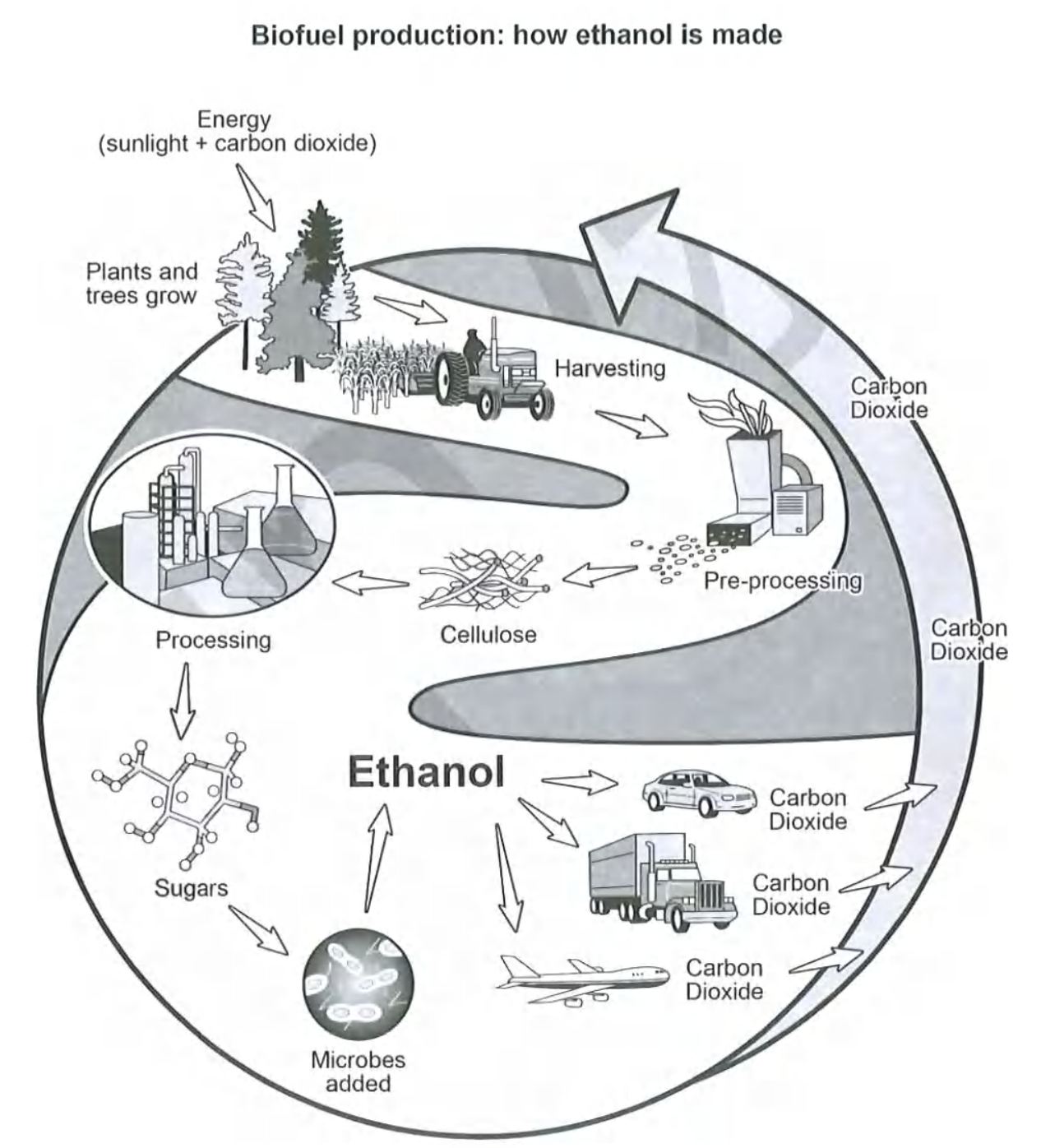
The diagram below shows how a biofuel called ethanol is produced.
Summarise the information by selecting and reporting the main features, and make comparisons where relevant.
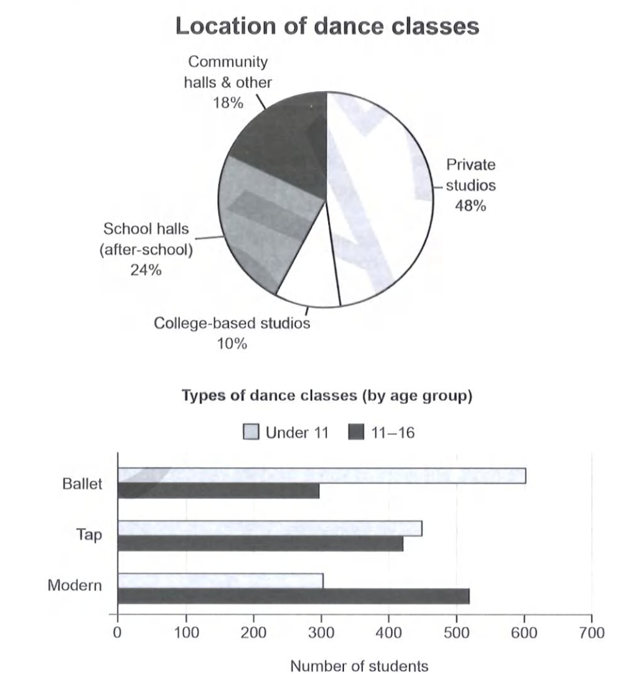
The charts below give information on the location and types of dance classes young people in a town in Australia are currently attending.
Summarise the information by selecting and reporting the main features, and make comparisons where relevant.
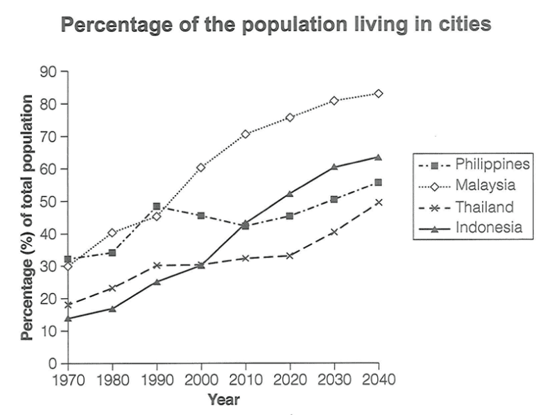
The graph below gives information about the percentage of the population in four Asian countries living in cities from 1970 to 2020, with predictions for 2030 and 2040.
Summarise the information by selecting and reporting the main features, and make comparisons where relevant.
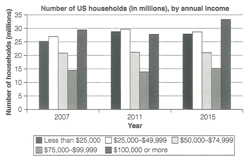
The chart below shows the number of households in the US by their annual income in 2007, 2011 and 2015.
Summarise the information by selecting and reporting the main features, and make comparisons where relevant.
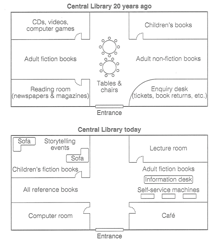
The diagram below shows the floor plan of a public library 20 years ago and how it looks now.
Summarise the information by selecting and reporting the main features, and make comparisons where relevant.
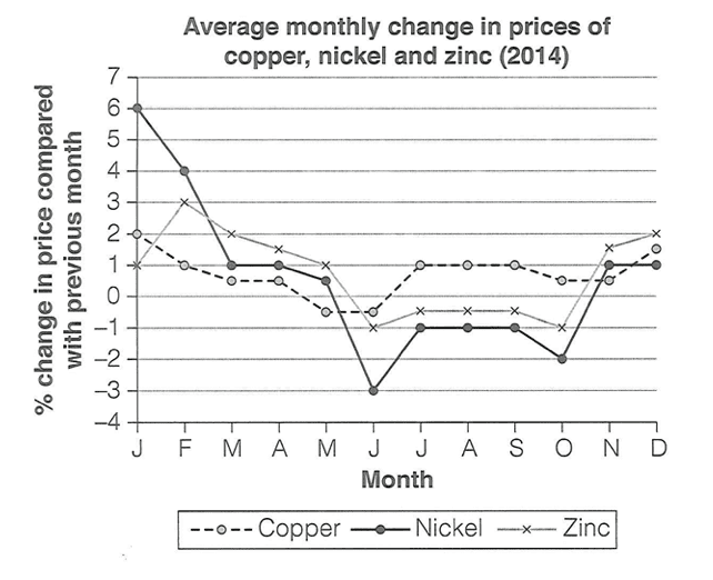
The graph below shows the average monthly change in the prices of three metals during 2014.
Summarise the information by selecting and reporting the main features, and make comparisons where relevant.
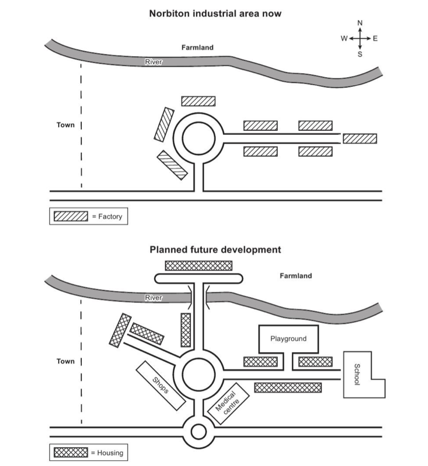
The maps below show an industrial area in the town of Norbiton, and planned future development of the site.
Summarise the information by selecting and reporting the main features, and make comparisons where relevant.
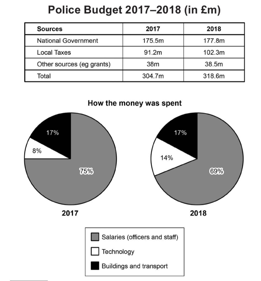
The table and charts below give information on the police budget for 2017 and 2018 in one area of Britain. The table shows where the money came from and the charts show how it was distributed.
Summarise the information by selecting and reporting the main features, and make comparisons where relevant.
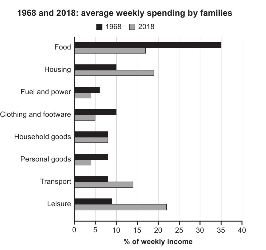
The chart below gives information about how families in one country spent their weekly income in 1968 and in 2018.
Summarise the information by selecting and reporting the main features, and make comparisons where relevant.
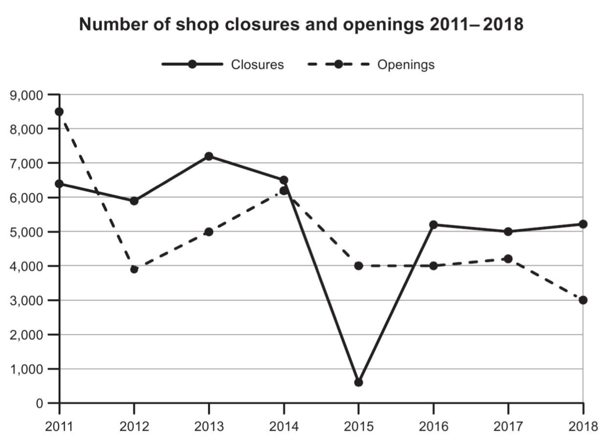
The graph below shows the number of shops that closed and the number of new shops that opened in one country between 2011 and 2018.
Summarise the information by selecting and reporting the main features, and make comparisons where relevant.