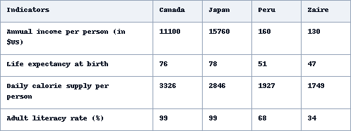
The table below shows social and economic indicators for four countries in 1994, according to United Nations statistics. Describe the information shown below in your own words. What implications do the indicators have for the countries? Indicators Canada Japan Peru Zaire Annual income per person (in $US) Life expectancy at birth Daily calorie supply per person Adult literacy rate (%)
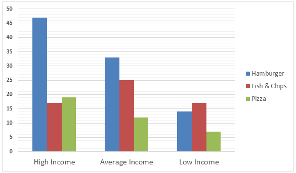
The Bar graph below shows the Expenditure in Million Pounds on fast food items by income groups in the UK. Expenditure on Fast Foods (in Million Pounds) by Income Groups, UK 1990
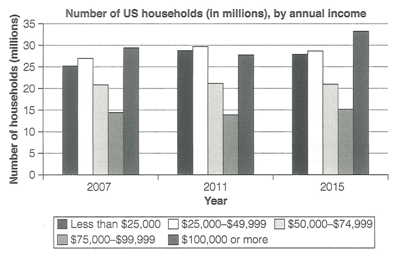
The chart below shows the number of households in the US by their annual income in 2007, 2011 and 2015. Summarise the information by selecting and reporting the main features, and make comparisons where relevant.
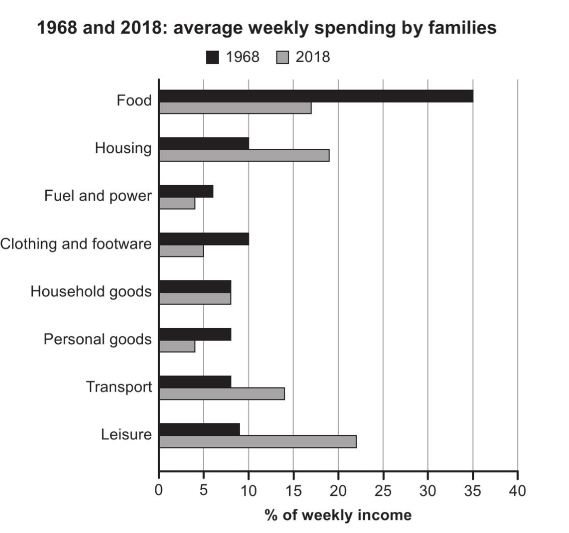
The chart below gives information about how families in one country spent their weekly income in 1968 and in 2018. Summarise the information by selecting and reporting the main features, and make comparisons where relevant.
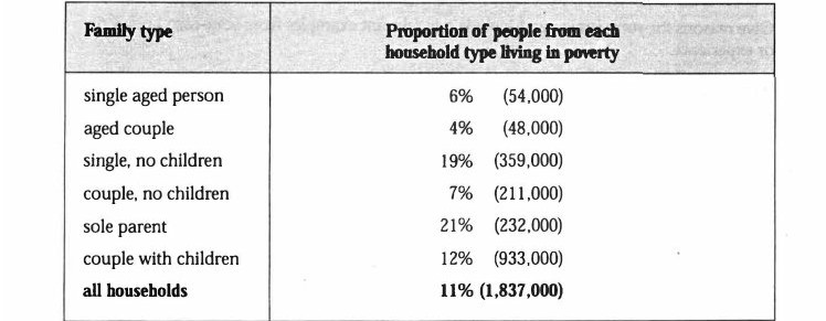
The table below shows the proportion of different categories of families living in poverty in Australia in 1999. Summarise the information by selecting and reporting the main features, and make comparisons where relevant.
The chart below shows what Anthropology graduates from one university did after finishing their undergraduate degree course. The table shows the salaries of the anthropologists in work after five years. Summarize the information by selecting and reporting the main features, and make comparisons where relevant.