Test 1Task 1
The charts below show the percentage of water used for different purposes in six areas of the world.
Summarise the information by selecting and reporting the main features and make comparisons where relevant.
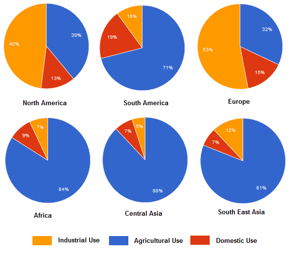
The charts below show the percentage of water used for different purposes in six areas of the world.
Summarise the information by selecting and reporting the main features and make comparisons where relevant.
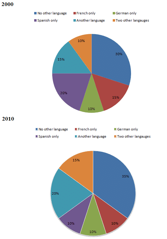
The charts below show the proportions of British students at one university in England who were able to speak other languages in addition to English, in 2000 and 2010.
Summarise the information by selecting and reporting the main features and make comparisons where relevant.
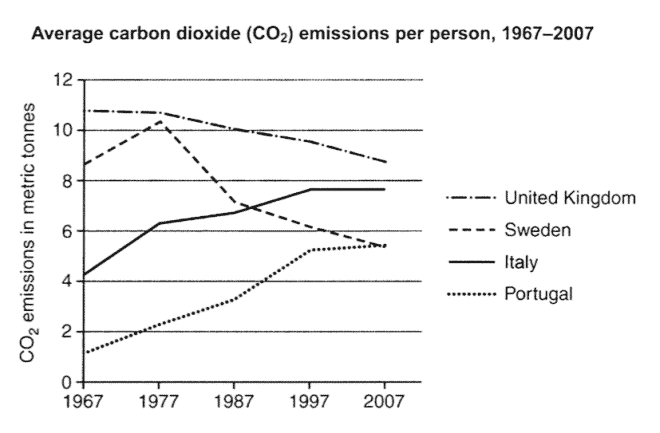
The graph below shows the average carbon dioxide (CO2) emissions per person in the United Kingdom, Sweden, Italy and Portugal between 1967 and 2007.
Summarise the information by selecting and reporting the main features, and make comparisons where relevant.
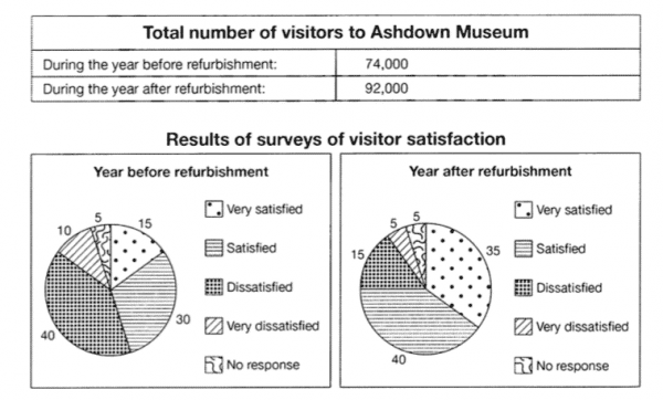
The table below shows the numbers of visitors to Ashdown Museum during the year before and the year after it was refurbished. The charts show the result of surveys asking visitors how satisfied they were with their visit, during the same two periods.
Summarise the information by selecting and reporting the main features, and make comparisons where relevant.
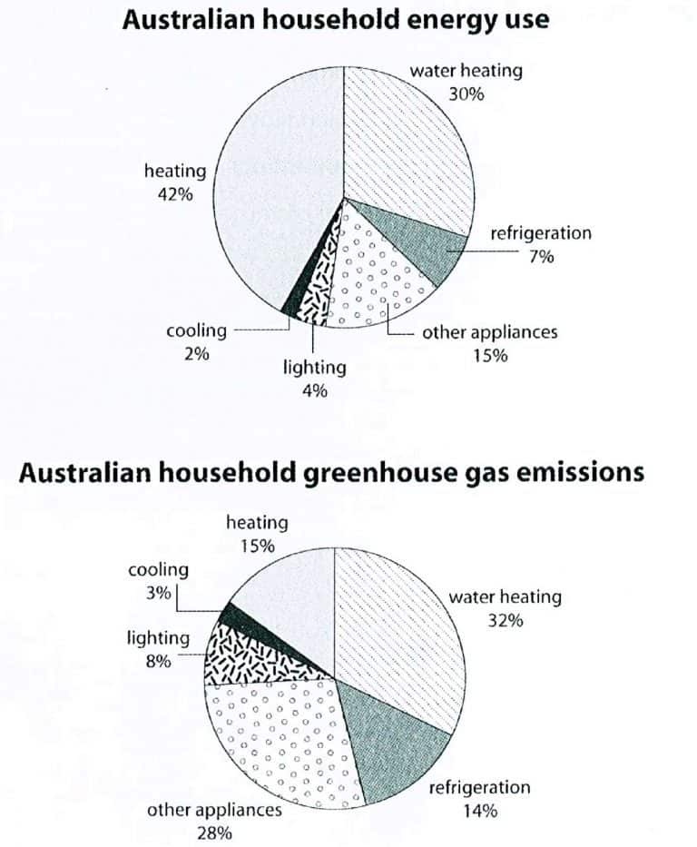
The first chart below shows how energy is used in an average Australian household. The second chart shows the greenhouse gas emissions which result from this energy use.
Summarise the information by selecting and reporting the main features, and make comparisons where relevant.
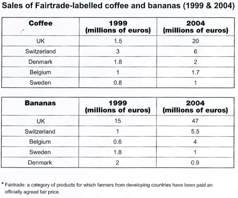
The tables below give information about sales of Fairtrade-labelled coffee and bananas in 1999 and 2004 in five European countries.
Summarise the information by selecting and reporting the main features, and make comparisons where relevant.
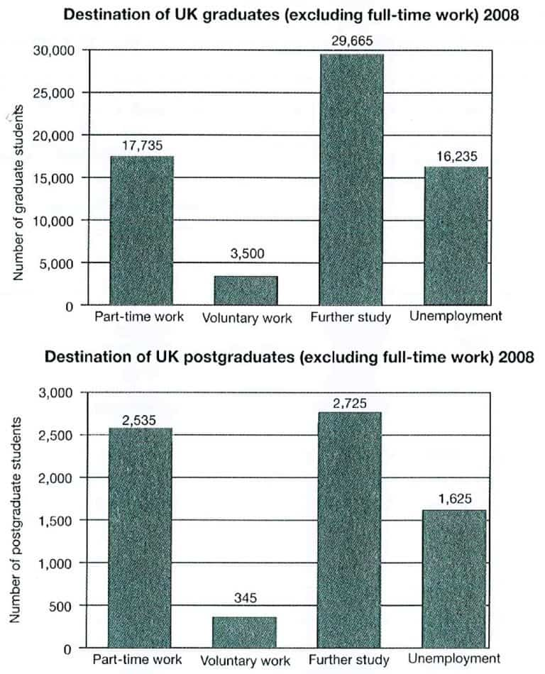
The charts below show what UK graduate and postgraduate students who did not go into full-time work did after leaving college in 2008.
Summarise the information by selecting and reporting the main features, and make comparisons where relevant.
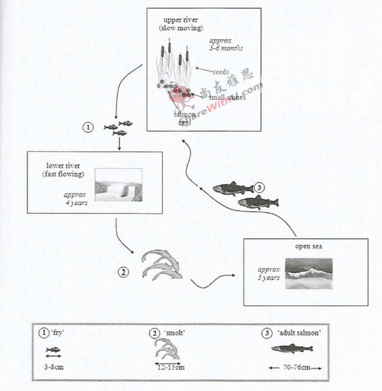
The diagrams below show the life cycle of a species of large fish called the salmon.
Summarise the information by selecting and reporting the main features, and make comparisons where relevant.
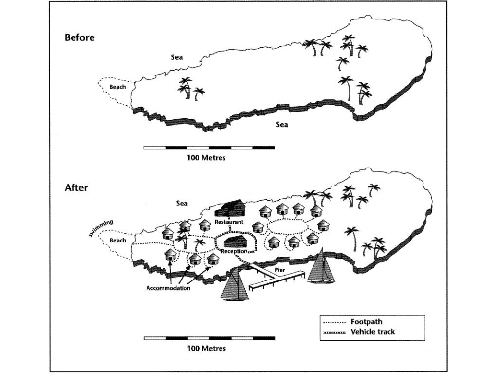
The two maps below show an island, before and after the construction of some tourist facilities.
Summarise the information by selecting and reporting the main features, and make comparisons where relevant.
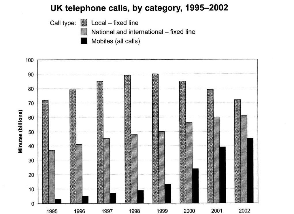
The chart below shows the total number of minutes (in billions) of telephone calls in the UK, divided into three categories, from 1995–2002.
Summarise the information by selecting and reporting the main features, and make comparisons where relevant.