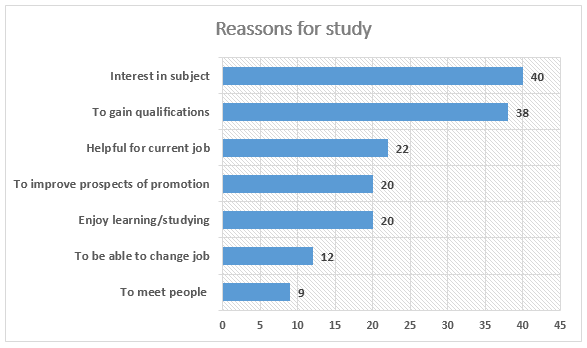
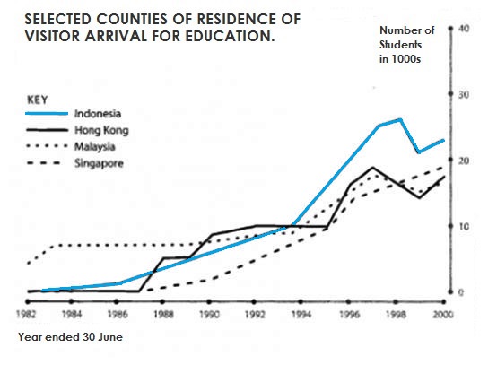
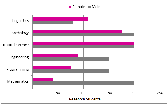
The charts below show the results of a survey of adult education. The first chart shows the reasons why adults decide to study. The pie chart shows how people think the costs of adult education should be shared. Reasons why adult people decide to study (figures in percentages)
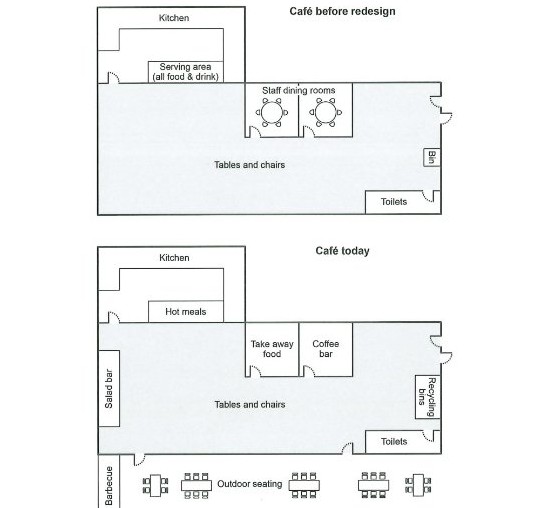
The plans below show a college café before it was redesigned and how it looks now. Summarise the information by selecting and reporting the main features, and make comparisons where relevant.
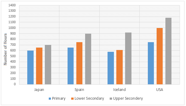
The bar charts below show the number of hours each teacher spent teaching in different schools in four different countries in 2001. The number of hours spent by each teacher in teaching.
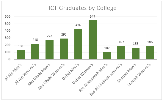
The graphs show enrolment in different colleges in the Higher Colleges of Technology in 1999. HTC Graduates by Colleges HTC Graduates by levels and genders
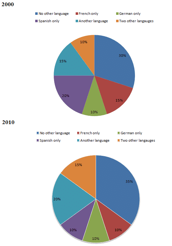
The charts below show the proportions of British students at one university in England who were able to speak other languages in addition to English, in 2000 and 2010. Summarise the information by selecting and reporting the main features and make comparisons where relevant.
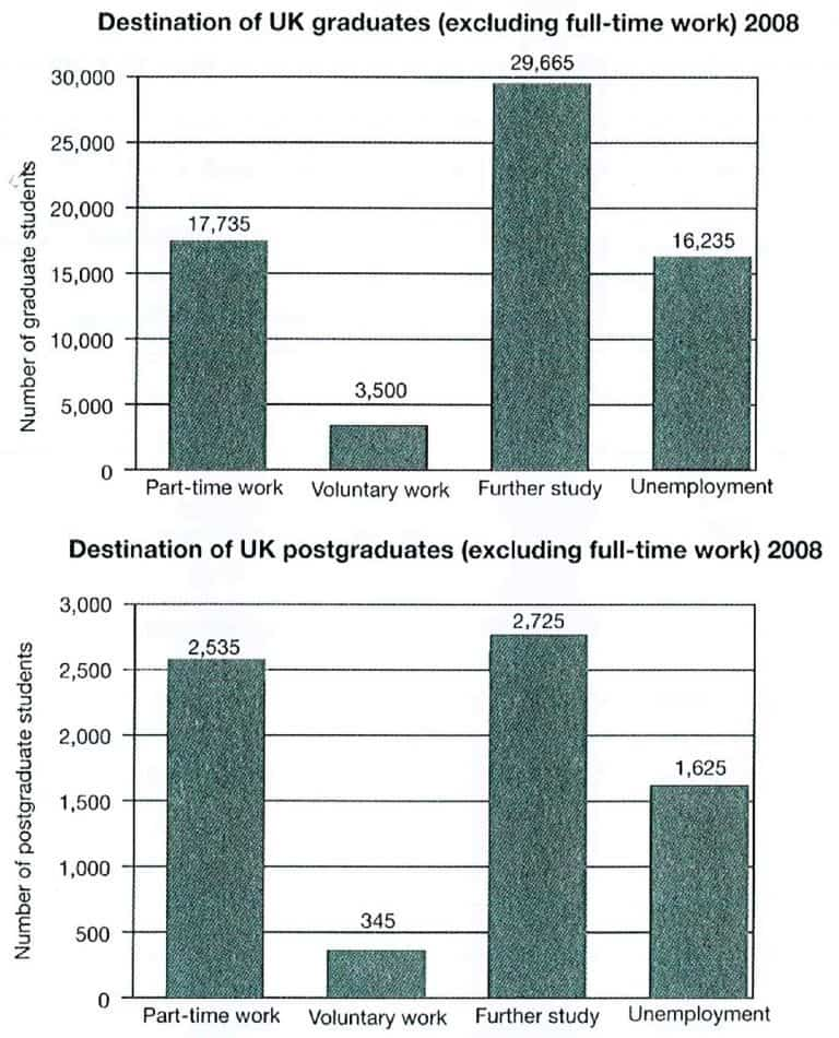
The charts below show what UK graduate and postgraduate students who did not go into full-time work did after leaving college in 2008. Summarise the information by selecting and reporting the main features, and make comparisons where relevant.
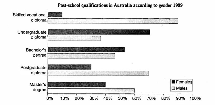
The chart below shows the different levels of post-school qualifications in Australia and the proportion of men and women who held them in 1999. Summarise the information by selecting and reporting the main features, and make comparisons where relevant.
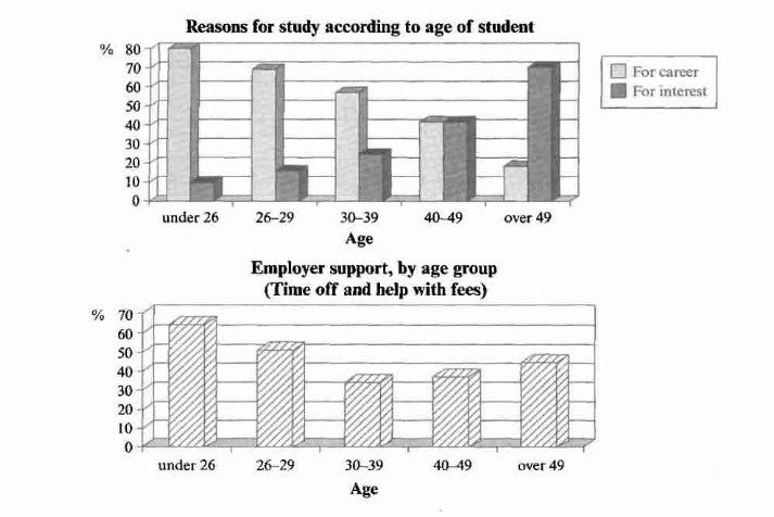
The charts below show the main reasons for study among students of different age groups and the amount of support they received from employers. Summarise the information by selecting and reporting the main features, and make comparisons where relevant.