The graph below shows the differences in wheat exports over three different areas. Wheat Exports from 1985 to 1990 (in million tonnes)
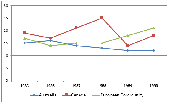
The graph below shows the differences in wheat exports over three different areas. Wheat Exports from 1985 to 1990 (in million tonnes)
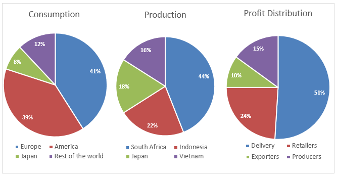
The pie charts below show the coffee production, coffee consumption and the profit distribution around the world.
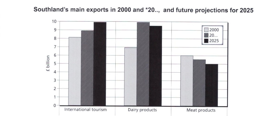
The chart below gives information about Southland's main exports in 2000, 20.., and future projections for 2025. Summarise the information by selecting and reporting the main features, and make comparisons where relevant. *20..: for test purposes, use and refer to the current year.
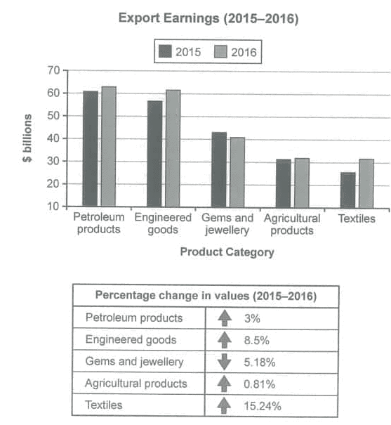
The chart below shows the value of one country’s exports in various categories during 2015 and 2016. The table shows the percentage change in each category of exports in 2016 compared with 2015. Summarise the information by selecting and reporting the main features and make comparisons where relevant.
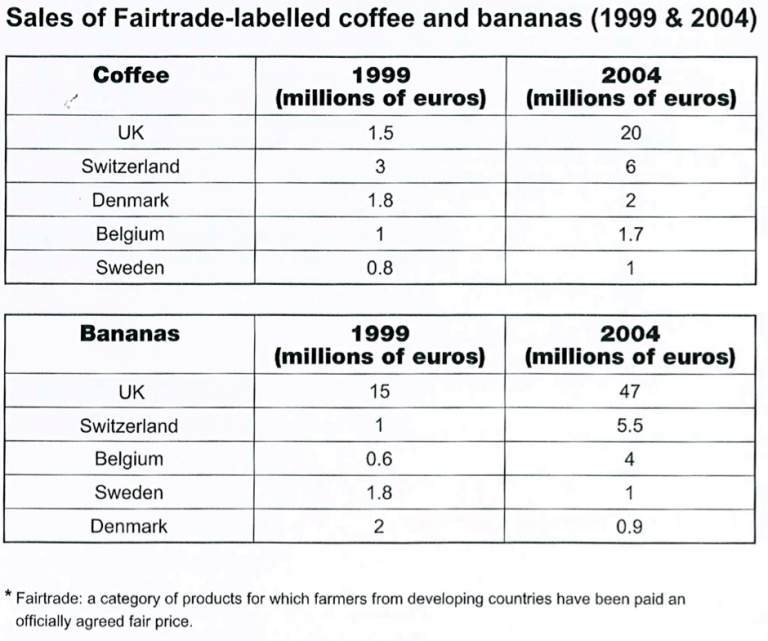
The tables below give information about sales of Fairtrade-labelled coffee and bananas in 1999 and 2004 in five European countries. Summarise the information by selecting and reporting the main features, and make comparisons where relevant.