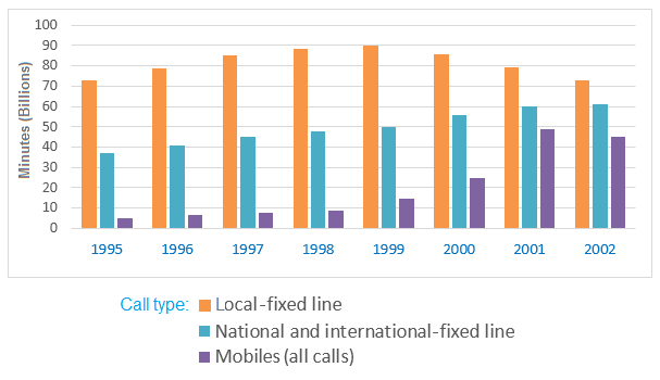
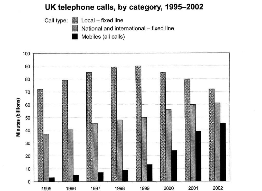
The chart below shows the total number of minutes (in billions) of telephone calls in the UK, divided into three categories, from 1995-2002. UK telephone calls, by category, 1995-2002
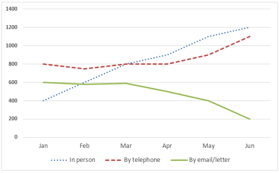
The graph below shows the number of enquiries to tourist information office made by telephone, letter/email, and in person from January 2001 to June 2001. Number of enquiries to tourist Information office
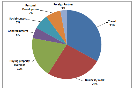
The pie charts below show responses by teachers of foreign languages in Britain to a survey concerning why their students are learning a foreign language. The first chart shows the main reason for learning a foreign language. The second chart shows how many teachers felt that there has been a recent change in the reason. % of teachers reporting the following as the most common reasons for learning: % of teachers reporting a recent increase in people learning for the following reasons:
The chart below shows the total number of minutes (in billions) of telephone calls in the UK, divided into three categories, from 1995–2002. Summarise the information by selecting and reporting the main features, and make comparisons where relevant.