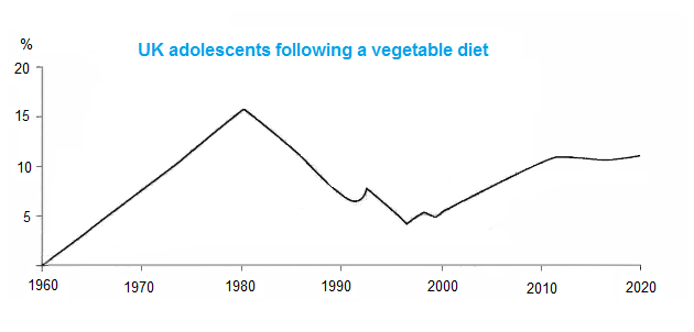
Food·Age The graph shows the percentage of UK adolescents following a vegetarian diet. Write this task View 1 sample answer→
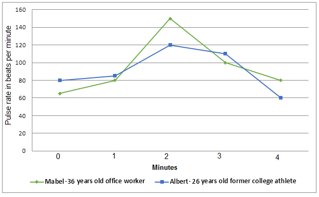
Health·Age·Employment The graph shows a comparison in the pulse rate changes between two different individuals of different ages and professions. Write this task Compare 2 sample answers→
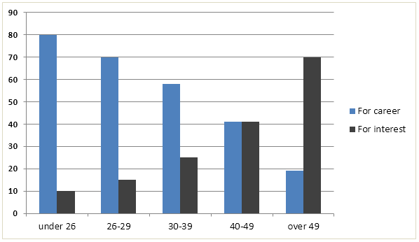
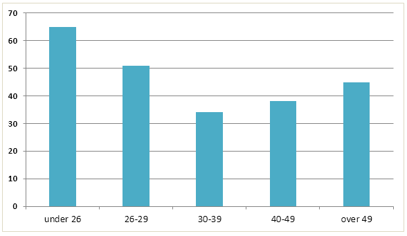
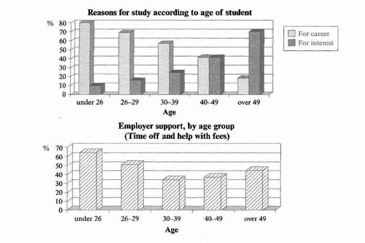
Education·Employment·Age The charts below show the main reasons for study among students of different age groups and the amount of support they received from employers. Write this task Compare 2 sample answers→
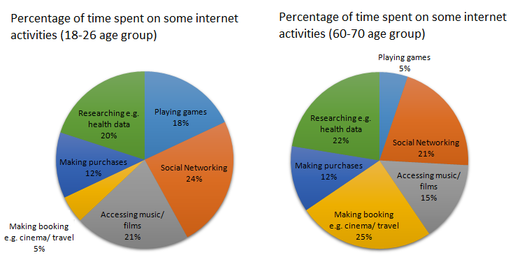
Internet·Age·Time use The charts below show the percentage of time younger and older people spend on various Internet activities in their free time (excluding email). Write this task View 1 sample answer→
Spending·Income·Age The table data shows the proportion of income adults and children spent on 4 common items in the United Kingdom in 2005. Write this task View 1 sample answer→
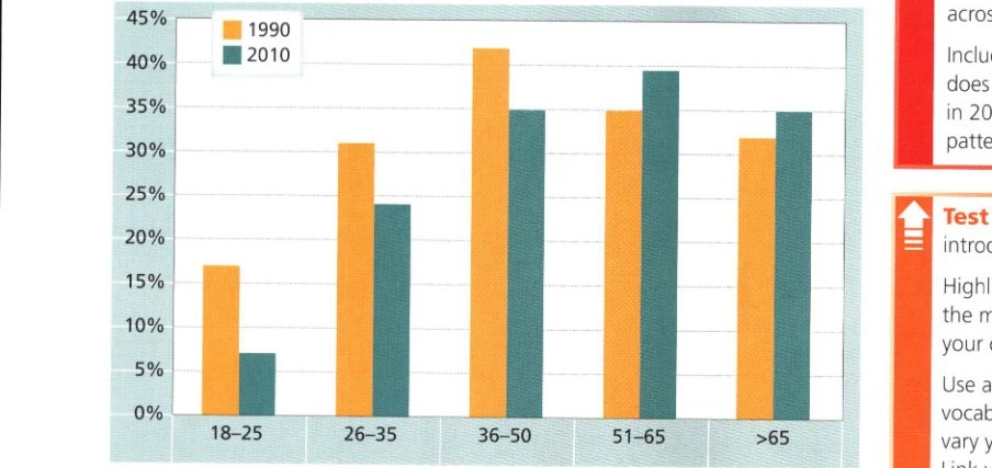
Charity·Age The chart below gives information on the percentage of British people giving money to charity by age range for the years 1990 and 2010. Write this task
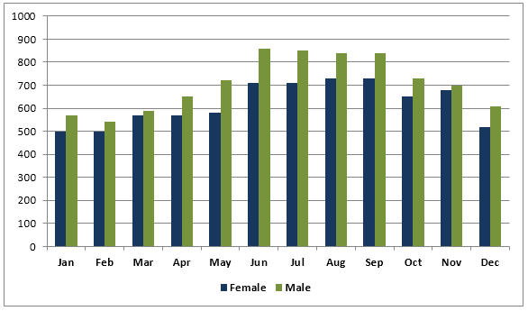
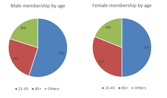
Sport·Age·Gender The graph below shows the average monthly use of health club in Miami and Florida by all full-time members in 2017. The pie charts show the age profile of male and female members of this health club. Write this task View 1 sample answer→
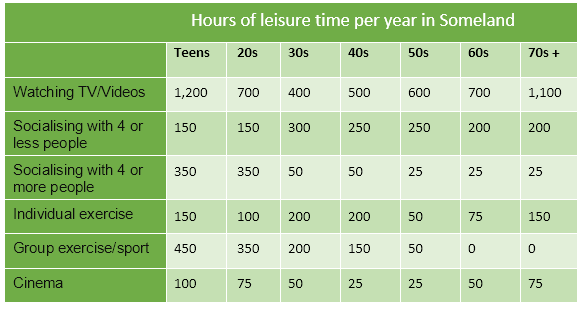
Leisure·Age The table below gives data on the hour of leisure time per year for people in Someland. Write this task Compare 3 sample answers→
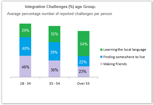
Migration·Age The chart below shows information about the challenges people face when they go to live in other countries. Write this task Compare 2 sample answers→
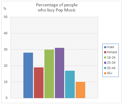
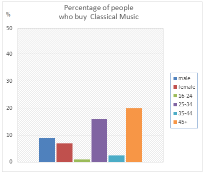
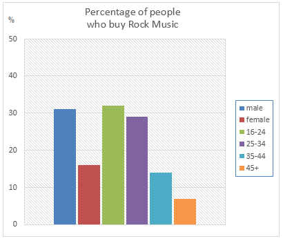
Arts·Age·Gender The graphs below show the types of music albums purchased by people in Britain according to sex and age. Write this task Compare 3 sample answers→
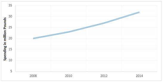
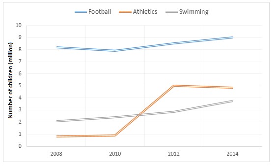
Sport·Spending·Age The graphs below show the average monthly expenditure on children’s sports and participation in different sports in the UK from 2008 to 2014. Write this task View 1 sample answer→
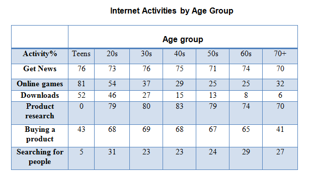
Internet·Age The table below gives information on internet use in six categories by age group. Write this task View 1 sample answer→
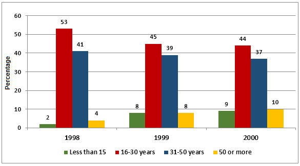
Internet·Age The graph shows Internet Usage in Taiwan by Age Group, 1998-2000. Write this task Compare 3 sample answers→
Education·Age·Employment The charts below show the main reasons for study among students of different age groups and the amount of support they received from employers. Write this task
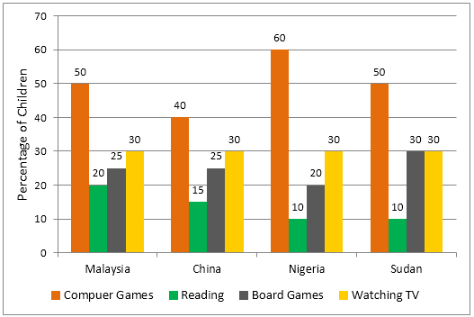
Age·Time use The graph below shows the different home activities among young children in four different countries. Write this task Compare 2 sample answers→