Line GraphTask 1Population·Urbanisation·GeographyThe graph shows the percentage of the population living in urban areas on different continents.Write this taskView 1 sample answer→
Bar ChartTask 1Nature·Geography·ProductionThe charts give information about world forest in five different regions.Write this taskCompare 2 sample answers (Band 8)→
Pie ChartTask 1Food·GeographyThe pie charts show the average consumption of food in the world in 2008 compared to China and India.Write this taskView 1 sample answer→
Bar ChartTask 1Nature·Geography·ProductionThe charts give information about world forest in six different regionsWrite this taskView 1 sample answer→
Bar ChartTask 1Literacy·Gender·GeographyThe chart below shows estimated world illiteracy rates by region and by gender for the year 2000.Write this taskView 1 sample answer→
Pie ChartTask 1Population·GeographyThe pie charts below give information about world population in 1900 and 2000.Write this taskView 1 sample answer→
Mixed ChartsTask 1Population·Demographics·GeographyThe table and pie chart illustrates populations in Australia according to different nationalities and areas.Write this taskView 1 sample answer→
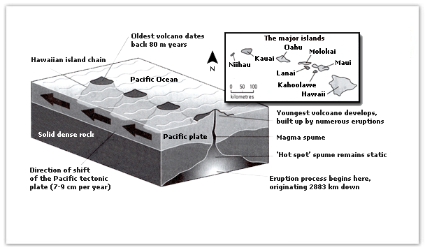
Mixed ChartsTask 1Geography·NatureThe Diagram Below gives information about the Hawaiian Islands chain in the centre of the Pacific Ocean.Write this taskView 1 sample answer→
Mixed ChartsTask 1Geography·NatureThe diagram below gives the information about the Hawaiian island chain in the centre of the Pacific Ocean.Write this taskView 1 sample answer→
Mixed ChartsTask 1Population·Demographics·GeographyThe table and pie chart illustrate populations in Australia according to different nationalities and areas.Write this taskView 1 sample answer→