Bar ChartTask 1Trade·EconomyThe three charts show the value in Australian dollars of Australian trade with three different countries from 2004 to 2009.Write this taskView 1 sample answer→
Line GraphTask 1Economy·Agriculture·ManufacturingThe graph below shows the contribution of three sectors- agriculture, manufacturing, and business and financial services- to the UK economy in the twentieth century.Write this taskView 1 sample answer→
Bar ChartTask 1Economy·Income·FoodThe chart below shows Morocco’s income from different economic sectors in 2003 as well as its income from fishing from 1982 to 2003.Write this task
TableTask 1Economy·Health·EducationThe table below shows social and economic indicators for four countries in 1994, according to United Nations statistics.Write this task
TableTask 1Economy·Health·EducationThe table below shows social and economic indicators for four countries in 1994, according to United Nations statistics.Write this taskView 1 sample answer→
TableTask 1Economy·HealthThe table below shows social and economic indicators for four countries in 1994, according to United Nations statistics.Write this task
Bar ChartTask 1GDP·EconomyThe chart below shows the GDP growth per year for three countries between 2007 and 2010.Write this taskView 1 sample answer→
Bar ChartTask 1Economy·BusinessThe bar chart below illustrates five different industries’ percentage share of Brazil’s economy in 2009 and 2019 with a forecast for 2029.Write this taskView 1 sample answer→
Bar ChartTask 1GDP·EconomyThe chart below shows the GDP growth per year for three countries between 2007 and 2010.Write this taskView 1 sample answer→
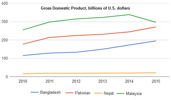
Line GraphTask 1GDP·EconomyThe graph below shows the Gross Domestic Products (GDP) in four selected countries between 2010 and 2015.Write this taskView 1 sample answer→