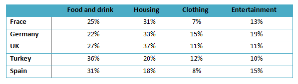
The table illustrates the proportion of monthly household income spend on food and drink, housing, clothing and entertainment in five European countries.
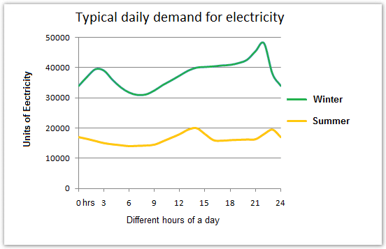
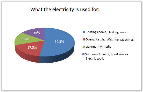
The graph below shows the demand for electricity in England during typical days in winter and summer. The pie chart shows how electricity is used in an average English home.
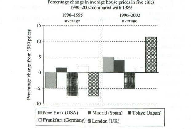
The chart below shows information about changes in average house prices in five different cities between 1990 and 2002 compared with the average house prices in 1989.