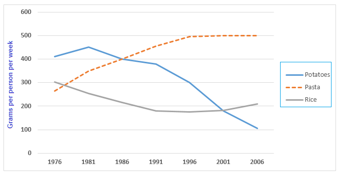
Food The graph below shows the amount in grams of potatoes, pasta and rice eaten in a European country between 1976 and 2006. Viết bài này
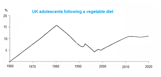
Food·Age The graph shows the percentage of UK adolescents following a vegetarian diet. Viết bài này Xem 1 bài mẫu cùng đề→
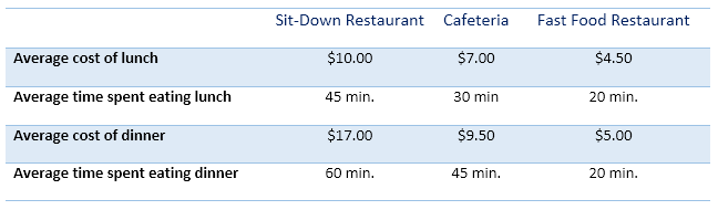
Food·Prices The table below shows information about three different types of restaurants. Viết bài này So sánh 2 bài mẫu cùng đề (Band 6.5–7)→
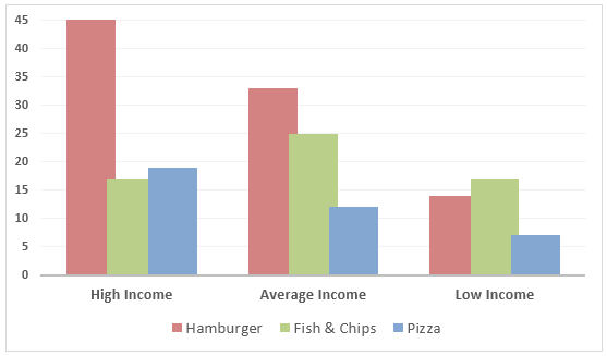
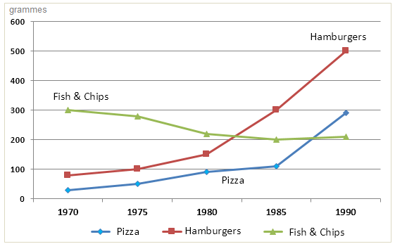
Food·Spending·Income The chart below shows the amount of money per week spent on fast foods in Britain. The graph shows the trends in consumption of fast foods. Viết bài này
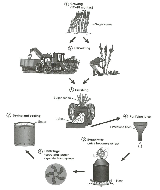
Food·Manufacturing·Production The diagram below shows the manufacturing process for making sugar from sugar cane. Viết bài này So sánh 2 bài mẫu cùng đề (Band 7–8.5)→
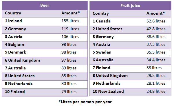
Food The tables below give information about the amount of beer and fruit juice consumed per person per year in different countries. Viết bài này Xem 1 bài mẫu cùng đề→
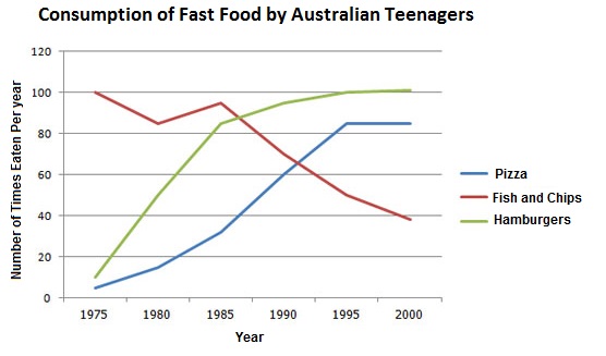
Food The line graph below shows changes in the amount and type of fast food consumed by Australian teenagers from 1975 to 2000. Viết bài này So sánh 2 bài mẫu cùng đề (Band 5–6.5)→
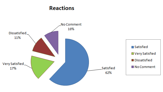
Retail·Food The tables and pie chart show in percentage terms of the results of a survey of a new shopping complex in Auckland, New Zealand. Viết bài này
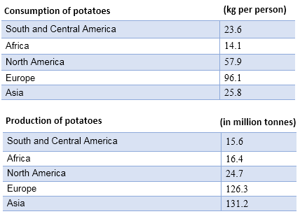
Food·Agriculture·Production The tables below provide information about the consumption and production of potatoes in five parts of the world in 2006. Viết bài này So sánh 2 bài mẫu cùng đề (Band 6.5)→