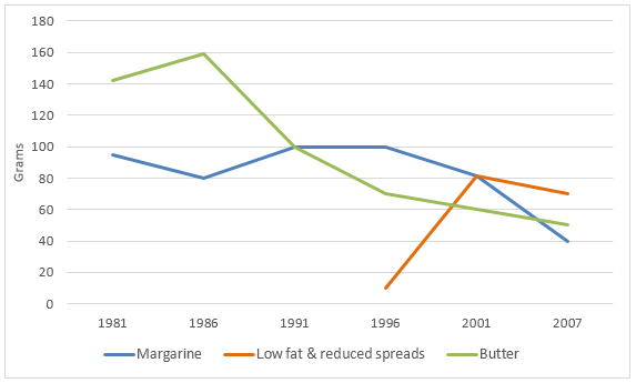
Food The graph below shows the daily consumption of three spreads per person from 1981 to 2007 in a country. Viết bài này So sánh 2 bài mẫu cùng đề (Band 6–7)→
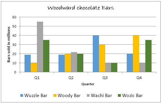
Sales·Food The graph below shows the quarterly sales figures of Woodward chocolate bars for 2010. Viết bài này Xem 1 bài mẫu cùng đề→
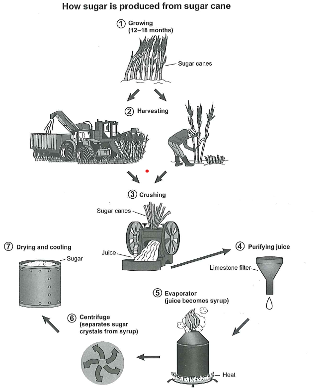
Manufacturing·Food·Agriculture The diagram below shows the manufacturing process for making sugar from sugar cane. Viết bài này
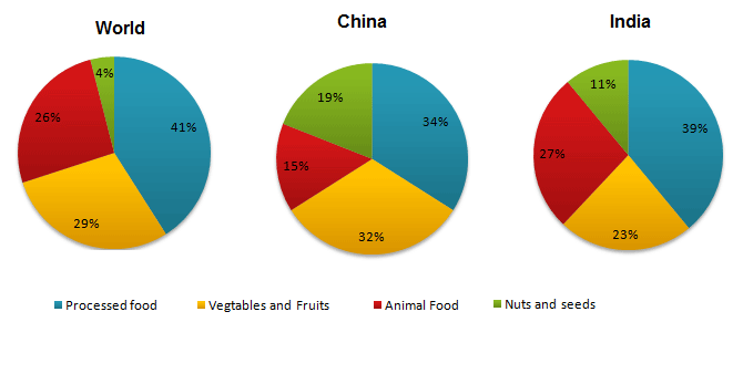
Food The pie charts show the average consumption of food in the world in 2008 compared to two countries; China and India. Viết bài này So sánh 2 bài mẫu cùng đề (Band 6.5–7)→
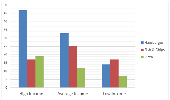
Spending·Food·Income The Bar graph below shows the Expenditure in Million Pounds on fast food items by income groups in the UK. Viết bài này