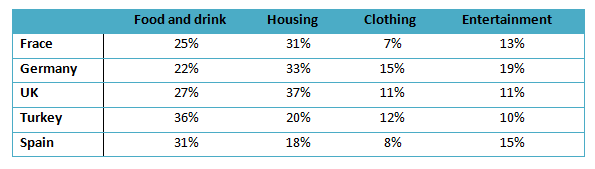
Spending·Income·Housing The table illustrates the proportion of monthly household income spend on food and drink, housing, clothing and entertainment in five European countries. Viết bài này
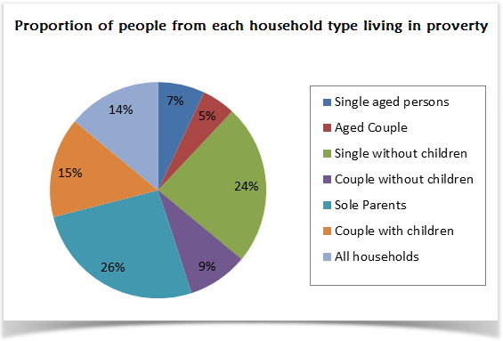
Income·Demographics The pie chart below shows the proportion of different categories of families living in poverty in the UK in 2002. Viết bài này So sánh 2 bài mẫu cùng đề (Band 5.5–6)→
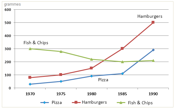
Food·Spending·Income The chart below shows the amount of money per week spent on fast foods in Britain. The graph shows the trends in consumption of fast foods. Viết bài này
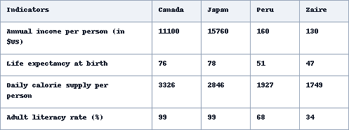
Income The table below shows social and economic indicators for four countries in 1994, according to United Nations statistics. Viết bài này
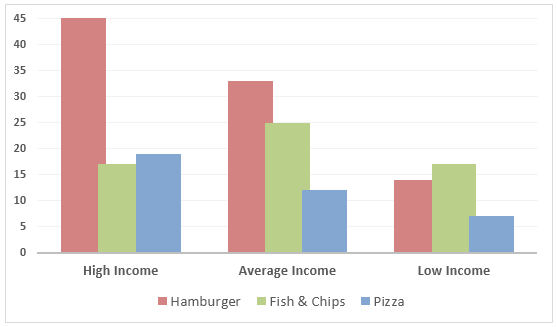
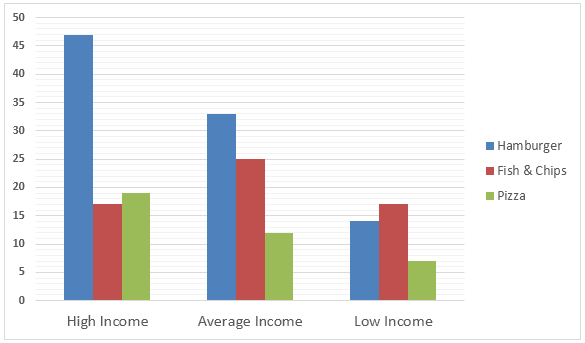
Spending·Food·Income The Bar graph below shows the Expenditure in Million Pounds on fast food items by income groups in the UK. Viết bài này
Income·Finance The table below shows personal saving as a percentage of personal income for selected countries in 1970, 1990 and 2010. Viết bài này