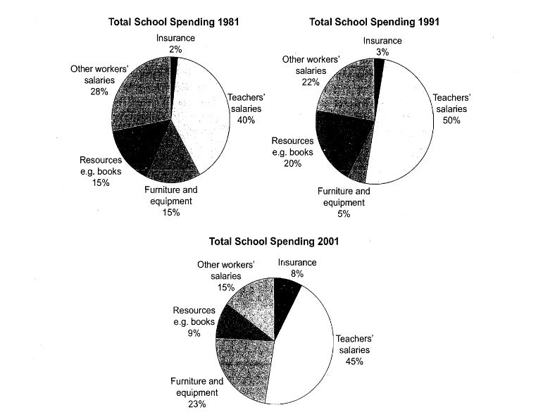
The three pie charts below show the changes in annual spending by a particular UK school in 1981, 1991 and 2001.
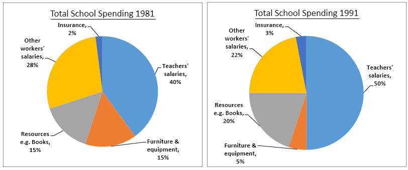
The three pie charts below show the changes in annual spending by a particular UK school in 1981, 1991 and 2001.
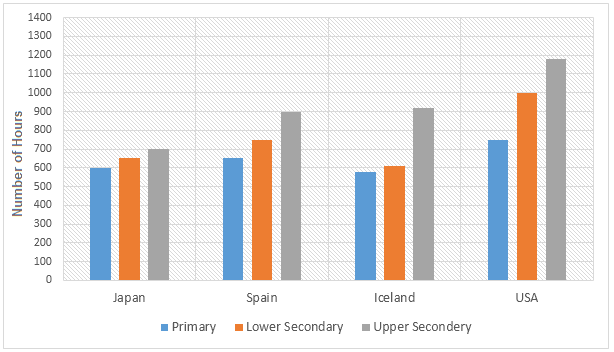
The bar charts below show the number of hours each teacher spent teaching in different schools in four different countries in 2001. The number of hours spent by each teacher in teaching.
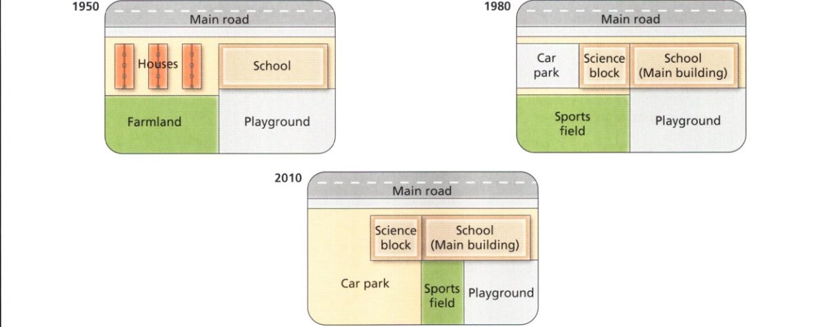
The diagrams below show the changes that have taken place at West Park Secondary School since its construction in 1950. Summarise the information by selecting and reporting the main features and make comparisons where relevant.
The three pie charts below show the changes in annual spending by a particular UK school in 1981, 1991 and 2001. Summarise the information by selecting and reporting the main features, and make comparisons where relevant.