The bar graph below represents data about the clubs joined by people of two different age groups at a leisure centre in a small city.
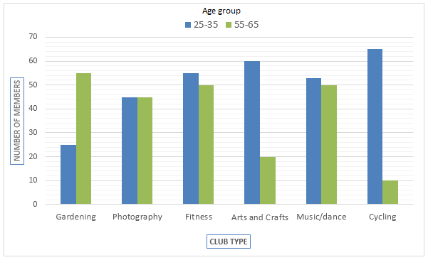
The bar graph below represents data about the clubs joined by people of two different age groups at a leisure centre in a small city.
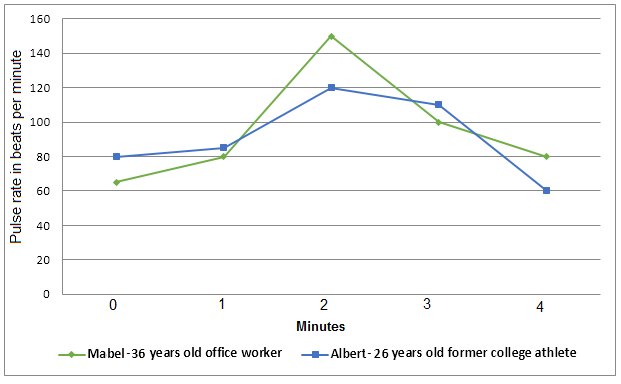
The graph shows a comparison in the pulse rate changes between two different individuals of different ages and professions. Write a report for a university tutor describing the information shown in the diagrams below. Exercise and pulse rate
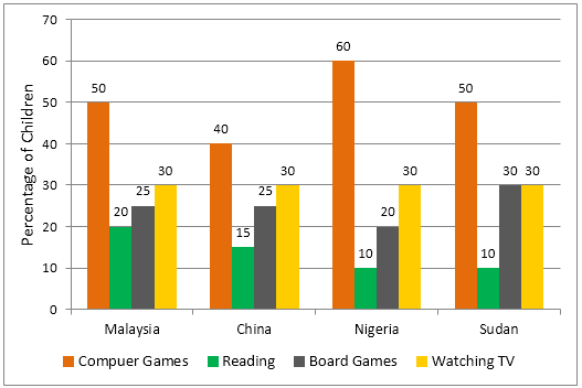
The graph below shows the different home activities among young children in four different countries. Home a ctivities among young children
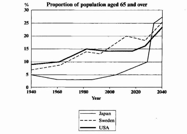
The graph below shows the proportion of the population aged 65 and over between 1940 and 2040 in three different countries. Summarise the information by selecting and reporting the main features, and make comparisons where relevant.
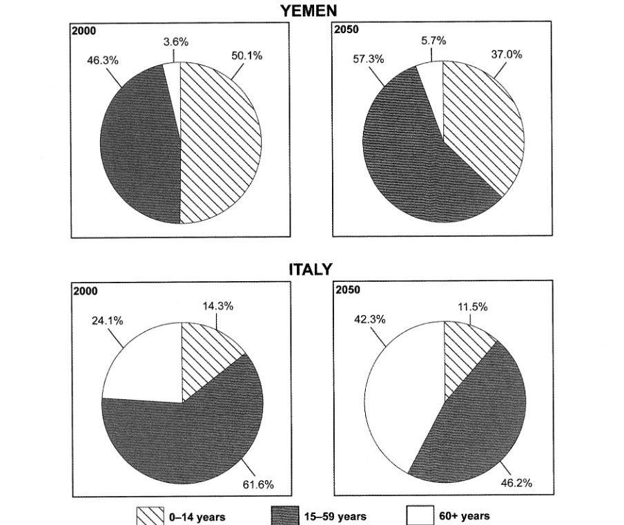
The charts below give information on the ages of the populations of Yemen and Italy in 2000 and projections for 2050. Summarise the information by selecting and reporting the main features, and make comparisons where relevant.
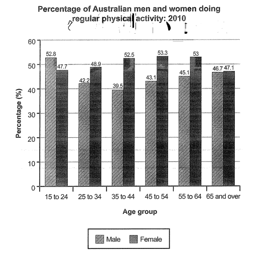
The bar chart below shows the percentage of Australian men and women in different age groups who did regular physical activity in 2010. Summarise the information by selecting and reporting the main features, and make comparisons where relevant.
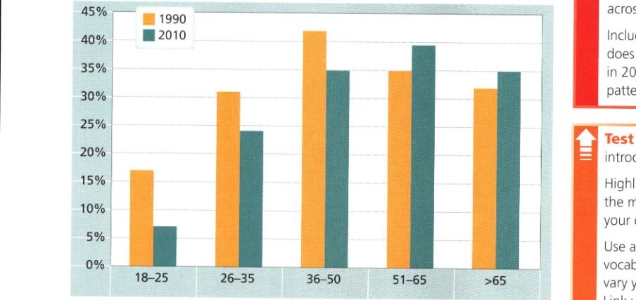
The chart below gives information on the percentage of British people giving money to charity by age range for the years 1990 and 2010. Summarise the information by selecting and reporting the main features and make comparisons where relevant.
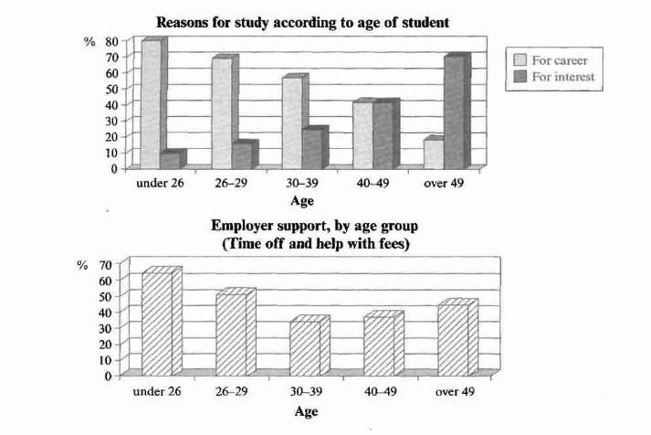
The charts below show the main reasons for study among students of different age groups and the amount of support they received from employers. Summarise the information by selecting and reporting the main features, and make comparisons where relevant.