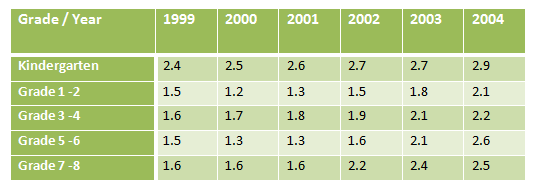
Education·Schools The table below describes percentages of homeschooled students in Some Country in 1999-2004. Write this task View 1 sample answer→
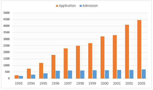
Universities·Education The graph below shows the comparison between the number of applicants and the number of students who were granted admission in a university. Write this task
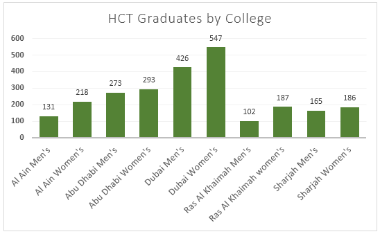
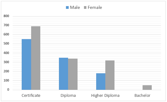
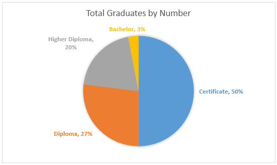
Universities·Education·Gender The graphs show enrolment in different colleges in the Higher Colleges of Technology in 1999. Write this task
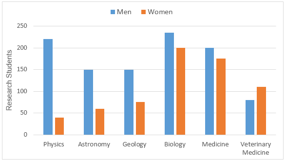
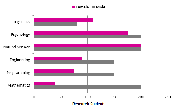
Universities·Education·Gender The chart below shows the numbers of male and female research students studying six science-related subjects at a UK university in 2009. Write this task Compare 2 sample answers (Band 6.5–7)→
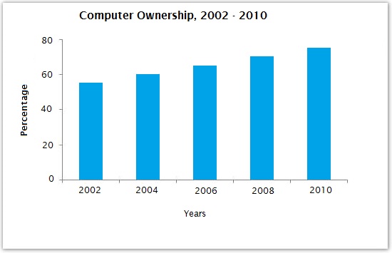
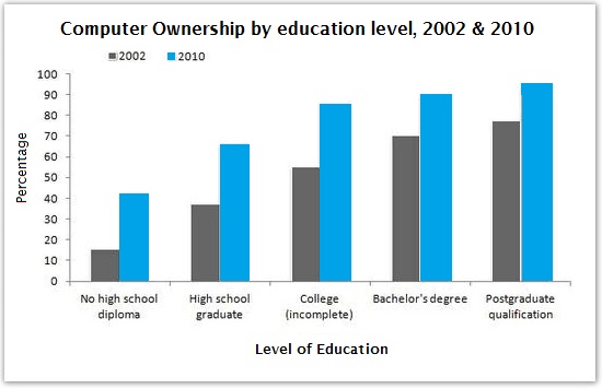
Technology·Education The graphs below give information about computer ownership as a percentage of the population between 2002 and 2010, and by the level of education for the years 2002 and 2010. Write this task Compare 3 sample answers (Band 5.5–8)→
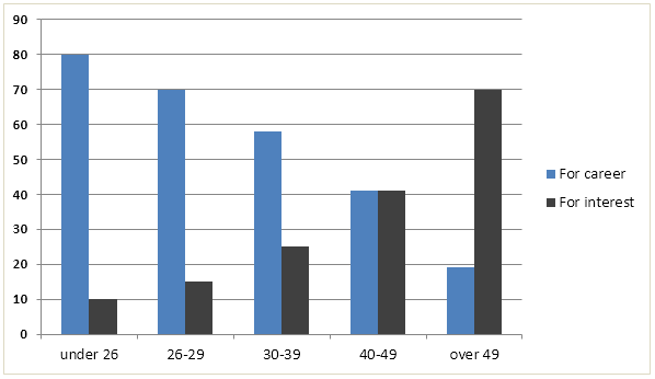
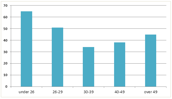
Education·Employment·Age The charts below show the main reasons for study among students of different age groups and the amount of support they received from employers. Write this task
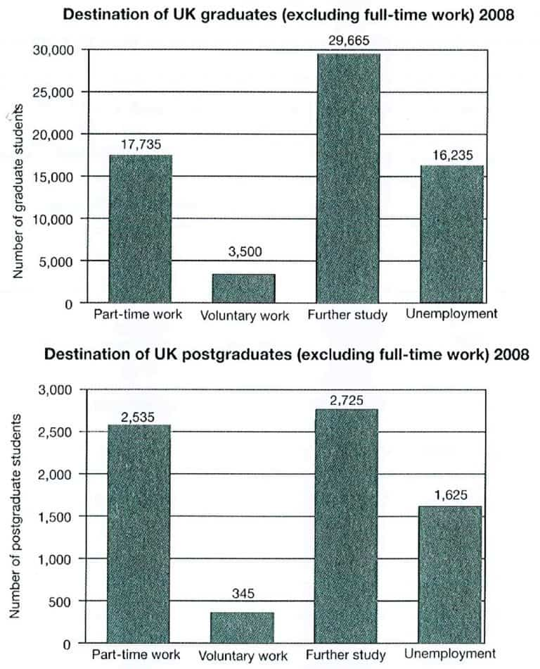
Education·Employment The charts below show what UK graduate and postgraduate students who did not go into full-time work did after leaving college in 2008. Write this task
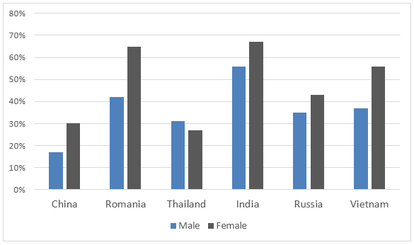
Education The bar charts below provide information about percentages of students who are proficient in a foreign language in different countries. Write this task View 1 sample answer→
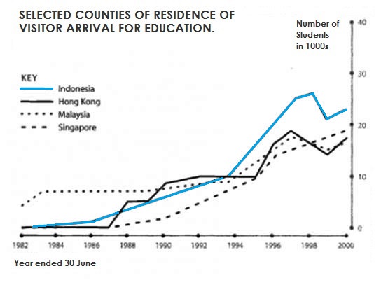
Education·Migration The graph below shows four countries of residence of overseas students in Australia. Write this task Compare 6 sample answers (Band 5–5.5)→
Universities·Education·Gender The bar graph below shows the numbers of male and female research students studying six subjects at a US university in 2011. Write this task Compare 2 sample answers (Band 5.5–6)→