Mixed ChartsTask 1Culture·ConstructionThe picture below shows the museum’s plant in 1998 and after some changes were made in 2008.Write this taskView 1 sample answer→
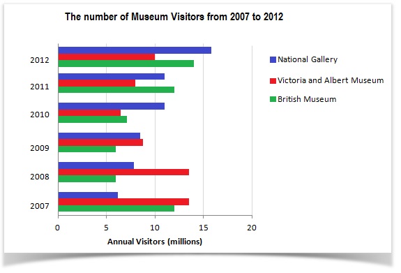
Bar ChartTask 1Tourism·CultureThe bar chart shows the number of visitors to three London Museums between 2007 and 2012.Write this taskView 1 sample answer→
MapTask 1Employment·CultureThe two plans below compare the layout of a typical Japanese office and a typical American office.Write this taskView 1 sample answer→
Bar ChartTask 1Culture·Sport·GenderThe charts show the percentage of boys and girls aged 5-14 taking part in cultural activities and sports in Australia in 2003.Write this taskView 1 sample answer→
Mixed ChartsTask 1Technology·CultureThe diagram below shows the development of the cutting tool in the Stone Age.Write this taskCompare 2 sample answers (Band 6–8)→
Line GraphTask 1Culture·TourismThe line graph below gives information about the number of visitors to three London museums between June and September 2013.Write this taskView 1 sample answer→
Line GraphTask 1Culture·TourismThe graph shows the number of visitors to four international museums between 1980 and 2015.Write this taskView 1 sample answer→
TableTask 1Arts·CultureThe table below gives information about UK independent films.Write this taskView 1 sample answer→
Line GraphTask 1Culture·TourismThe line graph below gives information about the number of visitors to three London museums between June and September 2013.Write this taskView 1 sample answer→
Line GraphTask 1Culture·LeisureThe line graph below gives information on cinema attendance in the UK.Write this taskView 1 sample answer→