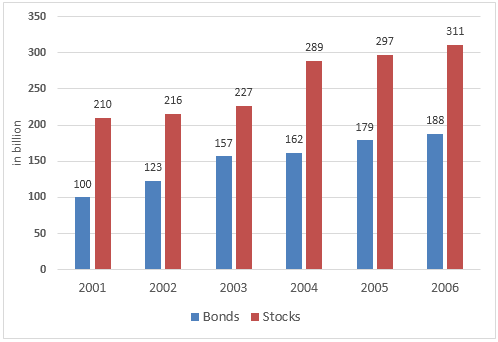
Line GraphTask 1FinanceThe graph below shows the way people of Somecountry invested their money during the years 2001 – 2006.Write this taskView 1 sample answer→
Pie ChartTask 1Charity·FinanceThe pie chart shows the amount of money that a children's charity located in the USA spent and received in one year, 2016.Write this taskView 1 sample answer→
Pie ChartTask 1Charity·FinanceThe pie chart shows the amount of money that a children’s charity located in the USA spent and received in one year.Write this taskView 1 sample answer→
Bar ChartTask 1Finance·BusinessThe chart below gives information about billions of euros invested in four areas by various organisations.Write this taskView 1 sample answer→
Line GraphTask 1Government·FinanceThe line graph shows the past and projected finances for a local authority in New Zealand.Write this taskView 1 sample answer→
Mixed ChartsTask 1Finance·EducationThe diagrams below show UK students’ responses to the question of to what extent would they describ e themselves as financially organised.Write this taskView 1 sample answer→
Line GraphTask 1Finance·Public servicesThe graphs indicate the source of complaints about the bank of America and the amount of time it takes to have the complaints resolved.Write this taskView 1 sample answer→
Mixed ChartsTask 1Sales·FinanceThe chart and graph below give information about sales and share prices for Coca-Cola.Write this taskView 1 sample answer→
Mixed ChartsTask 1Health·Disease·FinanceThe charts below show the Medical research funding amount in millions of Dollars in Someland and also shows the death number for this area.Write this taskCompare 3 sample answers (Band 6–7.5)→
TableTask 1Income·FinanceThe table below shows personal saving as a percentage of personal income for selected countries in 1970, 1990 and 2010.Write this task