The chart below shows the number of adults participating in different major sports in one area, in 1997 and 2017. Summarise the information by selecting and reporting the main features, and make comparisons where relevant.
The graph below shows the average monthly use of health club in Miami and Florida by all full-time members in 2017. The pie charts show the age profile of male and female members of this health club. Health club use in Miami and Florida in 2017
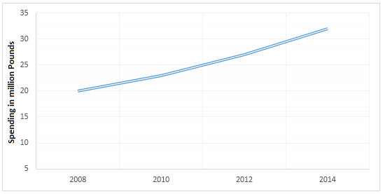
The graphs below show the average monthly expenditure on children’s sports and participation in different sports in the UK from 2008 to 2014. Average monthly spending on children’s sports Participation in three different sports
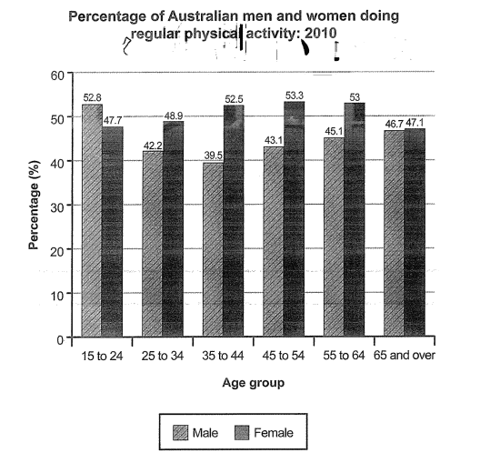
The bar chart below shows the percentage of Australian men and women in different age groups who did regular physical activity in 2010. Summarise the information by selecting and reporting the main features, and make comparisons where relevant.
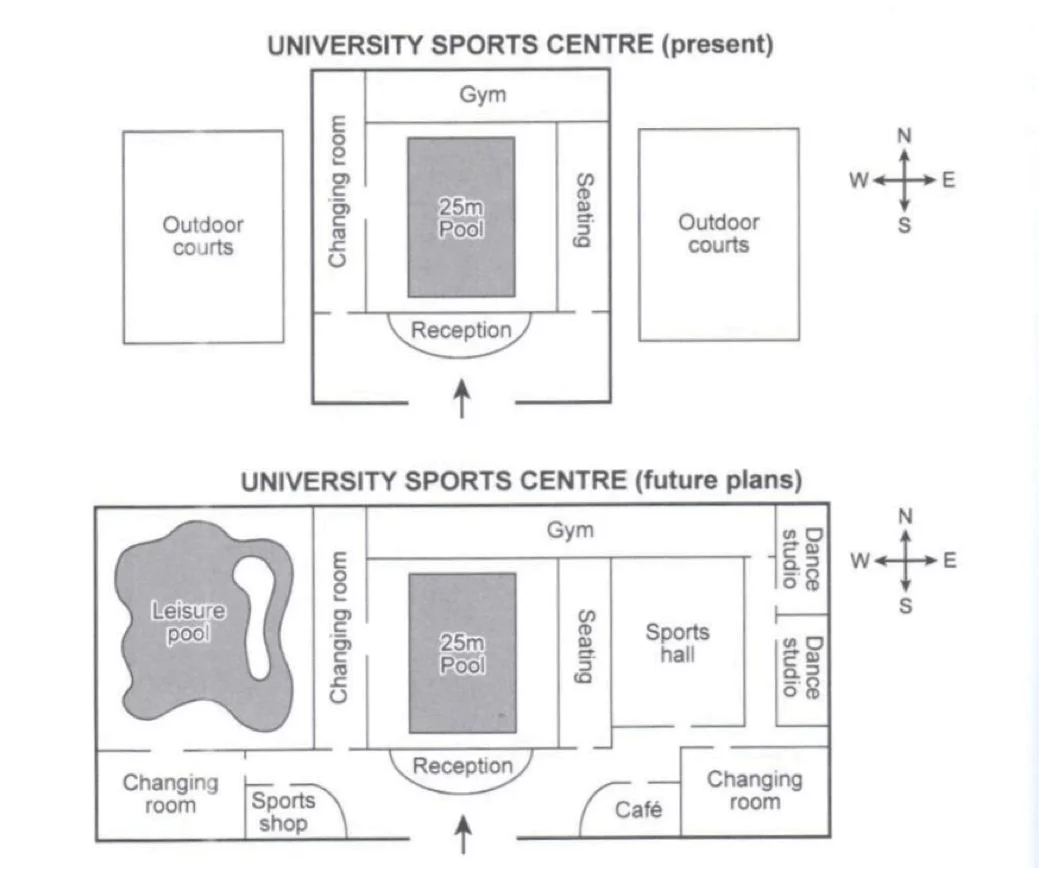
The plans below show the layout of a university’s sports centre now, and how it will look after redevelopment. Summarise the information by selecting and reporting the main features, and make comparisons where relevant.