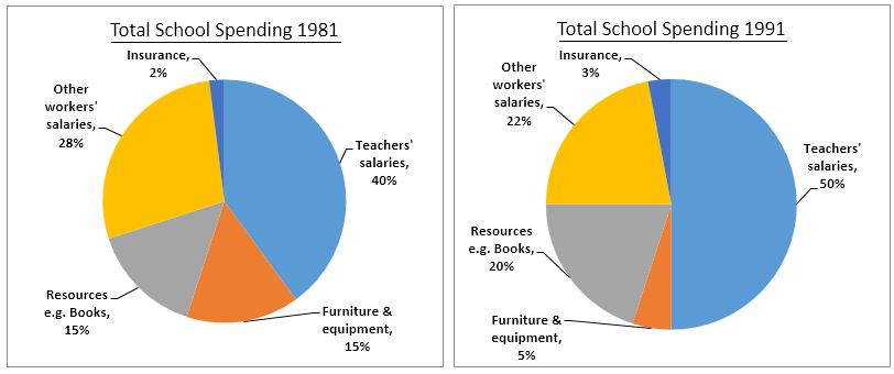
The three pie charts below show the changes in annual spending by a particular UK school in 1981, 1991 and 2001.
8 Corrections
Band
- Band 6.0View annotated correction →
- Task Achievement
- Band 6.0
- Coherence and Cohesion
- Band 6.0
- Lexical Resource
- Band 5.5
- Grammatical Range and Accuracy
- Band 5.5
The pie charts overall information about the shift in yearly expenditure at a certain UK schools in the three deferent years: 1981, 1991, and 2001. Overall, the proportions of educators’ paycheck was the highest amount spent in the mentioned years compared to other expenditure areas.
- Band 7.0View annotated correction →
- Task Achievement
- Band 7.5
- Coherence and Cohesion
- Band 6.5
- Lexical Resource
- Band 7.0
- Grammatical Range and Accuracy
- Band 7.5
The pie charts compare the expenditure of a school in the United Kingdom in three different years - 1981, 1991 and 2001, with a gap of a decade. It is clear from the pie charts that teachers’ salaries accounted for the highest percentage of the school’s expenses in all three years.
- Band 6.0View annotated correction →
- Task Achievement
- Band 6.5
- Coherence and Cohesion
- Band 6.0
- Lexical Resource
- Band 6.0
- Grammatical Range and Accuracy
- Band 6.0
The supplied pie charts compare the annual spending made by a school in the UK for three respective years which are 1981, 1991, and 2001. Overall, the salaries for teachers remained the highest portion in spending while insurance was the least expenses over the 20-year time frame.
- Band 6.0View annotated correction →
- Task Achievement
- Band 6.0
- Coherence and Cohesion
- Band 6.0
- Lexical Resource
- Band 5.5
- Grammatical Range and Accuracy
- Band 5.5
The pie charts give information on the spending of a UK school in three different years with the 10 years interval starting from 1981.
- Band 6.5View annotated correction →
- Task Achievement
- Band 6.5
- Coherence and Cohesion
- Band 6.5
- Lexical Resource
- Band 6.0
- Grammatical Range and Accuracy
- Band 6.0
A glance at the three given graphs reveals some differences among the expenditures per year of a British school in a period of three years: 1981, 1991, 2001. Overall, it can be seen that there are many trends that are obviously illustrated in those charts: upward, downward and both upward and downward.
- Band 7.0View annotated correction →
- Task Achievement
- Band 8.0
- Coherence and Cohesion
- Band 7.0
- Lexical Resource
- Band 7.0
- Grammatical Range and Accuracy
- Band 6.5
The pie charts depict the amount spent by a school in the UK annually for the years 1981, 1991 and 2001. As is observed from the pie charts, teachers’ salaries accounted for the highest percentage for both the years and insurance had the smallest proportion of money spent by the UK school in both three selected years.
- Band 7.5View annotated correction →
- Task Achievement
- Band 8.0
- Coherence and Cohesion
- Band 7.0
- Lexical Resource
- Band 7.0
- Grammatical Range and Accuracy
- Band 7.5
The given pie charts illustrate a UK school's annual spending and show the changes over two decades. As is seen in the provided pie charts, the school spent an increasing percentage of money on teachers' salaries, with the maximum of 50% being spent in 1991, after which it was reduced by 5% in 2001.
- Band 6.0View annotated correction →
- Task Achievement
- Band 5.5
- Coherence and Cohesion
- Band 6.0
- Lexical Resource
- Band 6.0
- Grammatical Range and Accuracy
- Band 5.5
The pie charts depict the shifts in annual expenditure by a certain UK school in three different times, 981, 1991, and 2001. In general, teachers’ salaries were the highest proportion of annual spending percentage.