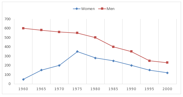
Health·Gender The line graph below gives information about men and women smokers in Bhutan from 1960 to 2000. Write this task
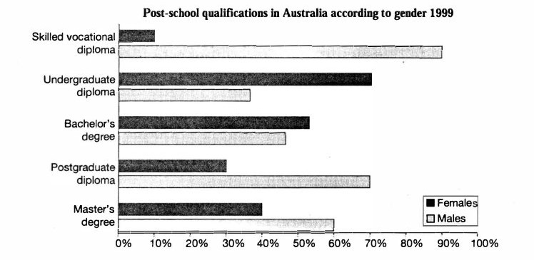
Education·Gender The chart below shows the different levels of post-school qualifications in Australia and the proportion of men and women who held them in 1999. Write this task
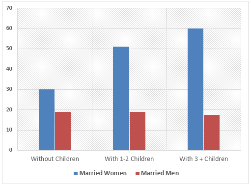
Time use·Gender The diagram below shows the average hours of unpaid work per week done by people in different categories. (Unpaid work refers to such activities as childcare in the home, housework and gardening.) Write this task
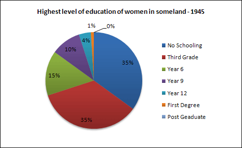
Education·Gender The pie charts below show information on the highest level of education of women in Someland in 1945 and 1995. Write this task Compare 3 sample answers (Band 6.5–7)→